WPBakery columns stack to full-width on mobile by default. To also make them full-width on tablets, set a width for each device in the column’s Responsiveness tab.
- Click the edit (pencil) icon on the column.
- Open the Responsiveness tab.
- Locate the breakpoint that has the width defined, remember the value and set the field to Inherit.
- Set the remembered width on the breakpoint above the one where you want the columns to stack. For example, to stack on Tablet portrait, set the width on Tablet landscape.
- Save, then repeat for every column in the row.
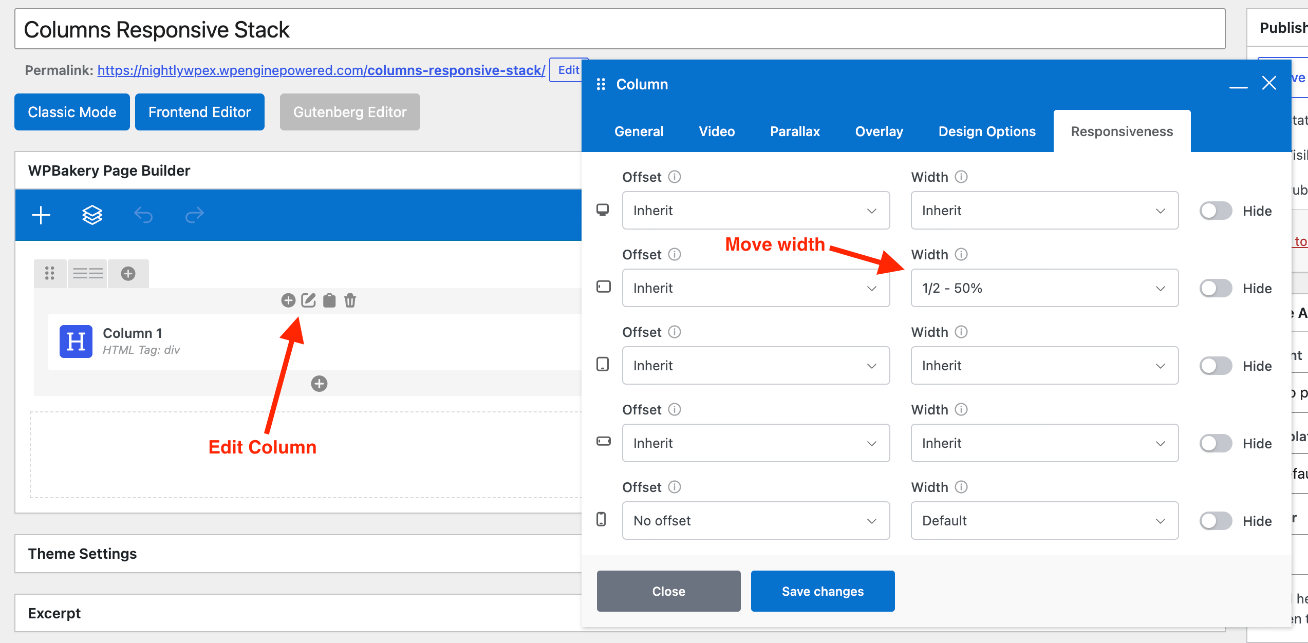
Widths inherit upward: a width set on a smaller device applies to every larger device set to Inherit. With Tablet portrait at 100% and Tablet landscape on Inherit, the column is full-width on both tablet sizes. To keep columns side-by-side on landscape tablets, give Tablet landscape its own width.
Legacy “Full-Width Columns On Tablets” Row Setting
Rows also include a Full-Width Columns On Tablets option added by the Total theme.
This setting predates WPBakery’s responsive column settings and only applies between 768px and 959px, which doesn’t line up with WPBakery’s device breakpoints. It’s recommended to leave it off and use the column Responsiveness settings above instead.
We’ll likely be deprecating this setting in a future version of the theme.