Creating full-screen background sections is a popular trend in modern web design and with Total, it’s incredibly easy to achieve. Using the WPBakery Page Builder, you can stretch rows to span the entire screen width, allowing you to add full-screen rows to any page, regardless of the layout.
Plus, the Total theme enhances the core WPBakery functionality by using pure CSS (instead of JavaScript) for full-width rows, ensuring they load quickly and look seamless. This is a unique feature available in Total only!
Step 1: Insert a new WPBakery Row (or Section) & Choose your Row Stretch Value
In WPBakery Page Builder, each section and row includes a Row Stretch setting with several options.
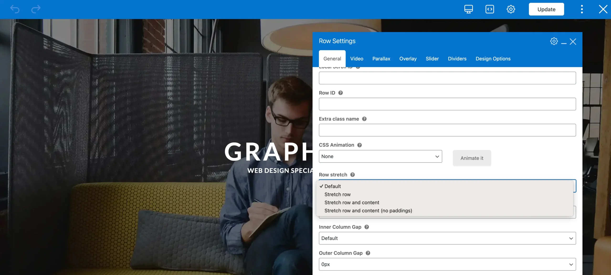
Below is a table explaining each option:
| Option | Description |
|---|---|
Default | No stretching applied. |
Stretch Row | Expands the row to full width while keeping the content centered within the page. |
Stretch Row and Content | Expands both the row and its content, leaving a 15px padding on each side. |
Stretch Row and Content (No Padding) | Expands both the row and its content to the very edges of the browser window. |
In most cases, you’ll use Stretch Row, while the other options are best suited for more niche design needs.
Step 2: Add your Background Image & Color
Once your row is stretched, the next step is to add a background image or color. You can do this from the Design Options tab.
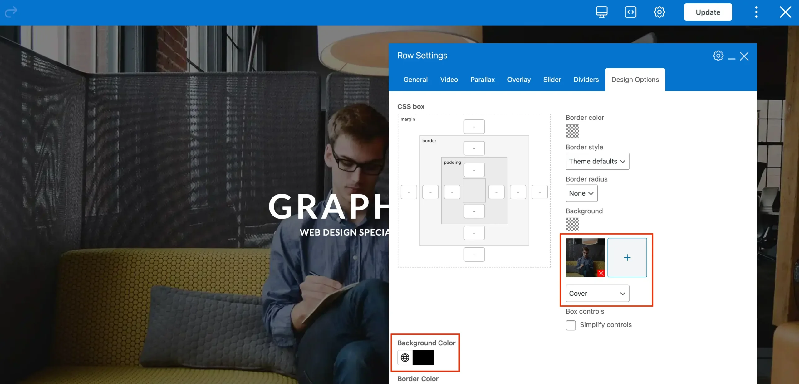
For best results, set the background style to “Cover”. This ensures the background fills the entire space and looks great across all devices. Refer to the screenshot above.
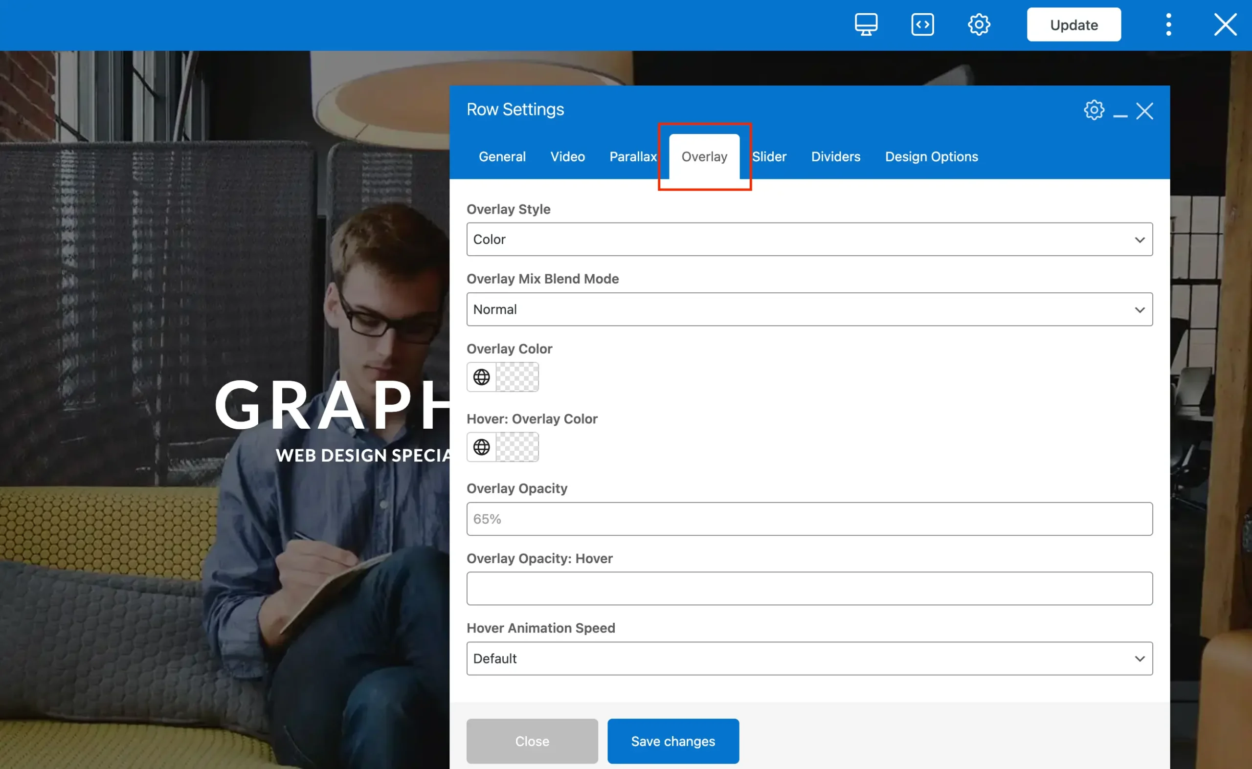
Step 3: Adding an Overlay
When placing text over a background image, it’s often best to add an overlay. The overlay sits on top of the background but behind your text, improving readability without requiring you to edit the image in a photo editor. You can enable and customize this directly from the Overlay tab.
Step 4: Customize your Background
Now you can take your backgrounds a step further by adding visual effects like Parallax or Fixed backgrounds.
a) Fixed Backgrounds
A Fixed background, stays locked in place while the rest of the page scrolls over it. This effect creates a sleek, modern look and helps highlight key sections of your page. An example of a fixed background can be seen on the Gym demo.
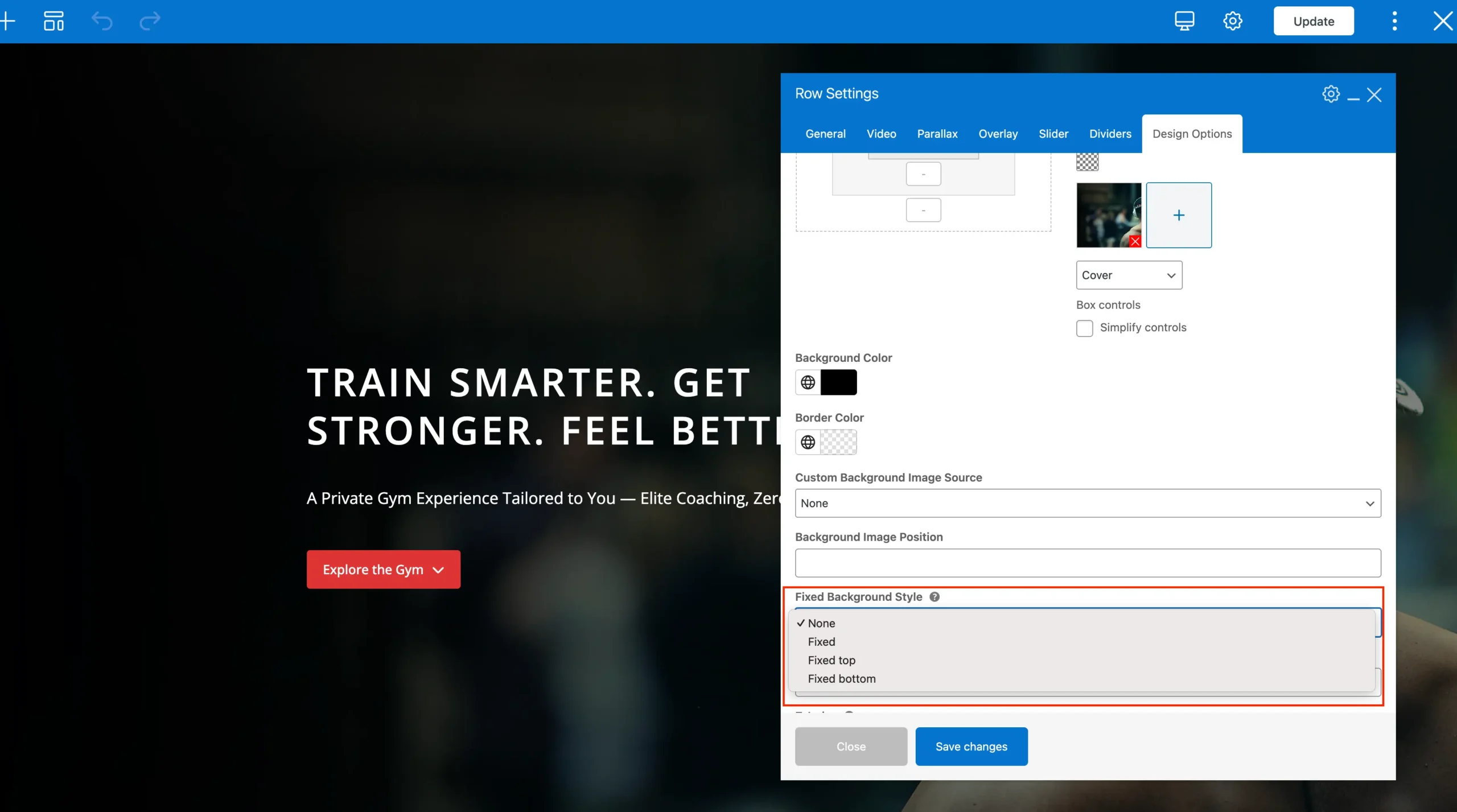
Due to limitations in iOS, fixed backgrounds aren’t supported on iPhones and iPads. If they were forced, the background would appear zoomed in and distorted. To prevent this, the theme automatically detects iOS devices and applies a modern CSS fallback. Instead of the fixed effect, the background is displayed in cover mode, ensuring it still looks clean and visually appealing across all screen sizes.
b) Animated Parallax Backgrounds
Parallax creates a dynamic scrolling effect where the background moves at a different speed than the content. You can enable the parallax effect through the Parallax tab.
Here, you’ll find a dedicated image field where you can set a specific parallax background image. If no image is selected, the row will use the background defined in the Design Options tab.
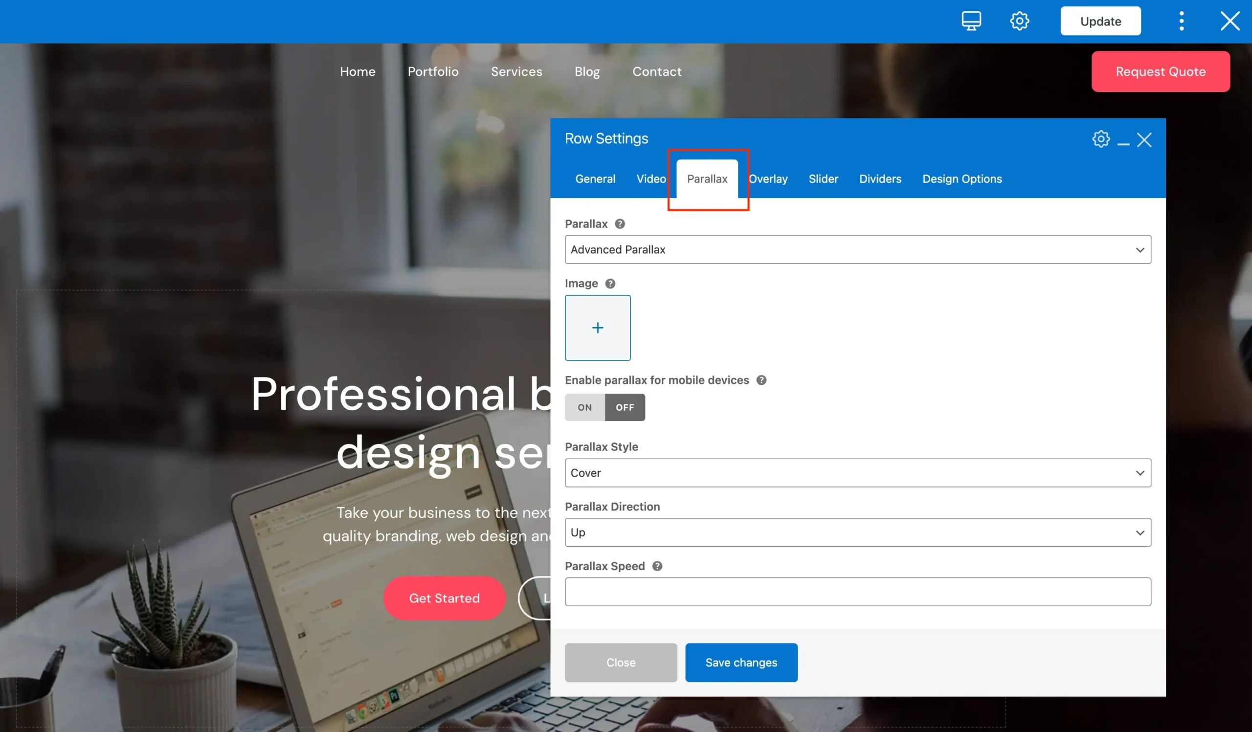
When using the Total theme you will have access to the following options for your Parallax:
| Option | Description |
|---|---|
Simple | Built-in WPBakery option that provides a basic image moving up animation. |
With Fade | Built-in WPBakery option that provides a basic image moving up animation with the content fading out. |
Advanced | Exclusive Total theme option that lets you fully customize the animation, including direction, speed, and style. |
You can use a parallax background to add depth and visual interest to a page, creating a more engaging and dynamic scrolling experience for visitors.
Parallax backgrounds rely on additional JavaScript, which can increase the number of assets loaded and potentially reduce your page speed scores; especially if you use multiple parallax sections on a single page. Having too many can also slow down scrolling, affecting usability. For optimal performance, use parallax backgrounds sparingly, particularly if site speed is a top priority.