Total Theme uses fluid font sizes by default for most text, meaning your typography scales naturally across screen sizes. For example:
--wpex-text-lg: clamp(1.125rem, 0.9688rem + 0.5vw, 1.25rem);  // 18–20px
--wpex-text-xl: clamp(1.25rem, 0.9375rem + 1vw, 1.5rem);      // 20–24px
--wpex-text-2xl: clamp(1.5rem, 1.1875rem + 1vw, 1.75rem);     // 24–28px
...
--wpex-text-7xl: clamp(3.625rem, 2.6875rem + 3vw, 4.375rem);  // 58–70px
Most sizes scale perfectly, but in some cases (like very large headings – 7xl) the font may not shrink enough for long text.
If you want to set your own custom font sizes in Total Theme, you can also use fluid typography to make them scale responsively using the modern CSS clamp() function. You can also adjust the default sizes so that they scale differently.
How to Use Fluid Font Sizes for Your Custom Font Sizes
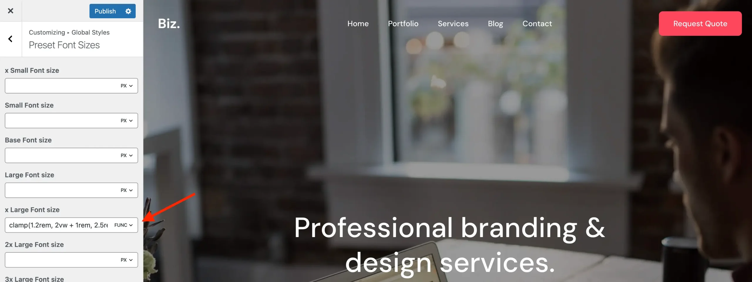
- Go to Appearance > Customizer > Preset Font Sizes.
- Click on the
pxunit of the font size you want to adjust. - Select Func to switch from a static pixel value to a function value.
- Enter a
clamp()value.
For example, you could set a heading font size like this:
clamp(1.2rem, 2vw + 1rem, 2.5rem)- 1.2rem → the minimum font size
- 2vw + 1rem → the fluid scaling based on viewport width
- 2.5rem → the maximum font size
This makes the font scale smoothly between the minimum and maximum as the screen size changes.
How to Generate Your Clamp Values
To experiment with fluid font sizes and generate clamp() values easily, try Fluid Typography. It’s a simple tool for designing responsive font scales.