Total includes a powerful function so you can easily tweak the widths of your site (main/content/sidebar) for all responsive sizes. All you need to do is go to Appearance -> Customize -> Layout to tweak your layouts and view the changes live.
- Container Width: Your site width (all content).
- Content Width: The area with the content when your left or right sidebar is enabled.
- Sidebar Width: Your sidebar width.
The customizer includes a sidebar with all options, which makes your site appear slightly smaller while editing. This means changes to desktop sizes may not look obvious at first, even though they are being applied. To ensure accurate results, open the customizer in a full-size window on large monitors, or save your changes and preview them live.
Container Width

This defines the overall width of your site. You can set the value using either pixels (e.g., 1200px) or percentages (e.g., 90%). There are no enforced maximum or minimum limits, giving you full control over the layout width.
Content With Sidebar Width

This setting defines the width of your main content area when a sidebar is present. By default, the content width is calculated as:
calc(100% - var(--wpex-primary-sidebar-width, min(300px, 30%)) - 5%)This means the content area automatically adjusts based on the sidebar width, defaulting to the smaller of 300px or 30%, with an additional 5% margin (or gap) accounted for in the layout. This setup allows for a fluid and responsive design.
You can customize this value using either a percentage or a fixed pixel width. If you’re using a fixed sidebar width, using calc() for the content area ensures proper spacing and layout alignment.
Sidebar Width

This setting controls the width of your sidebar. By default, the theme uses:
min(300px, 30%)This means the sidebar will be no wider than 300 pixels and no more than 30% of the container’s width (whichever is smaller). This ensures the sidebar remains appropriately sized across different screen sizes for a fluid, responsive layout.
You can override the default with a custom value using either a fixed pixel width (e.g., 250px) for consistency or a percentage (e.g., 25%) for a more flexible design.
If you change the sidebar width, make sure your content area is adjusted accordingly, especially if you’re using fixed widths.
Max-Width
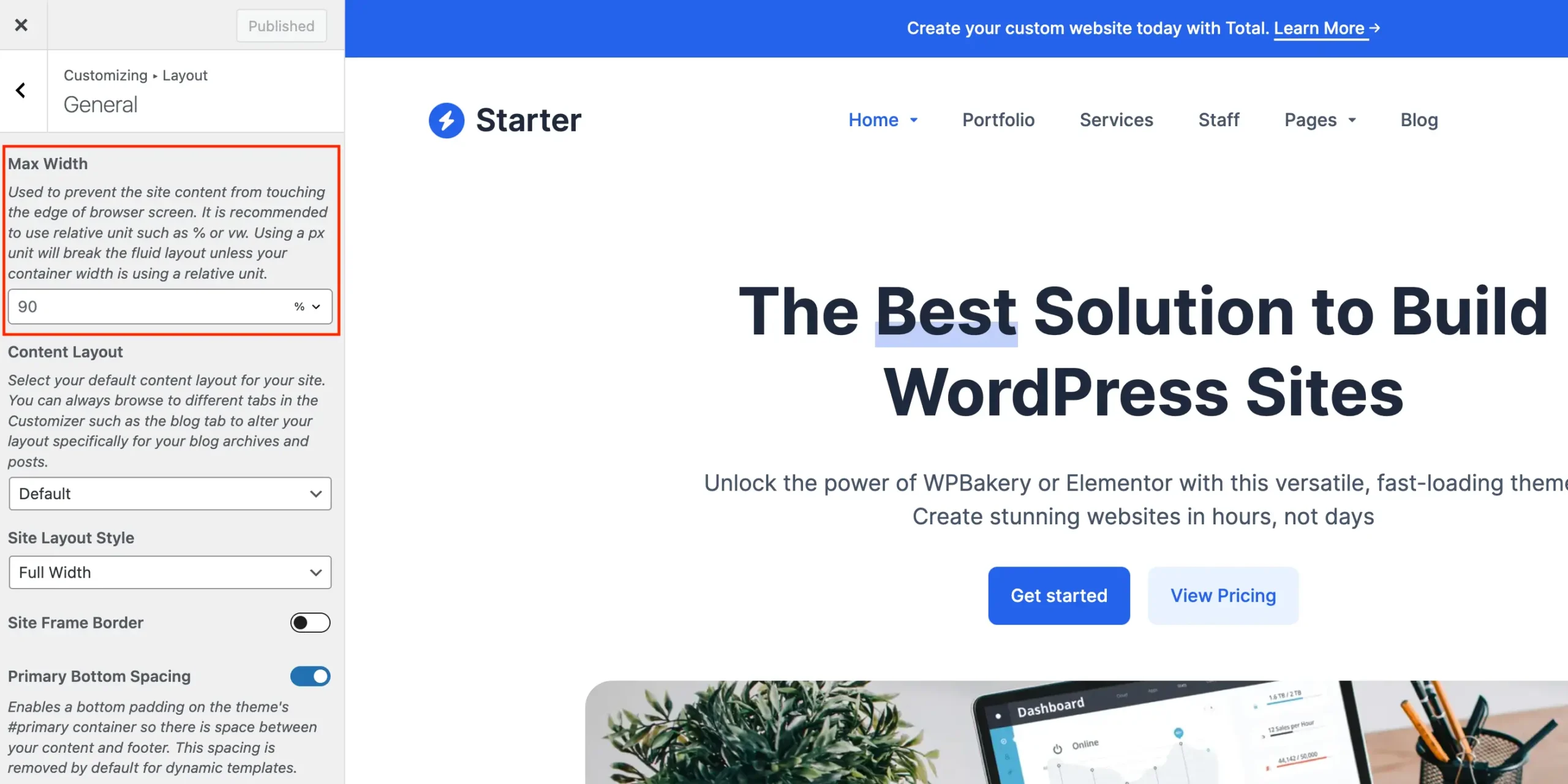
This setting limits the maximum width of the main site container. By default, it’s capped at 90% of the browser window’s width, ensuring that your content remains visible and well-formatted across a variety of screen sizes.
Even if you set a fixed layout width (e.g., 3000px), this max width prevents the layout from stretching too wide on large screens. You can adjust this value under the Layout > General tab in the customizer.
How to Set a Fixed Left & Right Site Padding
As mentioned earlier, the theme’s default 90% max width creates a fluid layout where the left and right padding adjusts automatically with the browser size. This means the space on the sides isn’t fixed.
If you want a fixed amount of space on the left and right instead, you can easily set this by customizing the max width using a calc() expression. For example, setting the max width to:
calc(100% - 40px)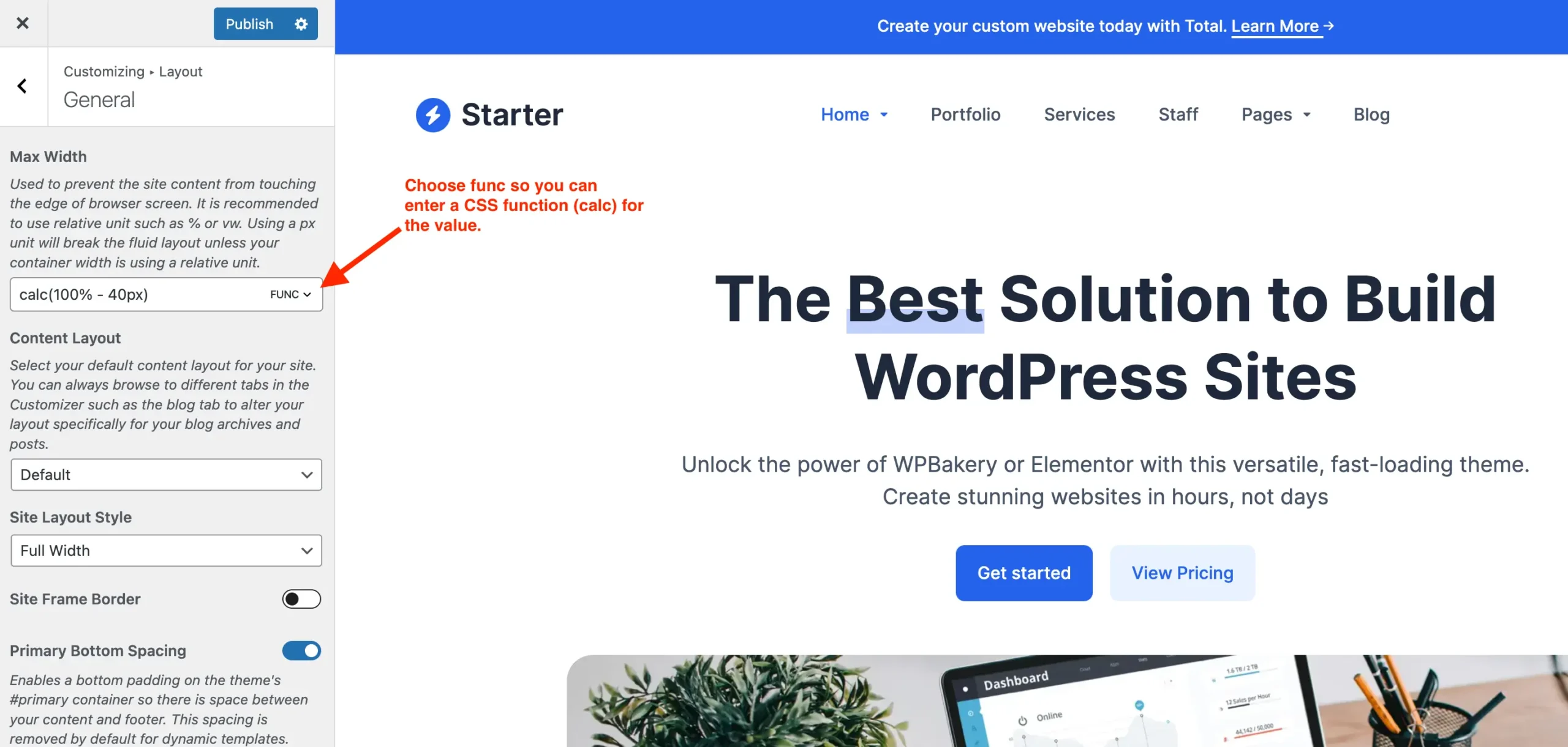
This will ensure there is always 20px of space on both the left and right sides of your site. You can adjust the 60px to increase or decrease the side spacing as needed.
This method lets you maintain consistent side padding while still keeping your layout responsive.