WPBakery Page Builder is a drag‑and‑drop layout builder for WordPress that allows you to create complex page designs visually — without writing any code. This guide walks you through everything you need to know to build pages with WPBakery, including adding rows, columns, and content elements, adjusting layouts, and customizing styles.
Introduction to WPBakery Page Builder
WPBakery Page Builder provides a visual canvas where you can build pages by dragging elements into place. It works with nearly every theme and lets you see the structure of your content as it’s built.
The WPBakery Page Builder plugin is bundled with the Total theme so it’s included for free and it’s our preferred page builder, although you can choose to use Elementor instead if you prefer. We have an article that compares WPBakery to Elementor if you haven’t chosen a builder yet.
WPBakery can be used in both Backend Editor (inside the WP dashboard) and Frontend Editor (live preview on the front of your site).
Installing & Enabling WPBakery
To begin, make sure WPBakery Page Builder is installed and activated in your WordPress dashboard:
- Go to Appearance → Install Plugins to install the theme if you have not yet.
- Once installed, go to Plugins → Installed Plugins to activate it.
- Navigate to Pages → Add New, then choose Backend or Frontend editor to start building.
WPBakery should automatically appear as the editor on pages. If it doesn’t, check WPBakery → Role Manager and confirm it’s enabled for the post types you want.
We generally only recommend using WPBakery for standard pages which usually require more complex layouts and using Gutenberg for your posts and custom post types. Remember, you can always create dynamic templates with WPBakery and assign them to use for your post or custom post type design (recommended).
Switching to the WPBakery Editor
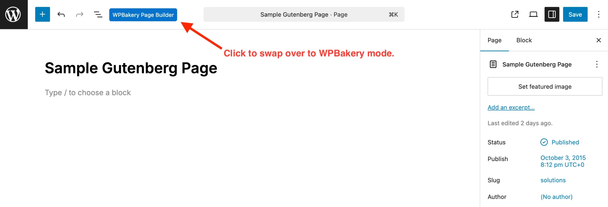
When you go to edit a blank page in the WordPress dashboard it will display either the Gutenberg editor or the Classic Editor. You will need to switch over to WPBakery mode so you can start creating your pages with WPBakery.
Gutenberg: Below is a screenshot showing how to switch from the Gutenberg editor over to the WPBakery editor:
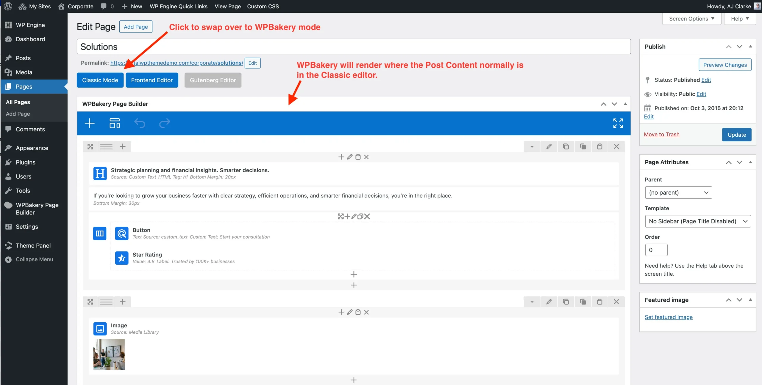
Classic Editor: Below is a screenshot showing what button to click in the Classic editor to swap over to WPBakery building mode and how the builder should render.
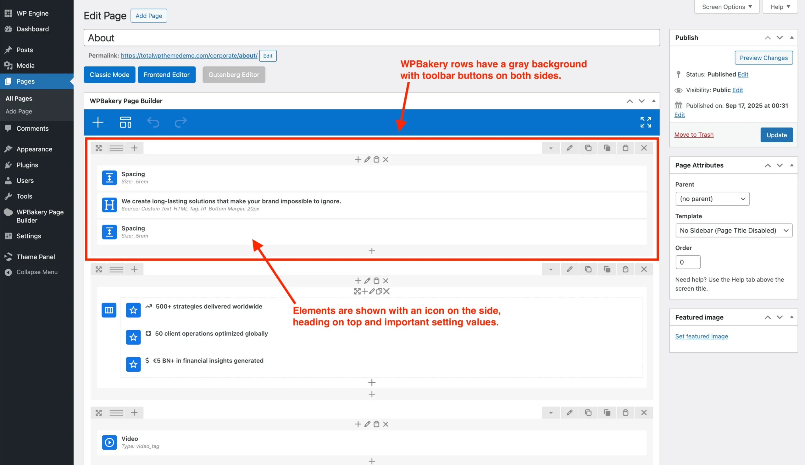
Understanding the WPBakery Interface
When WPBakery loads, you’ll see:
- Add Element buttons — to insert rows and content elements.
- Rows — horizontal sections that hold columns.
- Columns — vertical divisions inside rows that hold content.
- Grid Controls — to adjust layout widths.
- Toolbar Icons — for editing, cloning, deleting, and moving items.
The interface is designed so building blocks stack visually, making it easy to understand page structure at a glance.
Backend Editor
The WPBakery backend editor allows you to build-pages via the WP dashboard. Below is a screenshot showing what it looks like:
Frontend Editor
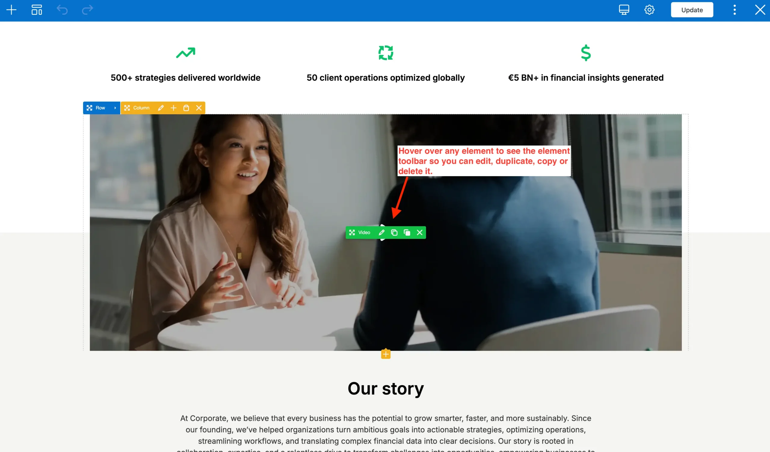
When working in the frontend editor you will be able to see your page live. The WPBakery toolbar will appear at the top of the page and can be used to insert elements, patterns and save your site.
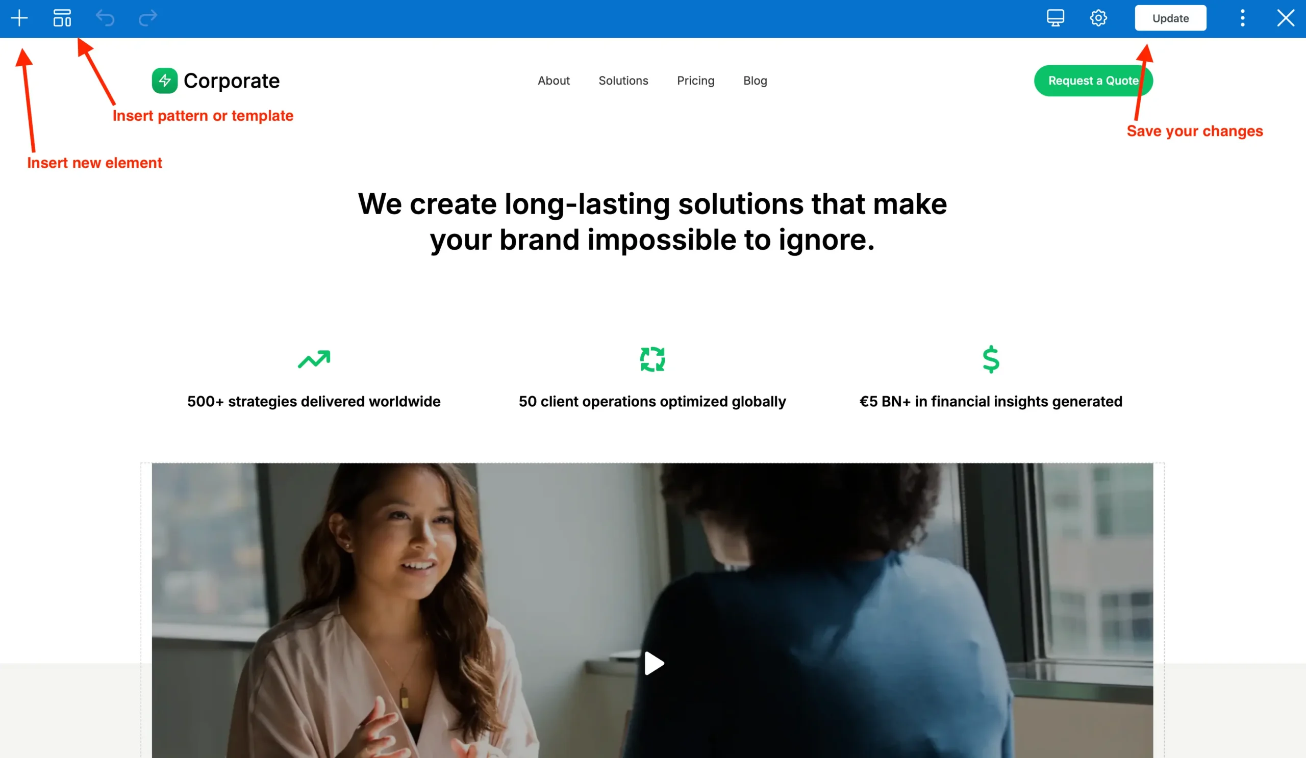
While working in the front-end editor you can hover over any element to edit, delete, copy or move it.
Frontend vs Backend Editor – Which should I use?
WPBakery Page Builder gives you two ways to build your pages: the Backend Editor and the Frontend Editor. Both have their advantages, and the right choice depends on your workflow and preferences.
Backend Editor
The Backend Editor allows you to build pages quickly from within the WordPress dashboard. It doesn’t show your page exactly as it appears on the front end, but it’s often faster because it uses JavaScript to generate content without repeatedly sending server requests to render your changes.
Pros:
- Fast, lightweight interface — ideal for very large pages with tons of elements.
- Easy to manage complex structures like nested rows and columns.
- Less dependent on server speed since it doesn’t render full live previews.
Cons:
- You don’t see the page exactly as your visitors will.
- Visual spacing, styling, and responsive design can be harder to judge without previewing.
Frontend Editor
The Frontend Editor lets you edit your page visually on the live site. Changes appear as they will be seen by your visitors, eliminating the need to save and preview repeatedly.
Pros:
- True WYSIWYG (“what you see is what you get”) experience.
- Immediate visual feedback for spacing, styling, and layout.
- Great for visual learners or designers who want precise control.
Cons:
- Can be slower on pages with many elements, depending on server speed.
- Editing nested structures or large layouts can be more cumbersome than in the backend editor.
Which Should You Use?
- Use Backend Editor for speed and managing very complex layouts.
- Use Frontend Editor when visual accuracy and design precision are most important.
Many users combine both: build the structure in the backend editor, then fine-tune the visual details in the frontend editor.
WPBakery Structure: Sections, Rows, Columns, and Elements
When building pages with WPBakery, it helps to understand the three primary structural components: Sections, Rows, and Columns. These are the building blocks that define how your content is organized on the page.
Sections: Containers used to group multiple rows together. Think of them as large page blocks, often used for full-width areas like headers, banners, or content sections. Sections help with layout management, spacing, and styling. You can apply backgrounds, padding, or other design options to an entire section at once.
Rows: The main structural component that holds your content, these can be added to Sections but can exist on their own. Each row can hold one or more columns, and it defines how content is aligned and stretched across the width of the page. Rows also allow you to control spacing and responsive behavior.
Columns: Columns divide rows vertically and are where all content elements are placed. Every element you add in WPBakery must reside inside a column. So even a row without “columns” will still technically have a single column in it. Columns can be resized and configured using a 12-unit grid system (e.g., 1/2 + 1/2, 1/3 + 2/3).
Elements: Elements are the actual content pieces that you place inside columns. Examples include: Text blocks, Images, Buttons, Videos, Sliders, Icon Boxes, etc. They are the visible building blocks your visitors see. While Sections, Rows, and Columns control structure and layout, Elements provide the content and functionality that make your page interactive and engaging.
How It All Fits Together
- Section → Row → Column → Element
- You always start with a section (optional in most cases), add a row, split it into columns, and then place elements inside columns.
- This hierarchy ensures a clean, organized structure and maintains responsive layouts across different devices.
Understanding these components is key to building pages efficiently and avoiding layout issues. Once you grasp sections, rows, and columns, adding and arranging content becomes much more intuitive.
Creating and Managing Rows
Rows are the main structural containers in the WPBakery page builder. All elements added in WPBakery will be contained inside a row.
- Click + Add Element.
- Select Row from the popup list.
- A blank row is added to your page.
Once you have your row you can start adding any content you want inside it.
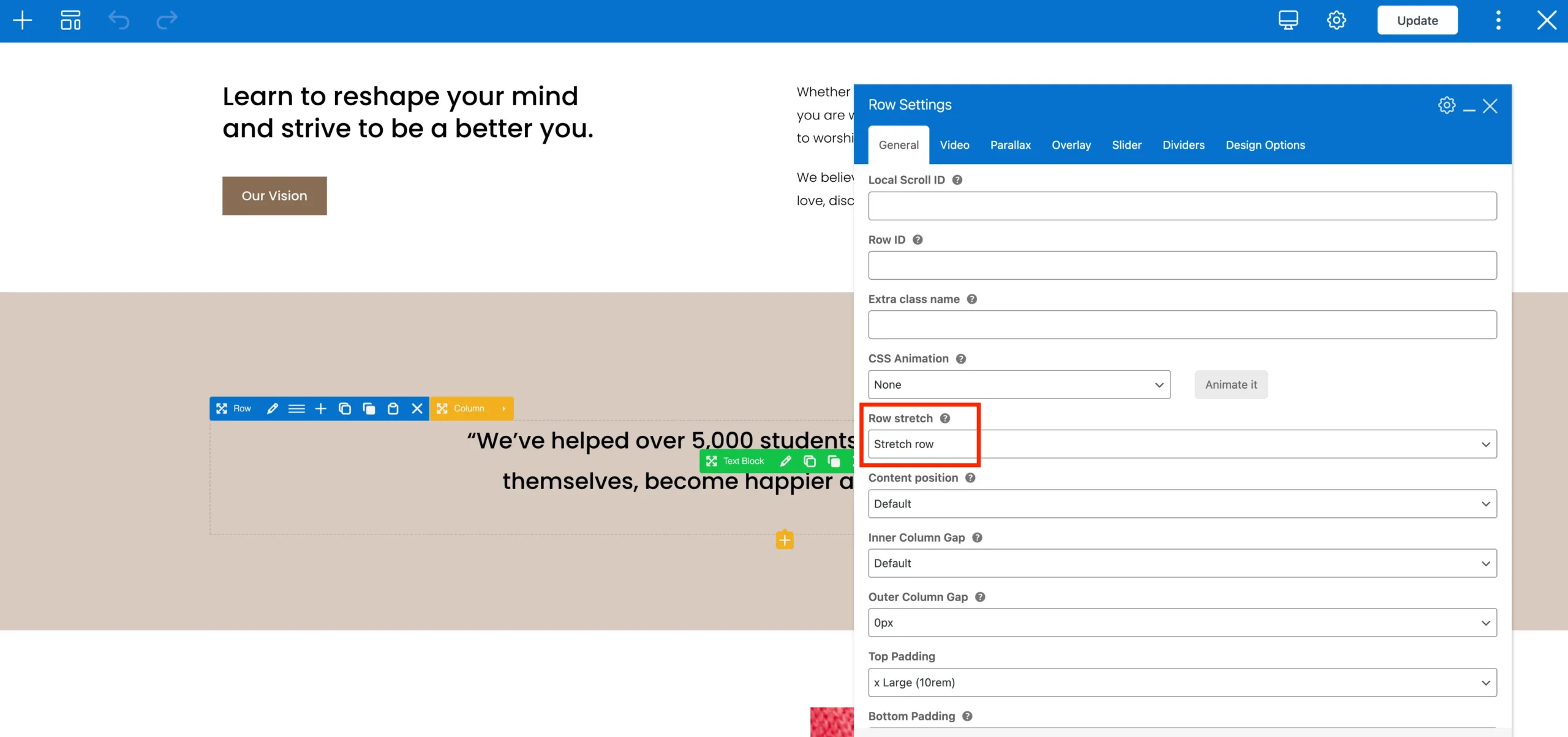
Full-Width Row Backgrounds
Sometimes you may want a row to have a background that is full-width and stretches to either side of the browser window. This can be enabled via the General row settings via the Stretch row setting.
Stretched Row Total Optimization
By default, WPBakery stretches rows using JavaScript. This approach can cause rows to appear stretched only after the page fully loads, which may create a noticeable delay or visual “jump.”
Total replaces this default behavior with modern CSS-based stretched rows. This ensures that your rows display correctly immediately on page load without relying on additional JavaScript execution, resulting in smoother performance and a cleaner visual experience.
Benefits:
- Rows appear correctly on first paint, avoiding visual shifts.
- Reduced dependency on JavaScript improves page performance.
- Fully responsive across devices without extra configuration.
Row Background Overlays
A background overlay is a semi-transparent layer placed on top of a row’s background but behind the content. You can use it to:
- Darken or lighten a background image.
- Add a color tint for branding consistency.
- Create visual separation between sections.
To add background overlay click on the row’s Overlay tab and choose your preferences.
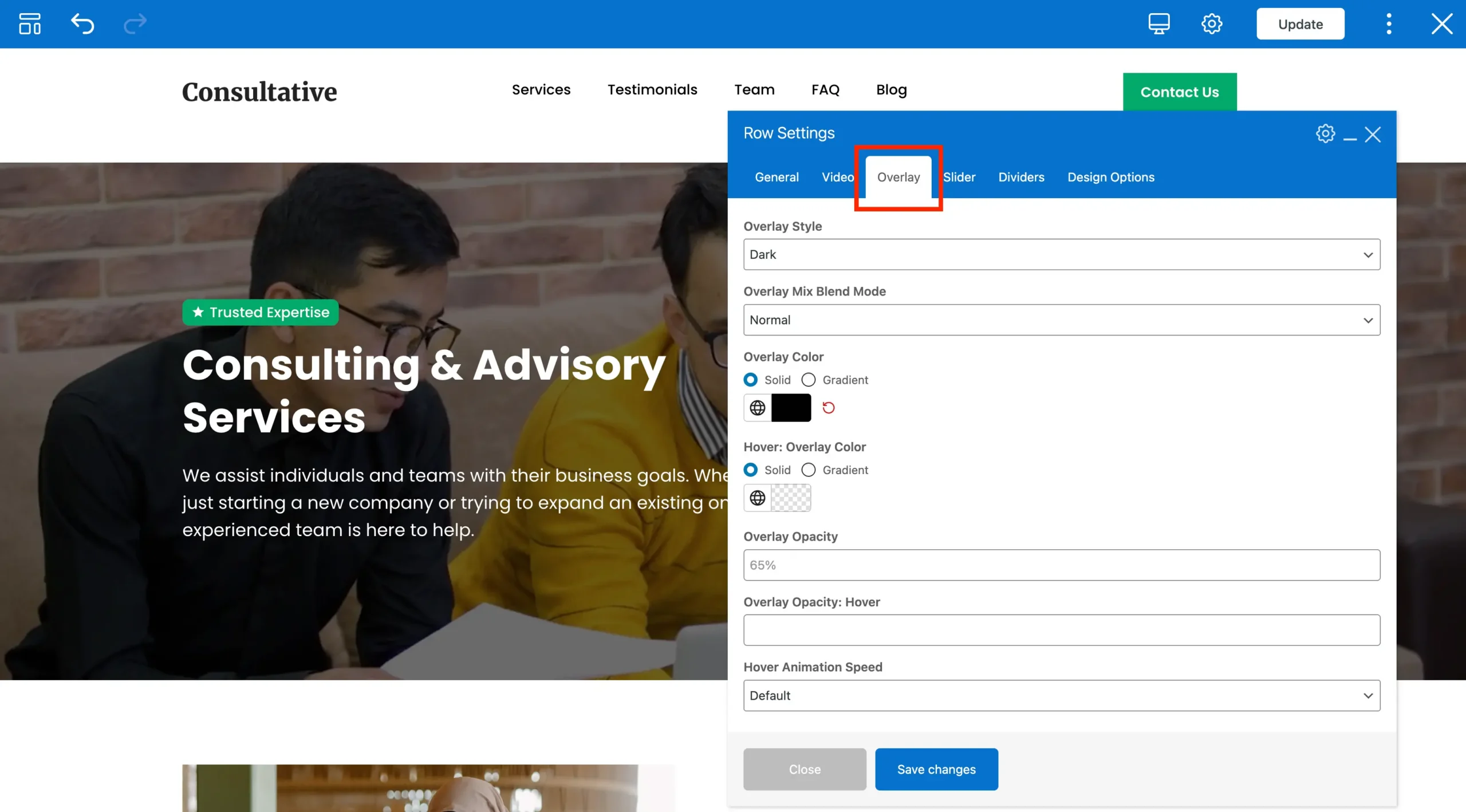
Tips for Using Row Overlays:
- Contrast matters: Make sure your text is still readable against the overlay.
- Subtlety is key: Avoid overly strong overlays that distract from your content.
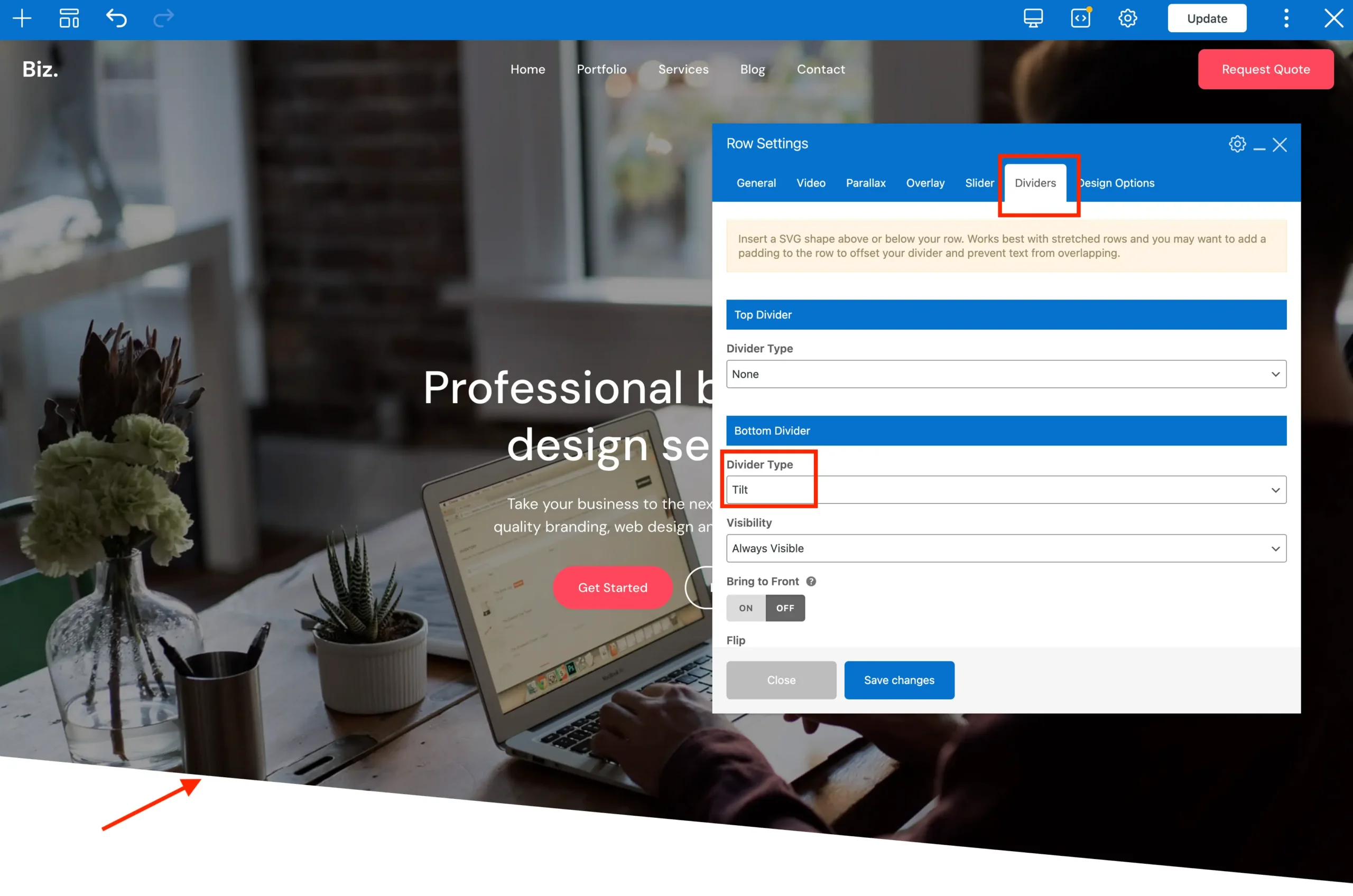
Row Shape Dividers
The Total theme includes an exclusive Shape Divider feature for WPBakery rows and sections. Shape dividers allow you to create visually appealing transitions between rows using decorative SVG shapes such as waves, curves, triangles, arrows, and diagonal slants.
These dividers are displayed at the top or bottom of a row and are commonly used to create smoother transitions between sections, especially when working with colored or image backgrounds. Simply click on the Dividers tab to select and customize your dividers.
Row Content Position
The Content Position setting in WPBakery controls the vertical alignment of content inside your columns. By default, content is aligned to the top, but you can change this to middle or bottom depending on your layout needs.
This is especially useful when using rows with a defined height, full-height or when enabling the Equal Height option, as it ensures all content aligns consistently within the available space.
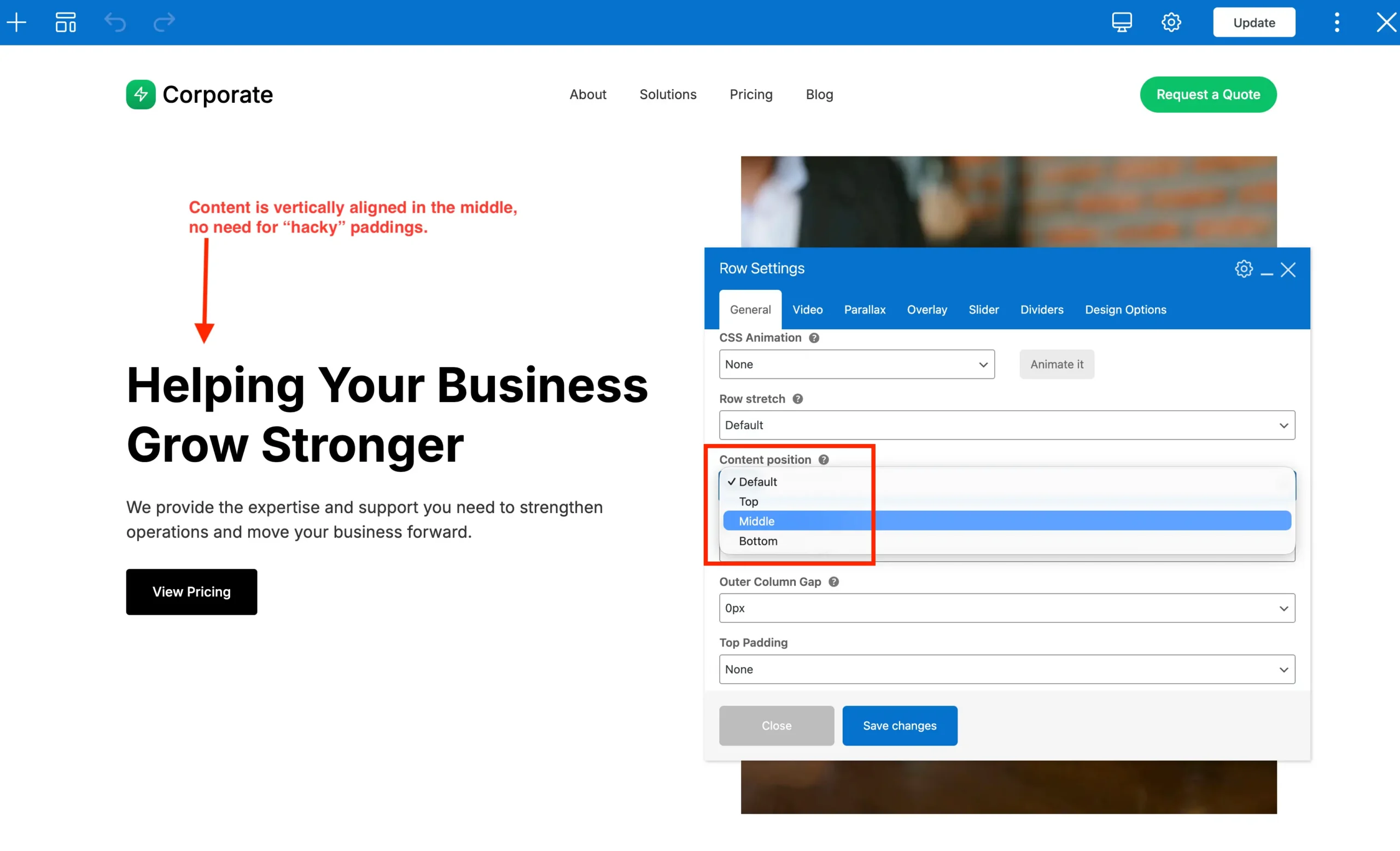
A common use case is when you have a column with a large image, video, or other media, and you want the text in the adjacent column to be vertically centered alongside it. Adjusting the Content Position helps create more balanced and visually polished layouts without needing custom CSS.
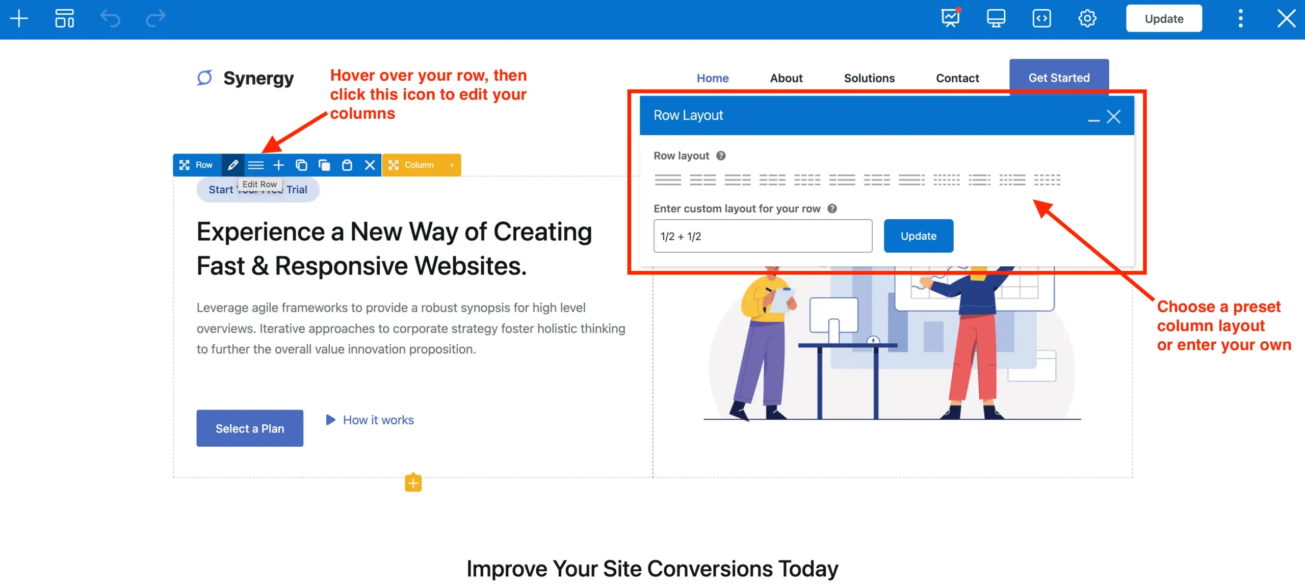
Adding and Configuring Columns
By default all rows contain a singular column, but they can be edited to display multiple columns.
- Hover over the Row.
- Click the Column Layout button (grid icon).
- Choose a column configuration (e.g., 1/2 + 1/2, 1/3 + 2/3) or enter a custom column config.
Each column displays as a container where you can add content elements.
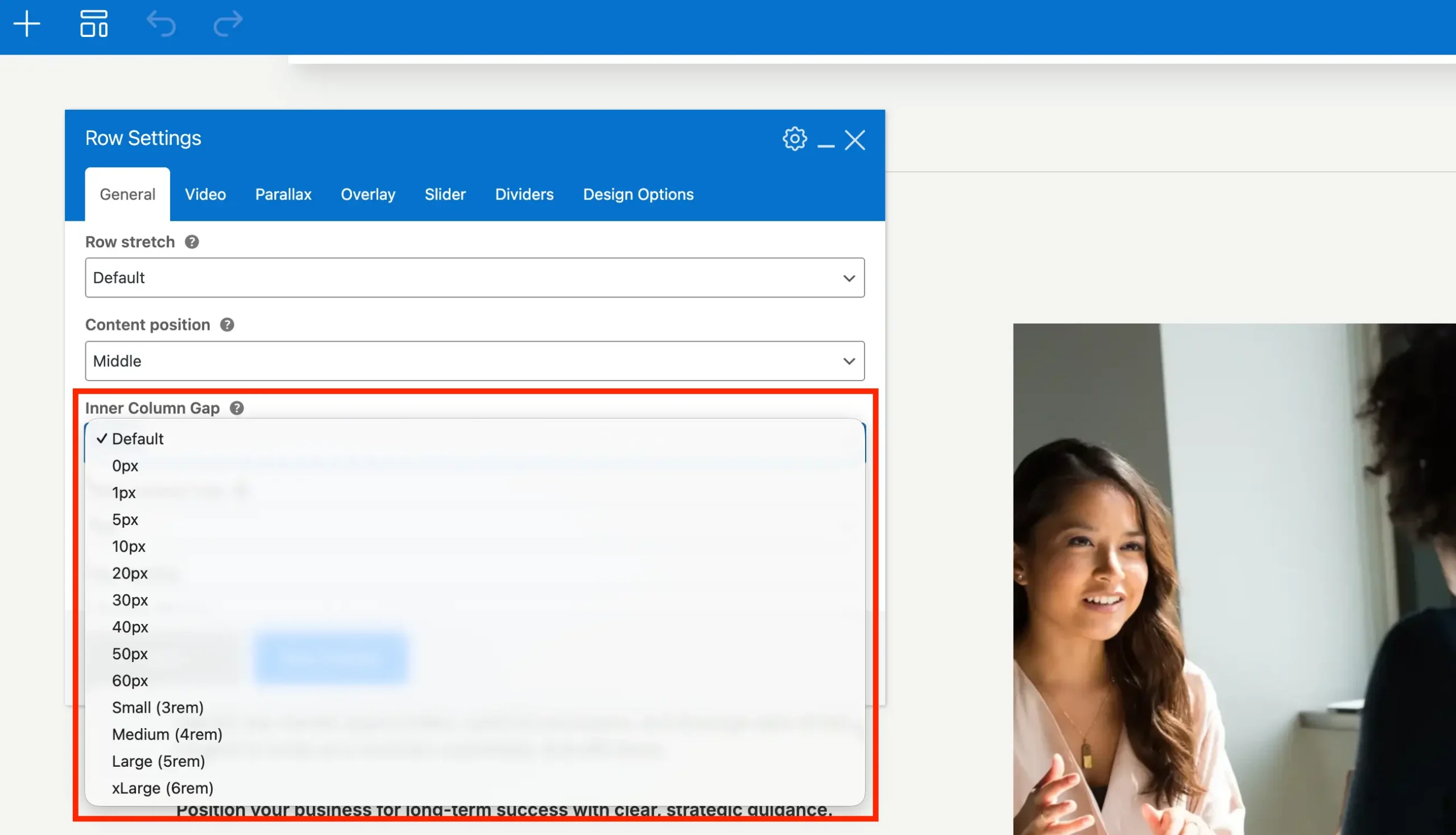
Adjusting Column Spacing
The default spacing between WPBakery columns is 30px. To adjust the space between columns you need to edit the Inner Column Gap setting on the row that has the columns you want to adjust. You can choose from various fixed pixel options or preset choices (Small, Medium, Large, xLarge).
The preset choices are fluid and will shrink as the browser gets smaller and are highly recommended when wanting a larger space between columns – perfect for hero sections.
The Inner Column Spacing field is an exclusive Total theme setting you won’t find anywhere else!
Inner Column Gap and Vertical Spacing
When using a pixel-based Inner Column Gap (as described earlier), the theme automatically applies that same value to the bottom margin of the columns as well. This ensures consistent spacing both horizontally and vertically.
In contrast, when using preset Inner Column Gaps (Small, Medium, Large, X-Large), the spacing only affects the horizontal gap between columns. The vertical spacing isn’t applied because the preset gaps are fluid — if they were added to vertically stacked columns, the spacing would often be too small and inconsistent.
How Horizontal Column Spacing Works in WPBakery
WPBakery uses a Bootstrap-style column system to handle spacing between columns. This works by applying left and right padding to columns (to create gaps) and a negative margin on the parent row to offset that padding so the content stays aligned with the rest of your site.
For example, if you set an inner column gap of 40px, the theme will apply:
- 20px left and right padding to each column
- -20px left and right margin to the parent row
This ensures consistent spacing between columns while keeping the row aligned with your layout container.
This behavior is important to understand because it can affect your designs. For instance, if you apply a background directly to a column, the background will extend into the padded area, which can make spacing appear inconsistent. For this reason, it’s often best to add an inner row inside your column and apply backgrounds to that inner row instead. This keeps the background contained and maintains proper spacing.
The Total theme includes an optimization that automatically removes the negative row margins when a row has a background image, overlay, or video. This ensures the row remains properly aligned with the rest of your site without visual overflow.
This means that when you add a background to a row while using the default column gap, there will be horizontal padding (typically around 15px) on either side of the content. In most cases this isn’t an issue, as backgrounds are often applied to single-column or full-width rows where the extra spacing isn’t noticeable.
However, when working with boxed layouts, this padding can become more apparent. In these cases, you may want to set the column gap to 0px for single-column rows. For multi-column layouts, a better approach is to add an inner row inside the column(s) and apply your layout there, giving you more precise control over spacing and background placement.
How Vertical Column Spacing Works in WPBakery – Why is there Space at the Bottom of Rows?
Vertical spacing between columns is controlled by default column bottom margin. The default bottom column margin can be controlled globally in the customizer.
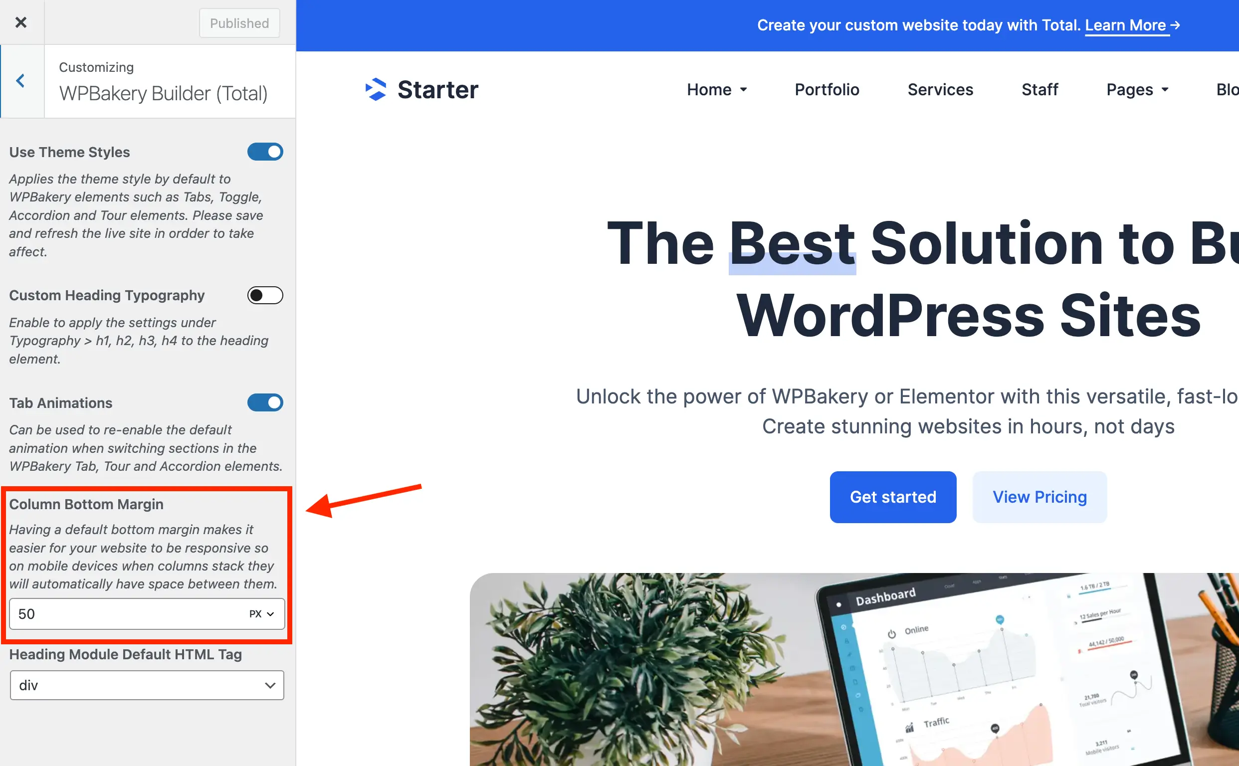
It is important to have a default bottom column margin or else your columns won’t have space between them when they stack on mobile. It’s not recommend to remove the default value.
Currently, there isn’t an option to adjust the bottom column margin on a per-row basis, but in most cases, maintaining consistent spacing across the site is preferable for a balanced layout.
When adding a row with a single column, you may want to set the “Inner Column Gap” to 0px or enable the “Remove Bottom Margin” option. This removes the default bottom margin on the row, making it easier to apply consistent padding or spacing around the row and maintain a uniform layout across your page.
Adjusting Column Sizes and Layouts
By default columns have percent based widths based on your row layout (e.g. 2 columns = 50% column width) but you can adjust the size of any given column on a per-column bases and at different breakpoints.
To adjust a specific column, hover over the column and click the edit button then click on the “Responsive Options” tab.
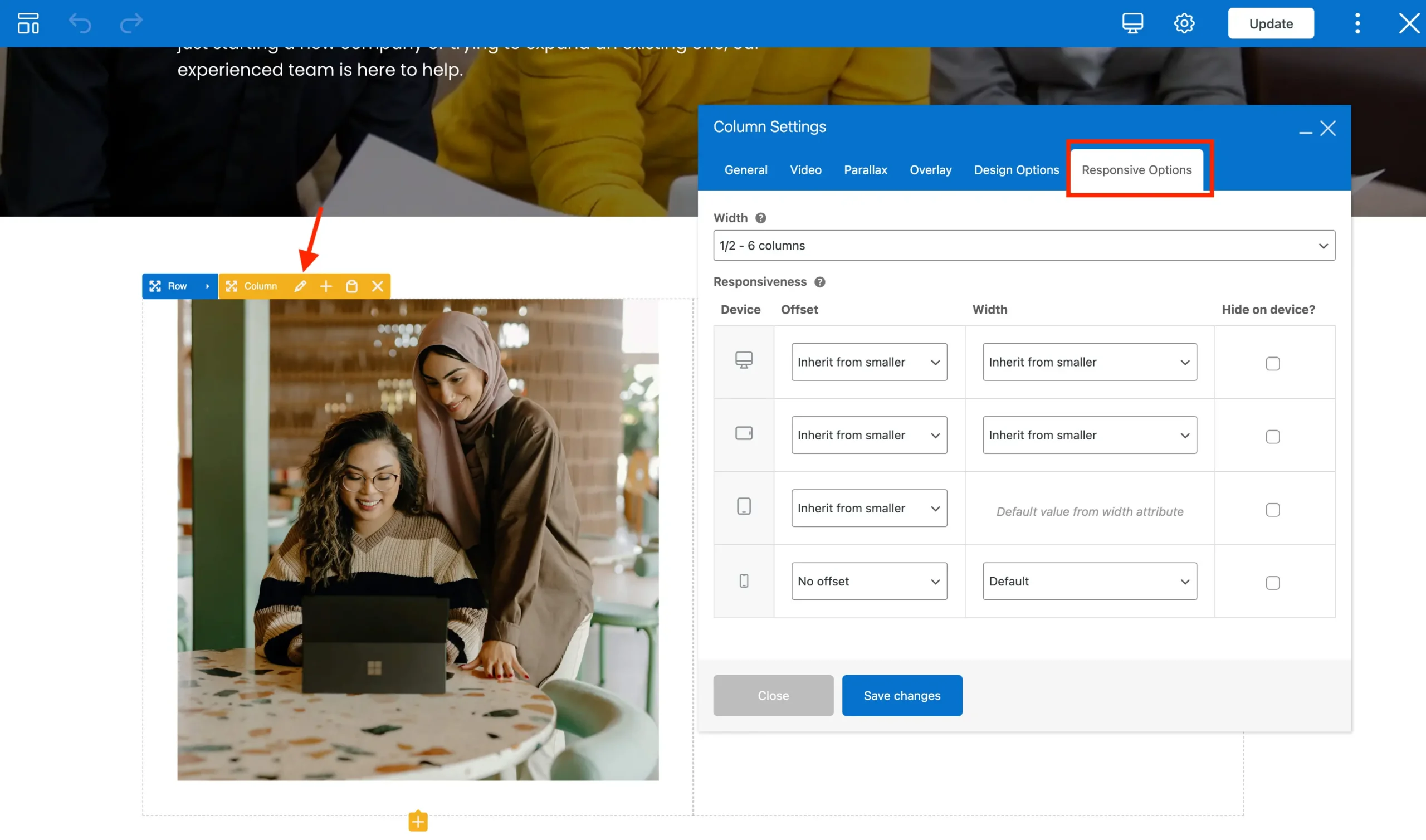
Columns use a Mobile-First Design
WPBakery Columns follow a mobile-first design approach, meaning you set column widths starting from the smallest screen size and work upward.
- The first option in the Responsive Options → Width field applies to all screen sizes by default.
- Custom widths or offsets set in the Responsiveness fields below will apply from that breakpoint and up, overriding the smaller sizes.
Example: If you set a width in the “Large Devices” field, that width will apply only to large screens and above, while smaller screens will follow the settings from the default or smaller breakpoints.
Default WPBakery Column Breakpoints
By default, WPBakery uses the following responsive breakpoints:
- Extra Small (XS): < 768px – typically smartphones
- Small (SM): ≥ 768px – small tablets / larger phones
- Medium (MD): ≥ 992px – small laptops / desktops
- Large (LG): ≥ 1200px – desktops
Unfortunately changing the default column breakpoints requires purchasing your own license of the WPBakery page builder plugin and disabling theme mode to activate your WPBakery license. The default breakpoints follow design conventions, so while it is possible we don’t recommend changing them.
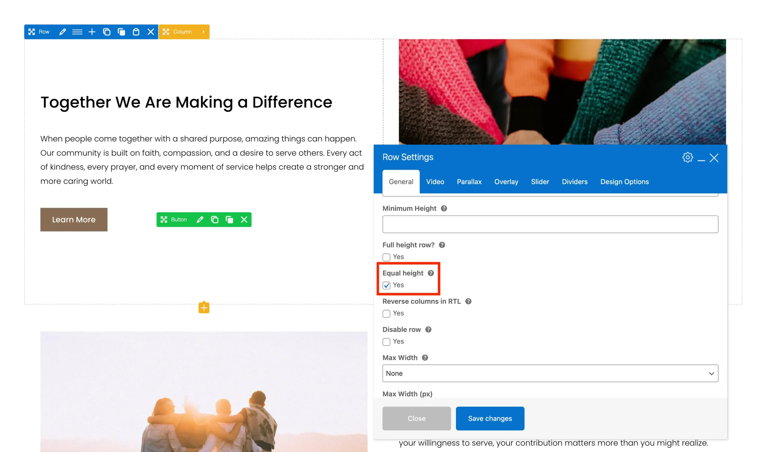
Equal Height Columns
WPBakery includes an Equal Height option for rows that ensures all columns within the row are displayed at the same height. This can be useful when creating layouts where columns need to visually align, even if their content lengths differ.
A common use case is placing a large image in one column and text in another, where the text can then be vertically centered alongside the image. It’s also helpful when applying background colors, borders, or shadows to columns so they appear as evenly sized blocks.
To enable this feature, edit the row containing your columns and enable the Equal Height option under the General tab in the row settings.
Equal Height Columns with Backgrounds, Borders & Shadows
Applying backgrounds to WPBakery columns can be tricky because WPBakery uses padding to create space between columns. This often breaks column backgrounds, so generally it’s best to use inner rows to apply backgrounds inside columns. However, if you are using the Equal Height option on the row and the columns have different heights, the backgrounds won’t line up.
To solve this, Total has an exclusive “Fill Column””” option for Inner Rows. You can insert a row inside a column and style the inner row with backgrounds, shadows, or padding. Turning on Fill Column makes the inner row fill the entire column, effectively giving you a full-column background without breaking WPBakery’s row and column layout rules.
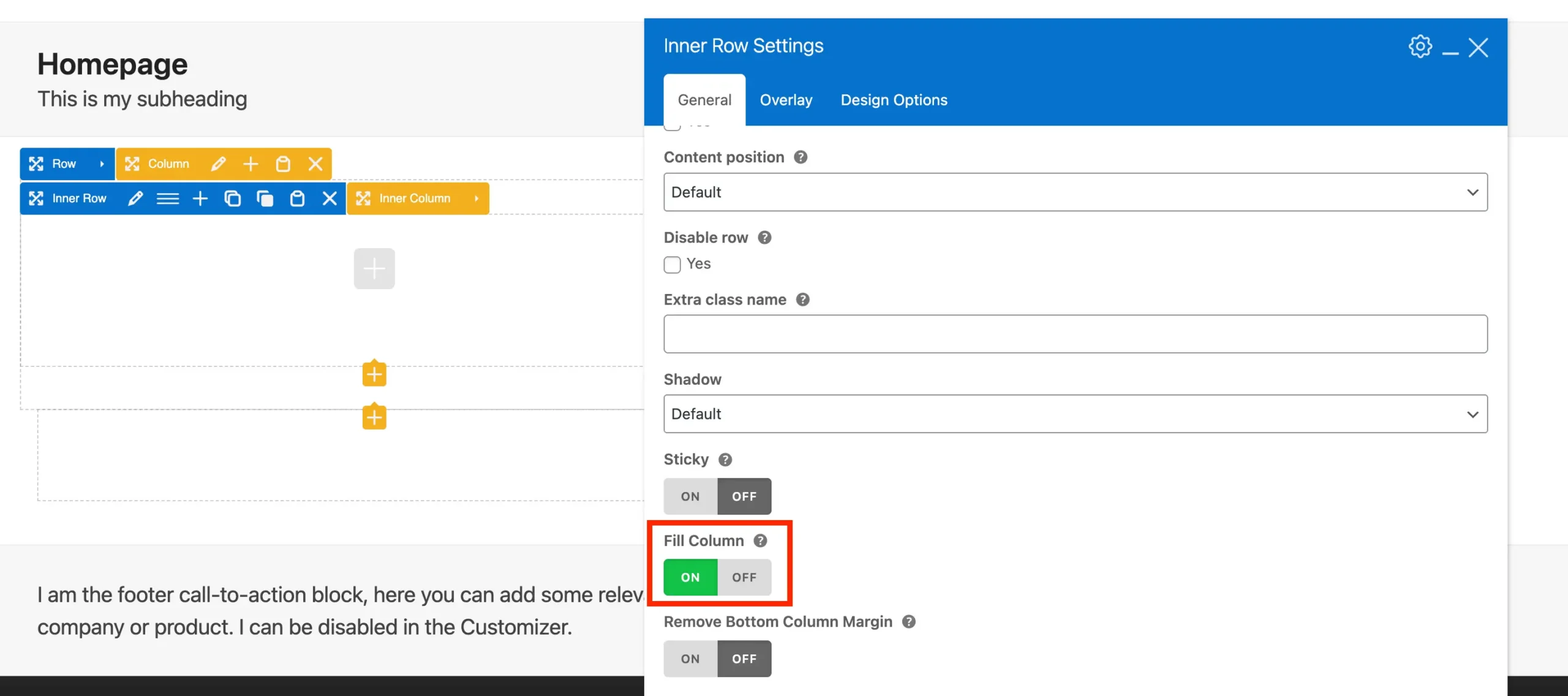
What this looks like:
Row → Column → Inner Row (has the background, border, shadow, etc) → Elements.
Sticky Columns
Sometimes you may want a column’s content to stay visible while scrolling, even if the adjacent column contains significantly more content. In the Total theme, this can be achieved using the Sticky Column option.

You can view an example of a sticky column in action on the Corporate demo homepage.
To make the Sticky Column work correctly, the Equal Height option must be disabled on the parent row. This ensures proper alignment with the other columns.
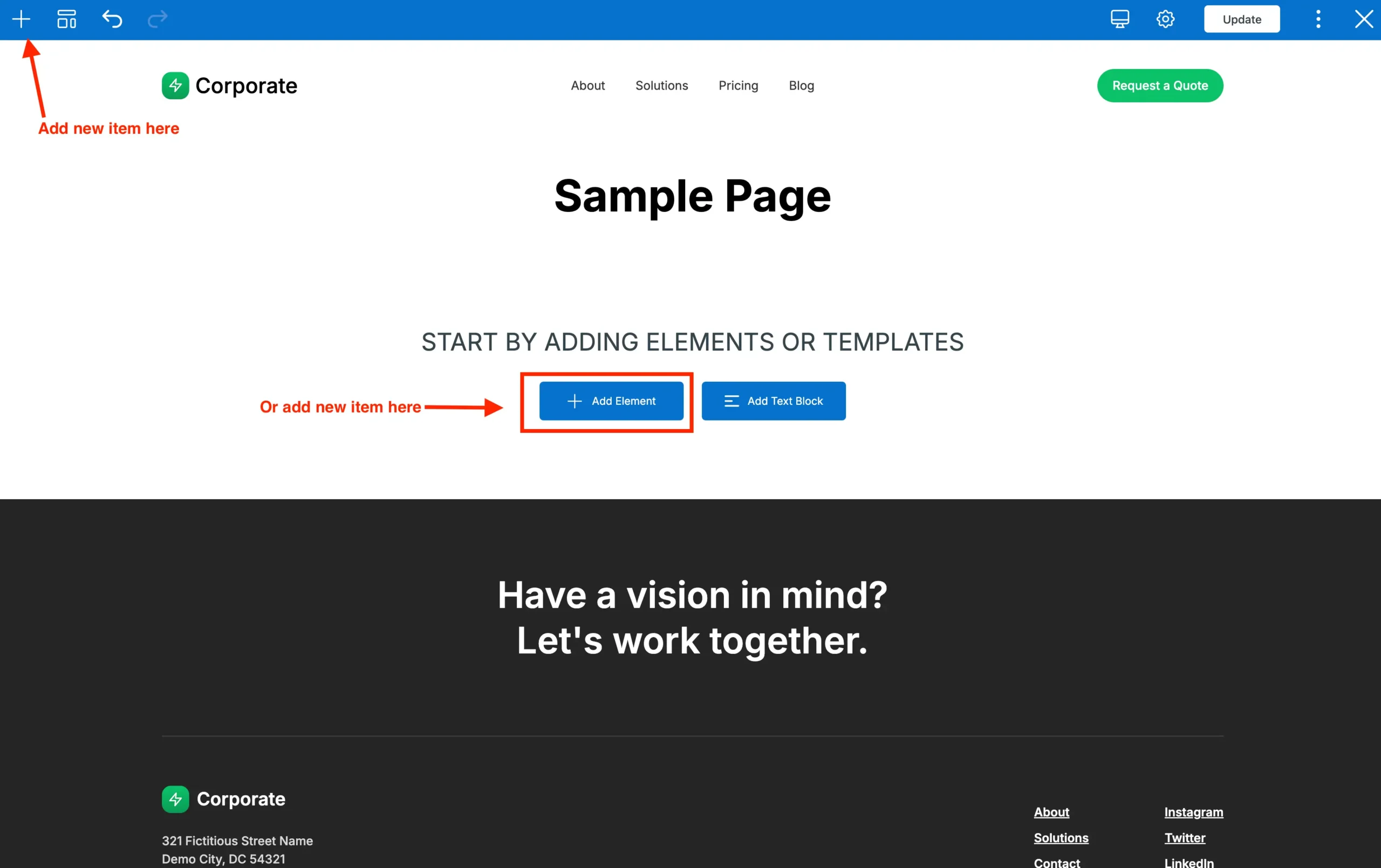
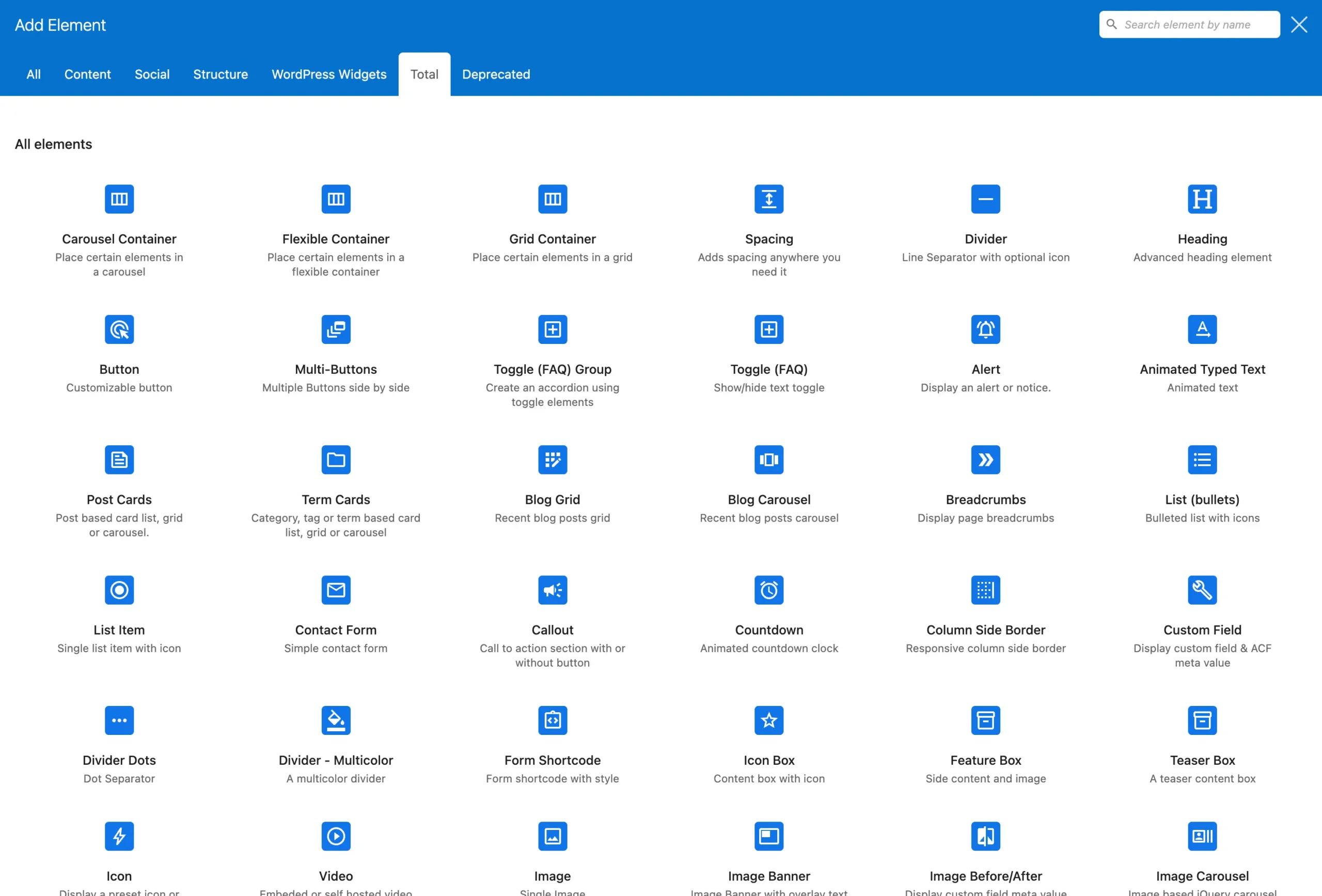
Adding Content Elements
With your columns in place, add content items:
- Hover inside any column.
- Click + Add Element.
- Choose your element from the list to insert it.
Recommended: Using Total Theme Elements
The Total theme includes many exclusive WPBakery elements. Some of these elements may seem like “duplicate” to existing WPBakery elements. For example, WPBakery already includes a “Single Image” element but Total offers it’s own “Image” element.
The custom elemens included in the theme are more customizable and provide access to exclusive theme functions such as gradient backgrounds, custom fonts, etc.
All of the theme’s exclusive elements can be located under the Total tab and include a unique icon design so they easily stand out:
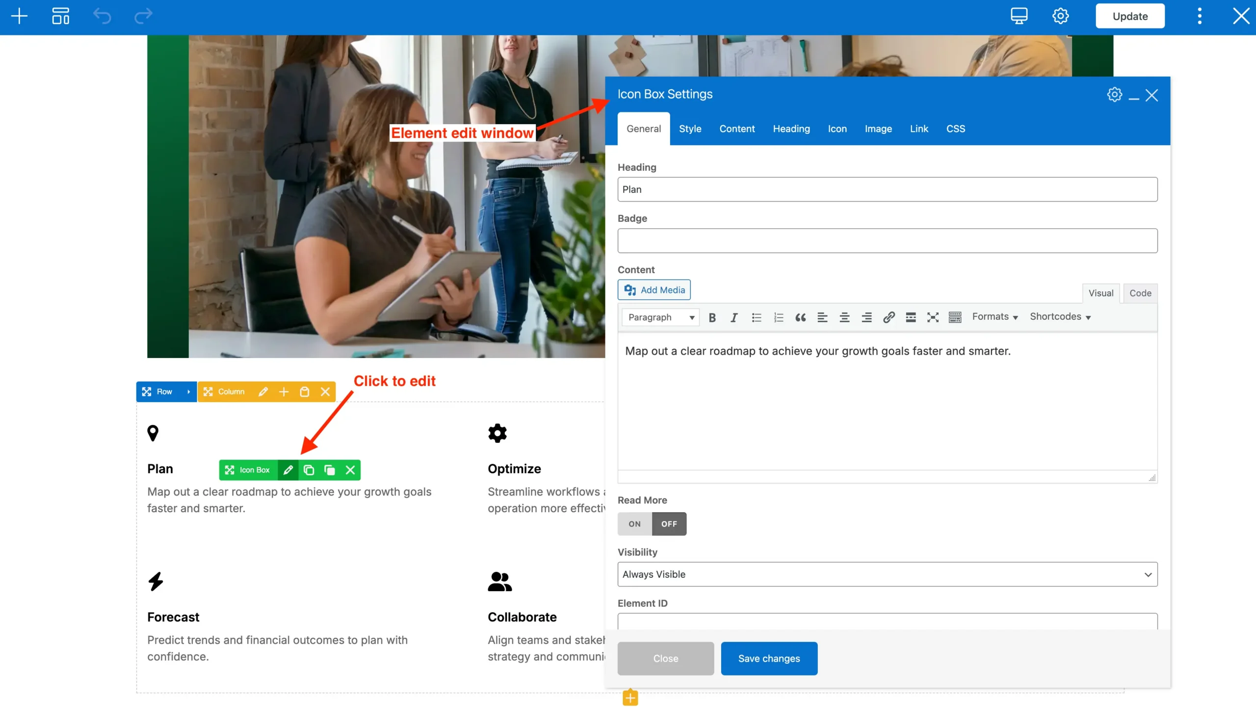
Editing Element Settings
To configure an element:
- Hover over the element.
- Click the Pencil/Edit icon.
- A settings popup lets you adjust content, style, spacing, animation, etc.
- Click Save Changes when finished.
Moving and Reordering Elements
WPBakery makes rearranging easy:
- Drag and Drop Rows: Click the move handle (cross icon) and drag to a new position.
- Move Columns: Hover a column and drag it to reorder.
- Move Elements: Drag individual elements within or between columns.
This lets you tweak layouts without re‑adding content.
Working with Pre‑Built Layouts (Patterns)
The Total theme includes an exclusive feature we call “Patterns” which allow you easily insert pre-designed sections to a page that you can then modify to fit your needs.
- Click the template icon in the toolbar.
- In the pop-up window click on the “Patterns” link.
- Browse starter layouts by category.
- Click on any pattern to insert it into the page (they will always be inserted at the bottom of the page).
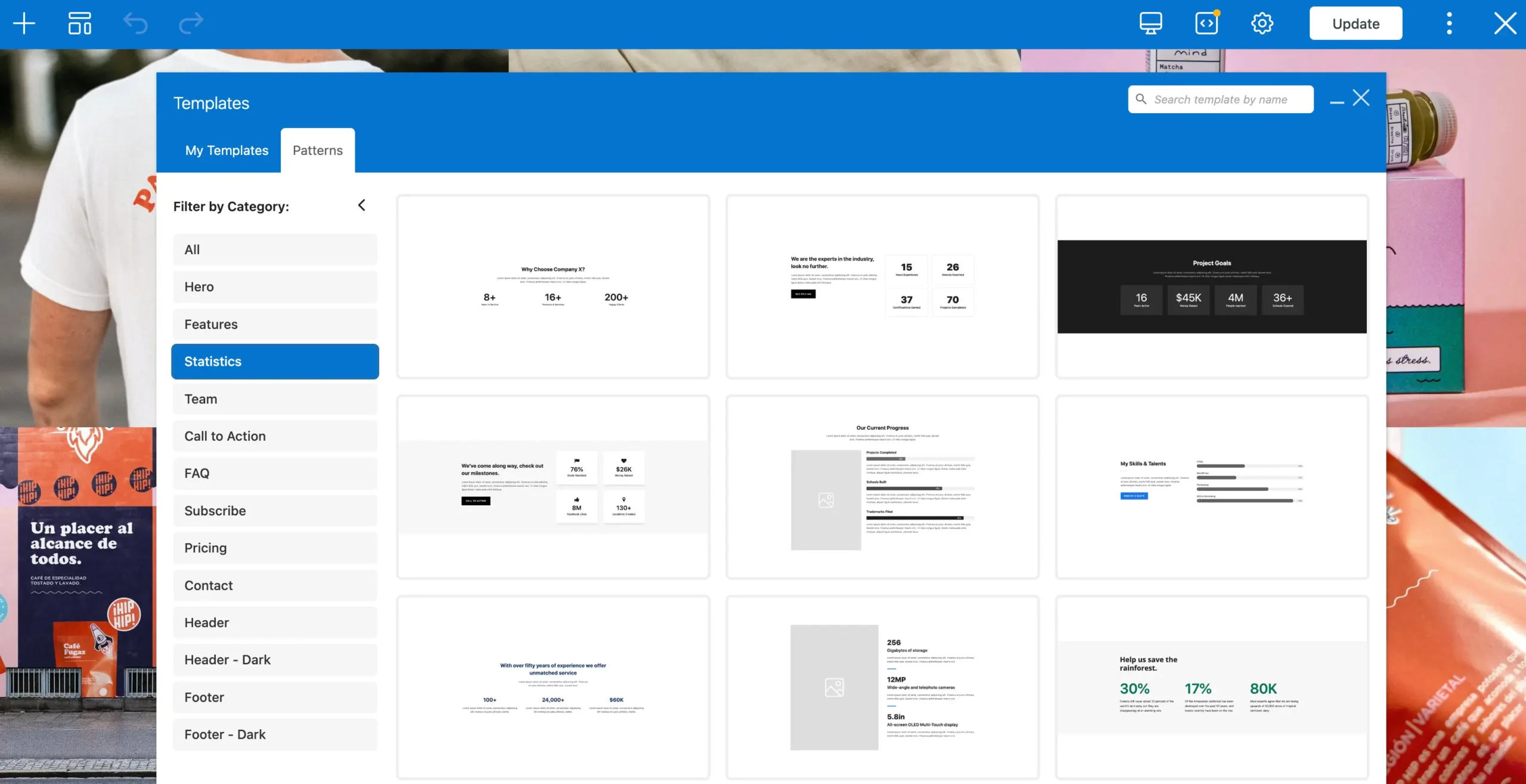
This speeds up building common designs.
Replicating Demo Pages, Sections or Dynamic Templates
f you find a section, page, or template in any of the Total theme demos that you like, you don’t need to import the entire demo to use it. The Total theme includes the Demo Inspector tool, which lets you examine any demo page and see exactly how it was built in WPBakery. This gives you full insight into the layout, row and column structure, and the elements used.
Once you’ve inspected the demo, you can copy and paste the WPBakery content directly into your own site. This makes it quick and easy to replicate designs without starting from scratch. Whether it’s a single section or an entire page template, you can rebuild professional layouts on your site in just a few clicks, saving time while keeping your design consistent.
Tips for Best Practices
Below are a few simple tips you should be following when using WPBakery or any page builder:
- Use sections to Structure Major Sections: you can group rows inside sections if you wish to group large sections of the page.
- Preview Frequently: always preview your page on the live site as the page builder may not always be accurate.
- Save Frequently: make sure you are clicking the update button to save your page as you make changes so you don’t risk losing your work.
- Check Responsive: the theme and WPBakery is responsive by default but it’s possible you can break the design on small screens by using large fixed pixel based paddings/margins or messing up your column widths.
- Keep Columns Balanced: equal column widths usually read best – don’t go too crazy messing around with your column widths.
- Use Theme Elements where Possible: The Total theme elements offer more customizability and advanced functionality.
- Don’t use WPBakery on Posts: posts, staff members, portfolio items or products, generally don’t need a complex page builder as they should all share a general design across all items- it’s best to use Gutenberg or the classic editor for these. If you wish to create a custom design for your posts or products, you can use dynamic templates.
- Enable WPBakery Slim Mode: this is an exclusive Total theme feature that will slim down some of the CSS and number of elements displayed in the editor (learn more about WPBakery Slim Mode).
Conclusion
WPBakery Page Builder is a powerful and user‑friendly tool for creating custom page layouts. By mastering rows, columns, and content elements, you can build professional pages without coding. Together with Total, which includes hundreds of extra WPBakery elements and WPBakery settings you can build beautiful, modern and professional websites.