Custom cards are one of the most powerful and flexible features of the Total theme, giving you the ability to present your post types in almost any style you can imagine. In this guide, we’ll walk through helpful tips and examples to help you design stunning custom cards for your testimonials.
Useful Elements for Testimonial Cards
When building custom testimonial cards in the Total theme, you have a wide range of elements available. To simplify things, here are some of the most commonly used elements and what they’re best for:
- Image: Displays the reviewer’s photo.
- Title: Shows the testimonial post title.
- Custom Field: Outputs specific testimonial details such as the rating number, reviewer name, or company.
- Star Rating: Displays the testimonial’s star rating (leave the rating input empty to automatically pull the value from the current testimonial).
- Excerpt: Shows a shortened preview of the testimonial.
- Post Content: Displays the full testimonial text.
- Button: Links to the full testimonial post (if enabled) or opens it in a modal popup.
- Icon Box: Arranges the reviewer’s photo, name, details, and/or star rating in a clean side-by-side layout using dynamic variables for the heading and content.
Simple Testimonial Card Example
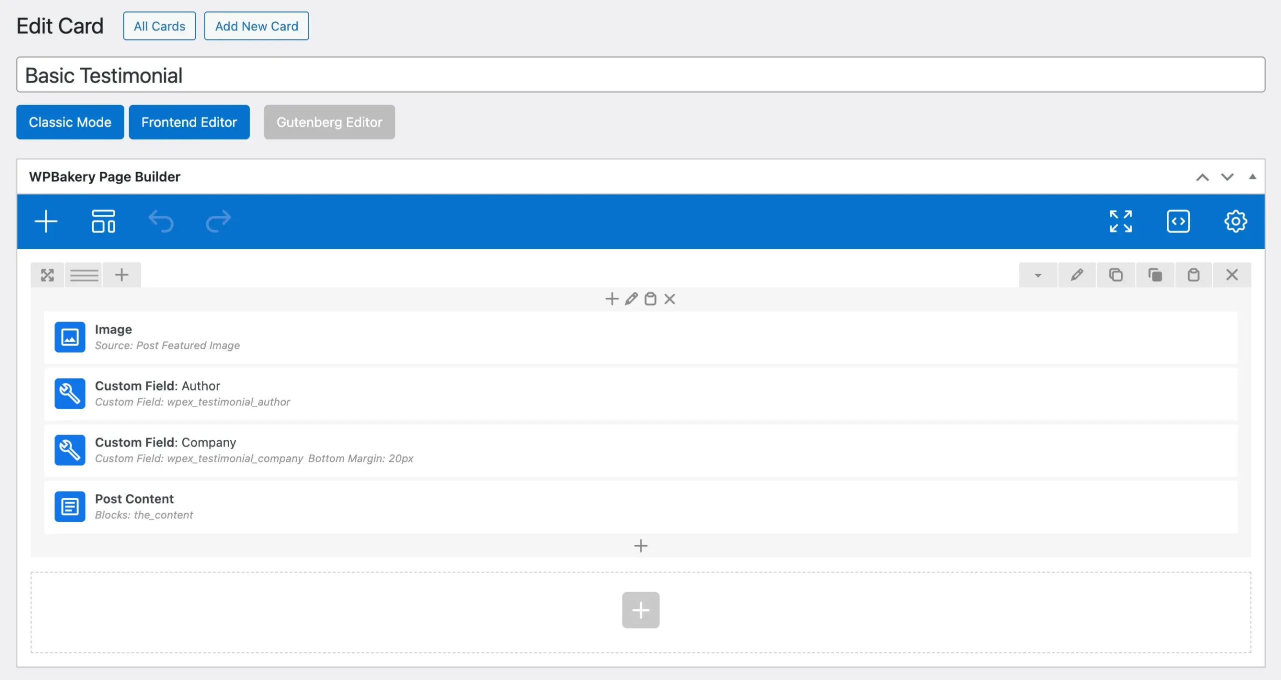
A basic testimonial card might follow a simple structure like this:
Reviewer Photo → Reviewer Name → Reviewer Company → Full Testimonial
To build this layout, you would use the following elements:
Image → Custom Field → Custom Field → Post Content
Below is an example of how this would appear in the WPBakery editor (you can create the same layout using Elementor as well).
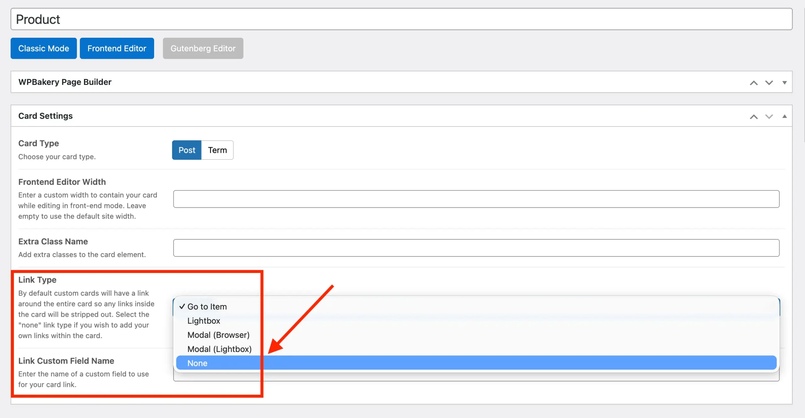
By default, all custom cards automatically link to their associated post. If testimonial posts are enabled for the testimonial post type (you can disable this under Testimonials > Settings > Single Post), you will most likely want to set the card’s Link Type option to “None” when creating the post to prevent unwanted linking.
If you’d like to recreate this card quickly, you can copy and paste the code into your blank card:
[vc_row column_spacing="0px"]
    [vc_column]
        [vcex_image source="featured" aspect_ratio="1/1" width="80px" border_radius="rounded-full" bottom_margin="10px"]
        [vcex_custom_field name="wpex_testimonial_author" font_size="lg" font_weight="600"]
        [vcex_custom_field name="wpex_testimonial_company" bottom_margin="20px" font_size="sm"]
        [vcex_post_content remove_last_mb="true"]
    [/vc_column]
[/vc_row]
And here is a screenshot of what the card will look like:

Advanced Card with Star Rating and Icon Box Elements
Now that you’ve seen how to create a basic testimonial card, let’s elevate the design with a more advanced layout. This card will have a left-aligned image alongside the reviewer’s name, company, and star rating, and it will feature box shadow, padding, and a background for a polished look.
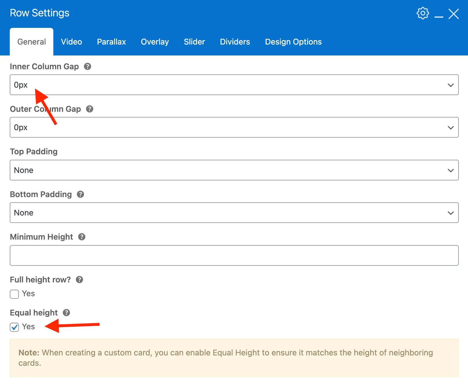
Step 1: Insert a new Row
- After inserting, edit the main row and enable the Equal Height option.
- Set the Inner Column Gap to 0px to ensure your content lines up neatly.
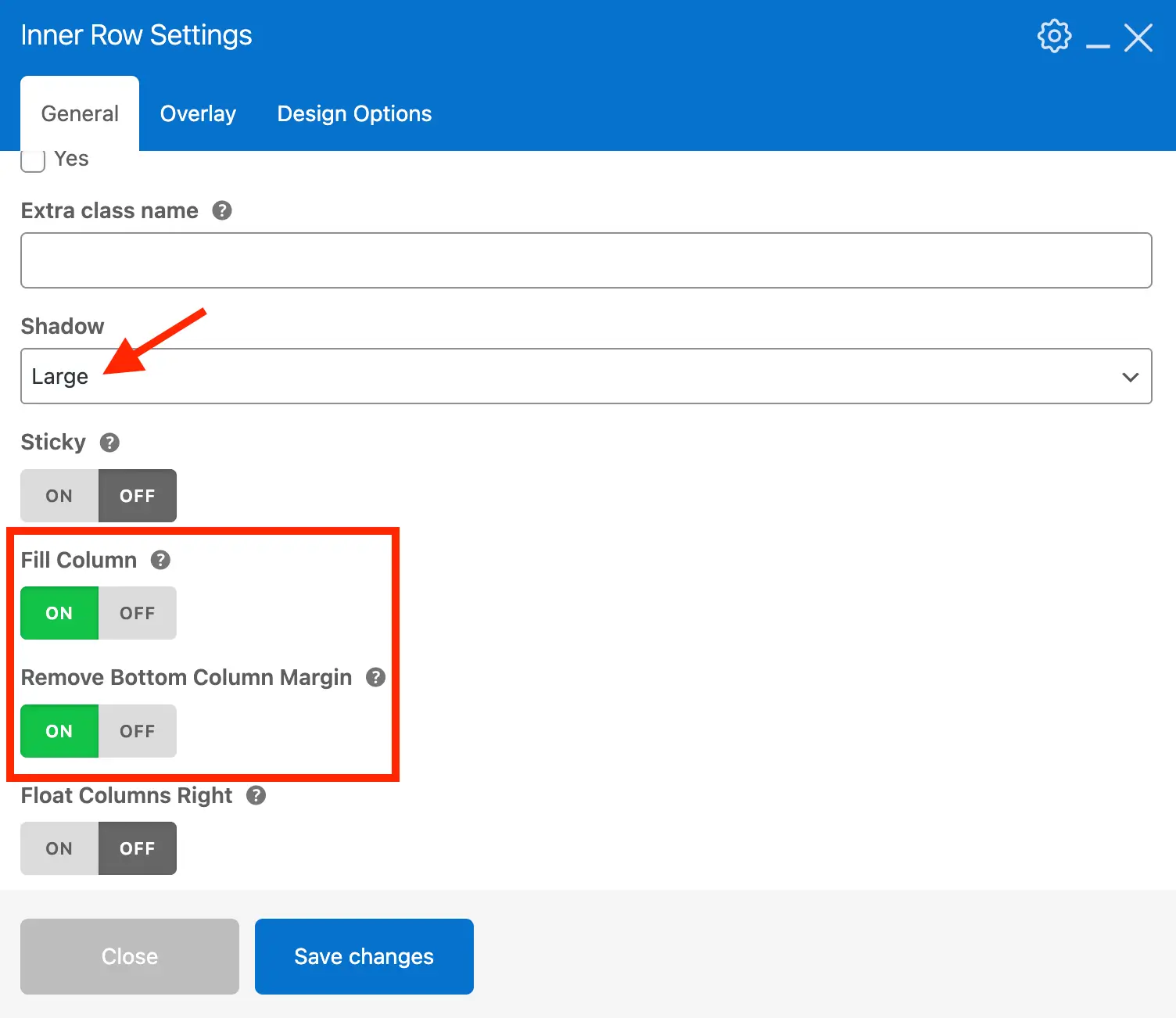
Step 2: Add an Inner Row
- Insert an inner row inside the main row.
- This inner row will handle the card styling: background, padding, box shadow, etc.
- Enable the Fill Height option so that the inner row stretches to match the height of the main row, this way each testimonial will have the same height regardless of the length.
- Enable the Remove Bottom Margin option to prevent extra space at the bottom of each testimonial.
- Add an optional background, padding and border radius under the Design Options tab.
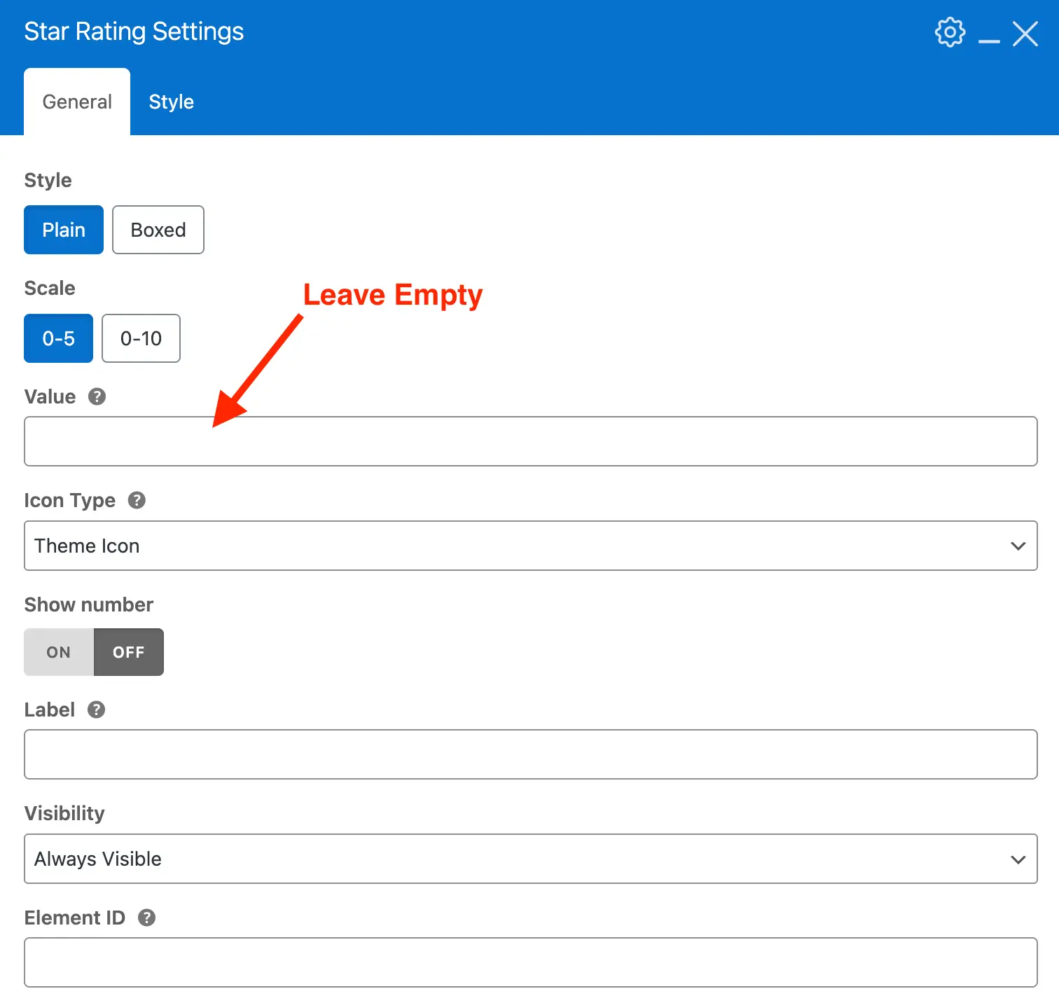
Step 3: Insert the Star Rating Element
With the main rows in place for the overall layout, it’s time to add the elements that will display the testimonial data. Start by inserting the Star Rating element to showcase the testimonial’s rating.
Important: Make sure to leave the value field empty so it automatically pulls the rating from the current testimonial.
Step 4: Insert the Post Content Element
Next you'll want to add the Post Content element which will display the testimonial content. You can then add a spacing element after it which will create some blank space between the testimonial and the details (photo, star rating, etc).
Step 5: Insert & Edit the Icon Box Element
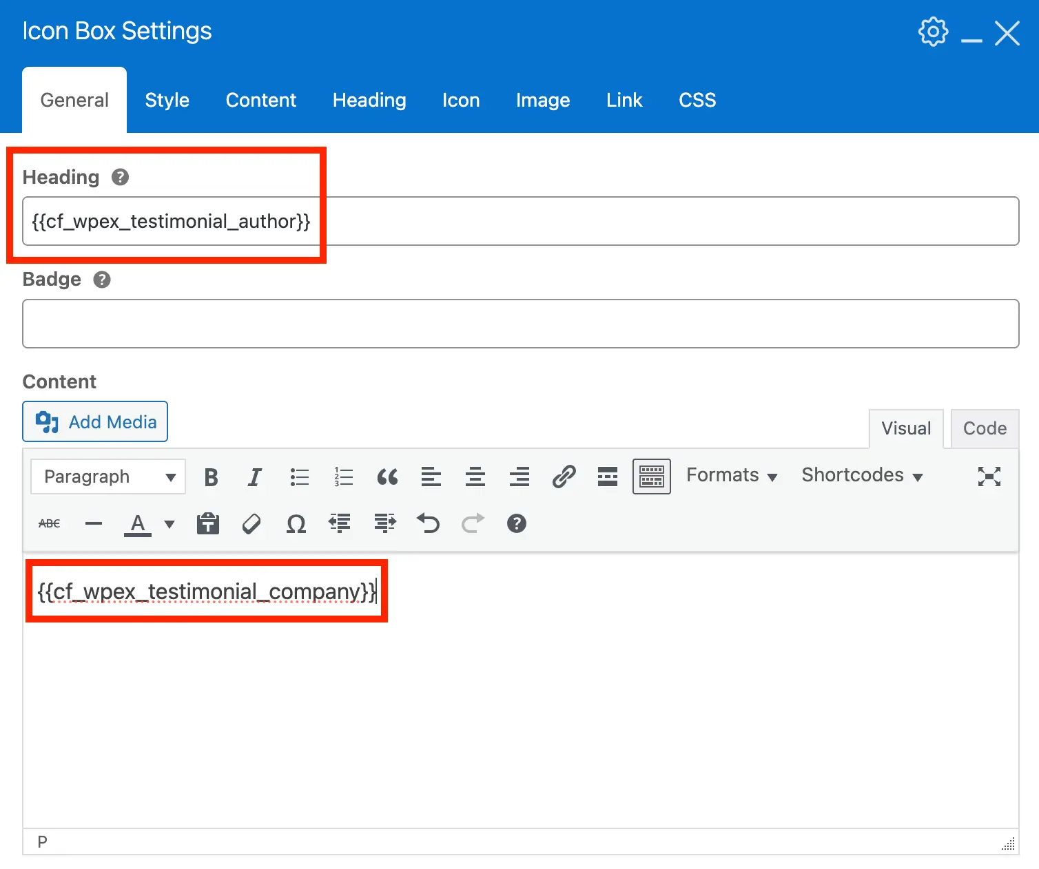
Finally, we’ll add the Icon Box Element, which allows you to create a responsive layout with a left-aligned image and a right-hand content block for the testimonial details. For this element, we’ll use dynamic variables to automatically display the reviewer details.
Below is a list of useful dynamic variables for use with Testimonials:
- - Display the reviewer's name.
- - Display the reviewer's company name.
- - Display the numerical rating.
Here’s a screenshot of the Icon Box Main Settings configured to display the testimonial author and company name. Keep in mind that the field is labeled "Company", but you can enter any content you like. You can also create custom fields if you want more control over the dynamic data.
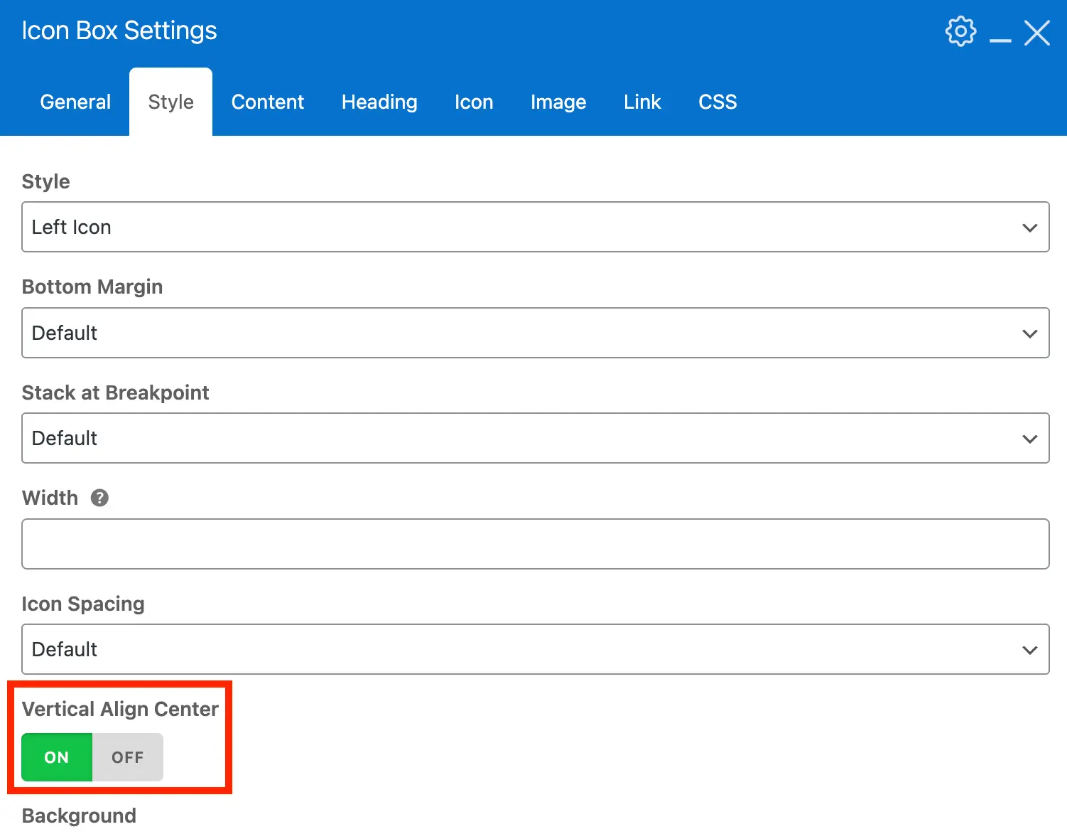
Under the Style tab, enable the Vertical Align option so that the content is properly aligned vertically with the image.
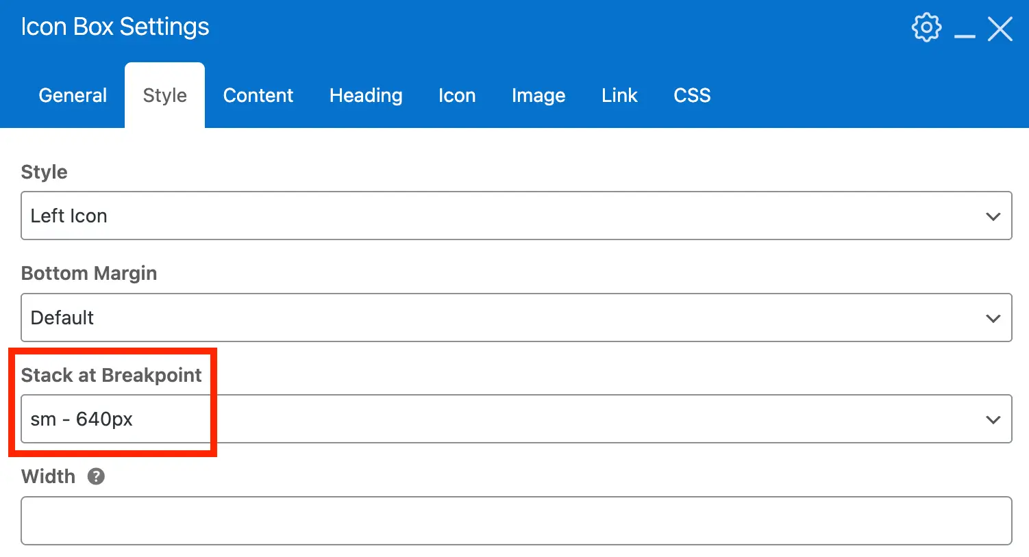
Also select a Stack Breakpoint so that the image can display above the content on small devices:
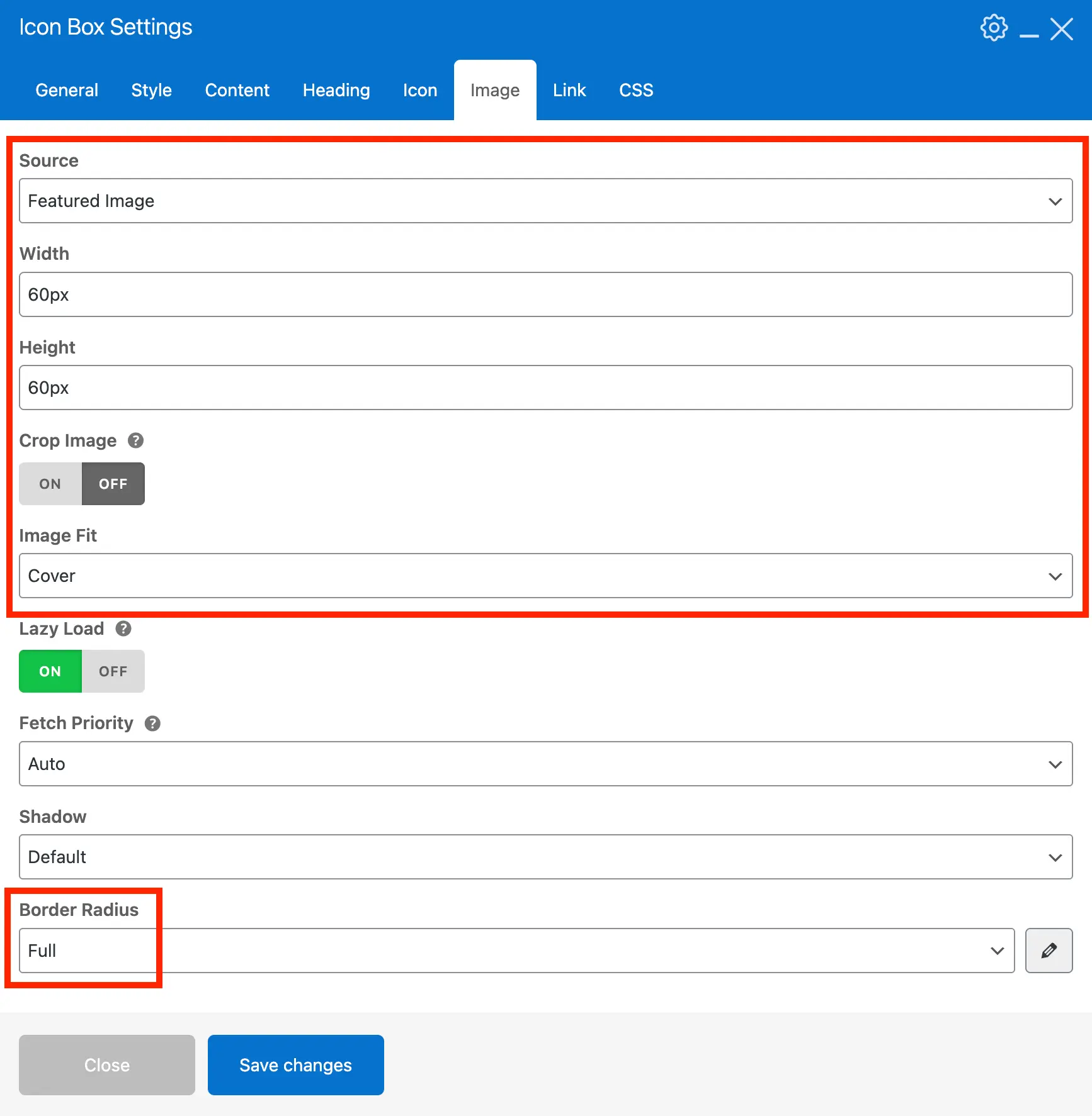
Under the Image tab, set the source to "Post Thumbnail", specify a custom width and height, optionally disable Crop (recommended for best results), and set the Border Radius to Full for a perfectly rounded image.
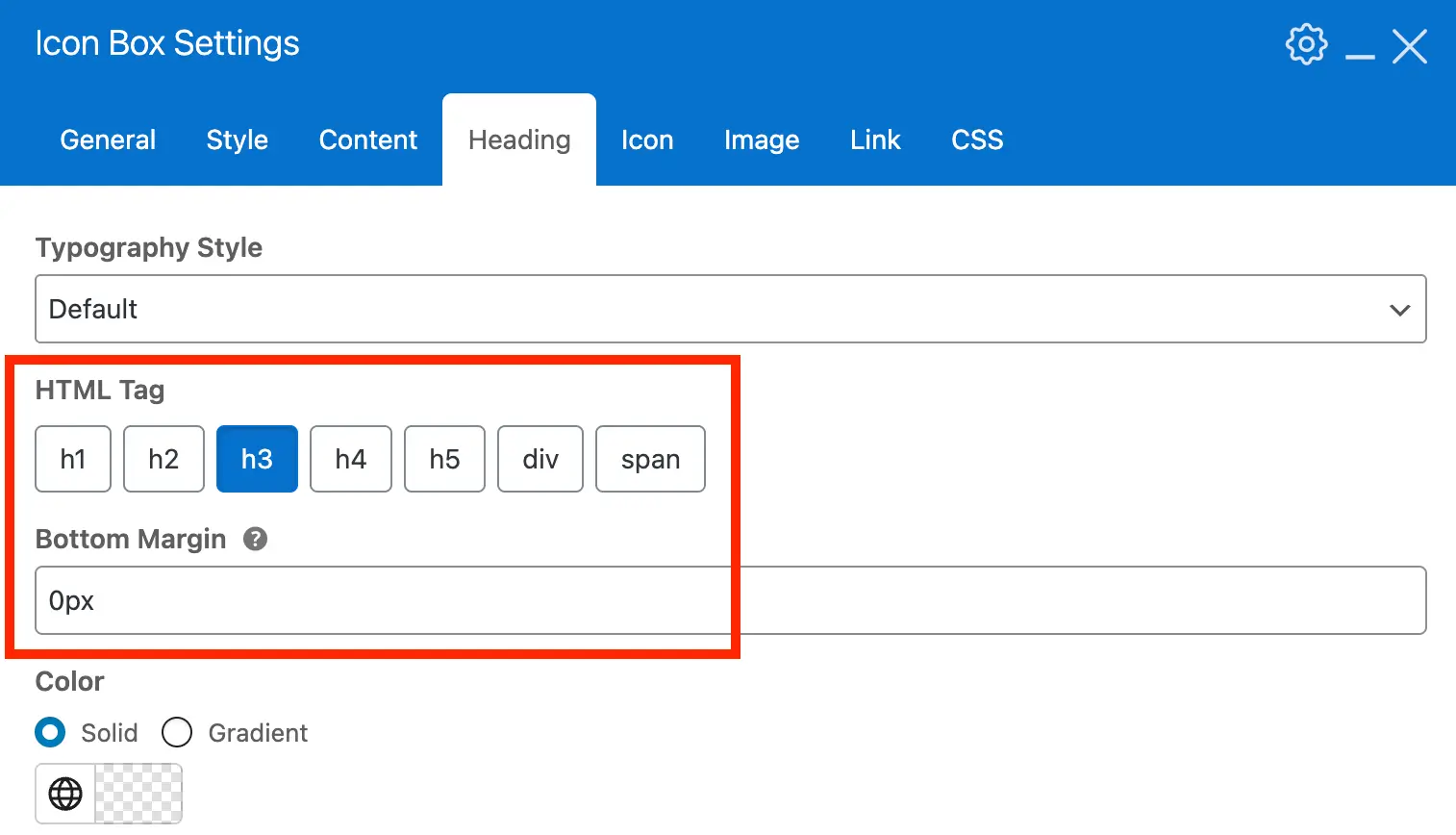
Finally, under the Heading settings, we recommend adjusting the HTML tag. The default is h2, but for cards it’s usually better to use h3 or div, depending on where the testimonial cards will be displayed.
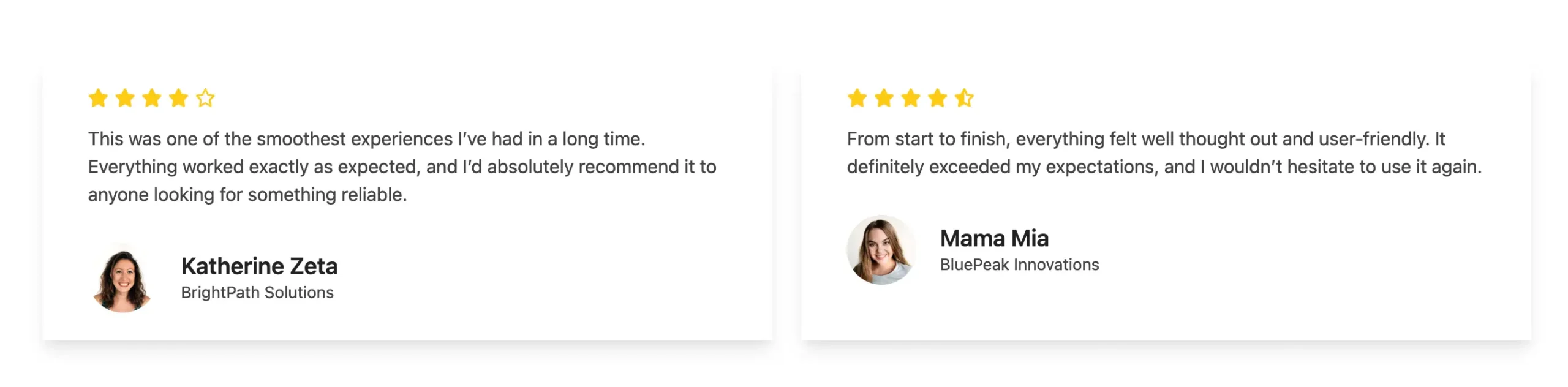
Here is a screenshot of what this card design will look like:
Here is the code if you’d like to copy and paste our advanced sample card for use on your site:
[vc_row column_spacing="0px" equal_height="yes"]
    [vc_column]
        [vc_row_inner fill_column="true" remove_bottom_col_margin="true" wpex_shadow="shadow-lg" css=".vc_custom_1774556218840{padding-top: 24px !important;padding-right: 24px !important;padding-bottom: 24px !important;padding-left: 24px !important;}" wpex_bg_color="#ffffff"]
            [vc_column_inner]
                [vcex_star_rating bottom_margin="15px" star_color="#ffcc12"][vcex_post_content remove_last_mb="true"]
                [vcex_spacing]
                [vcex_icon_box heading="" align_center="true" heading_type="h3" image_source="featured" resize_image="false" image_width="60px" image_height="60px" image_fit="cover" image_border_radius="rounded-full" heading_bottom_margin="0px" font_size="sm" stack_bk="sm"][/vcex_icon_box]
            [/vc_column_inner]
        [/vc_row_inner]
    [/vc_column]
[/vc_row]
Be sure to review all settings and customize your card exactly the way you want it.