Version 6.6 introduces exciting new features and enhancements. While you can find the full list of changes in the changelog, we’ll dive into some of the most impactful updates here.
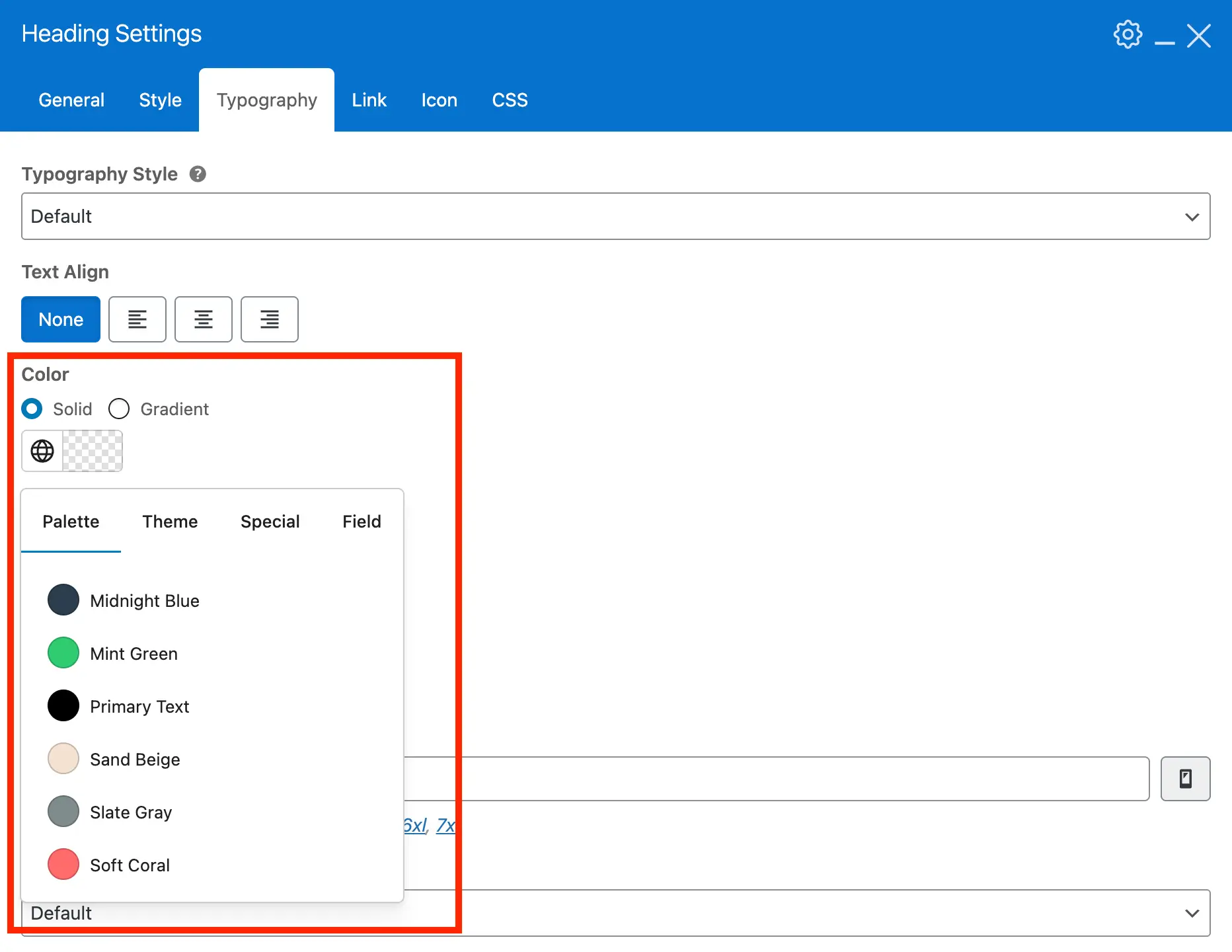
Improved Color Selector
The color selector now opens as a dropdown instead of a full-screen modal. Your custom palette, theme accent colors, and special colors like transparent, currentColor, and term colors display in separate tabs for better organization.
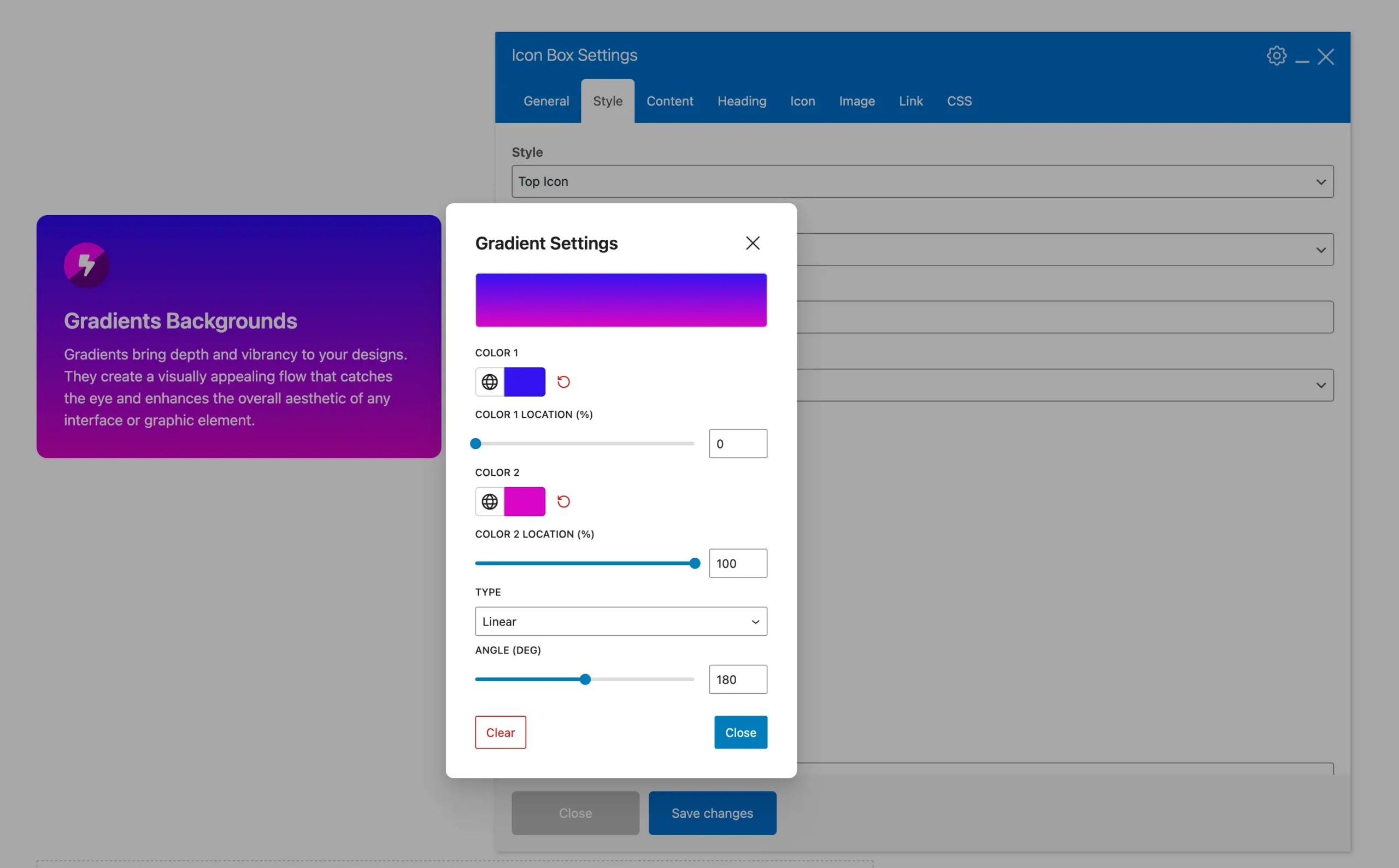
Color Gradients
Enhance your designs with new gradient options. Apply multi-tone gradients to backgrounds, text, and elements for a modern, professional look. Gradients are added to the most important Customizer and theme element fields, not every color option.
To keep things as optimized and lightweight as possible, we’ve decided to limit gradients to two colors. This approach helps prevent unnecessary bloat while still providing flexibility, and it aligns with how other builders like Elementor handle gradients.
We’re aware that other platforms, like Gutenberg, include a gradient builder that lets users click within a container to add color stops. However, those tools are typically limited to custom colors. In Total, it’s essential that we support not only custom palette colors but also special options such as transparent.
For some elements such as the Heading you can also defined a a gradient for your text color, see the example below:
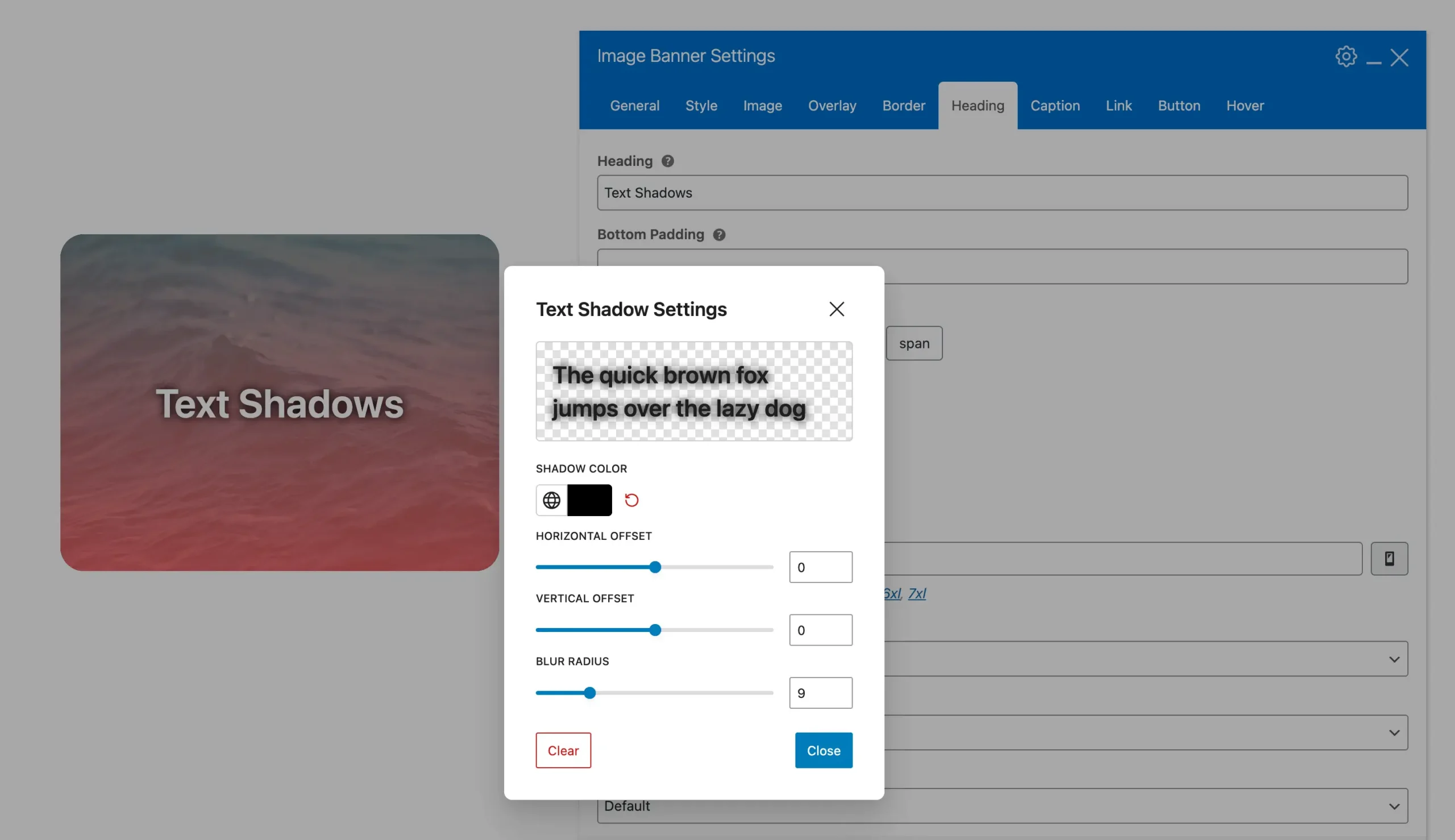
Text Shadow
A new text shadow option is available for multiple WPBakery elements, including text blocks, bullets, buttons, callouts, countdowns, custom fields, feature boxes, headings, icon boxes, image banners, list items, milestones, page titles, pricing, and skill bars.
Custom Field Based Colors
You can now enter a custom field name for a color when using WPBakery theme elements. This allows you to create advanced designs with custom cards and dynamic templates.
Carousel Container
Create custom carousels with Icon Boxes, text blocks, image banners, and other theme elements using the new Carousel Container. Not all elements are included, but there are plenty of options to choose from.
Below is an example carousel container with 2 image banner elements:
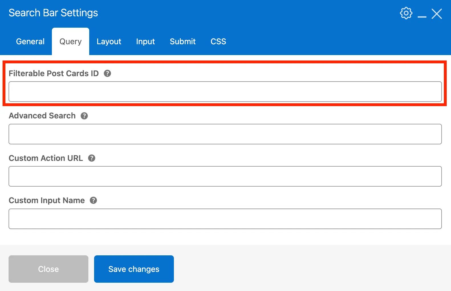
Live Post Cards Search
The Search Bar element now lets you enter the ID of any Post Cards element. This enables live searches on Post Cards without refreshing the page.
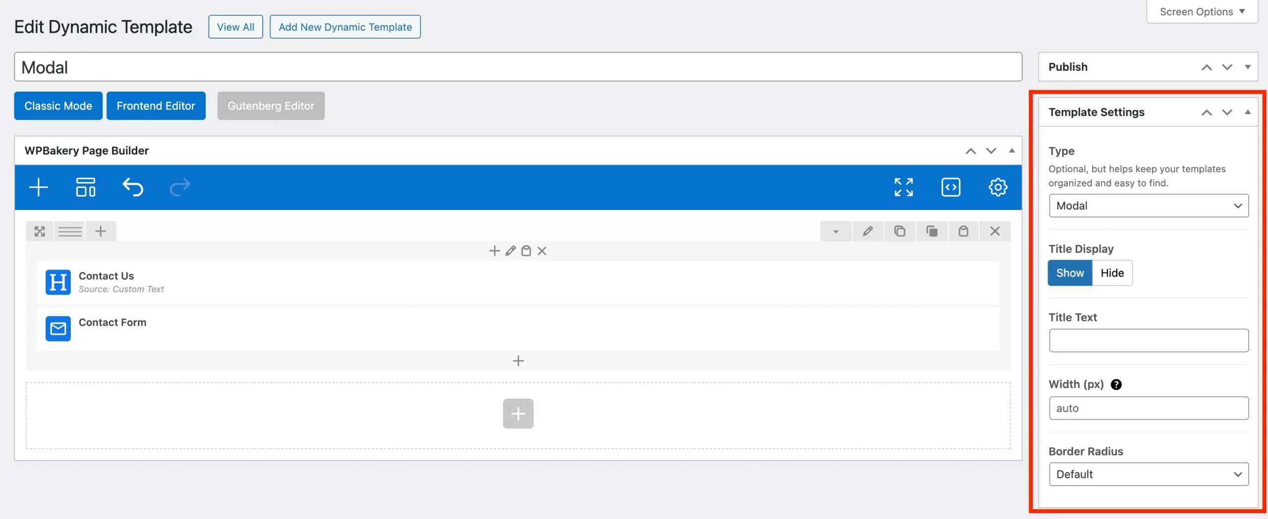
Modal Templates
Version 6.6 introduces a new dynamic template type called “Modal”. Use it to create custom popups for Post Cards or other elements like Buttons. You can customize or hide the title, set a custom width, and adjust the border radius. A great use for modal templates is creating pop-up forms.
Click the button below to preview a modal template in action using the theme button element.
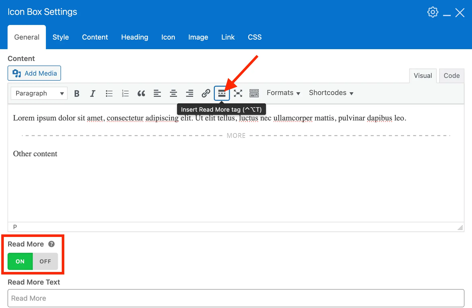
Icon Box, Feature Box & Teaser Read-More Content
The Icon Box, Feature Box, and Teaser elements now include two new ways to handle long content by splitting it using the WordPress more tag.
Inline Read-More: Display a simple “Read More” link that, when clicked, reveals the remaining content directly after the link. This uses the HTML <details> element so it’s accessible and doesn’t rely on any javascript.
Modal Read-More: Use a new link type to open the content after the more tag inside a modal popup. This is ideal for showing longer content without expanding the page.
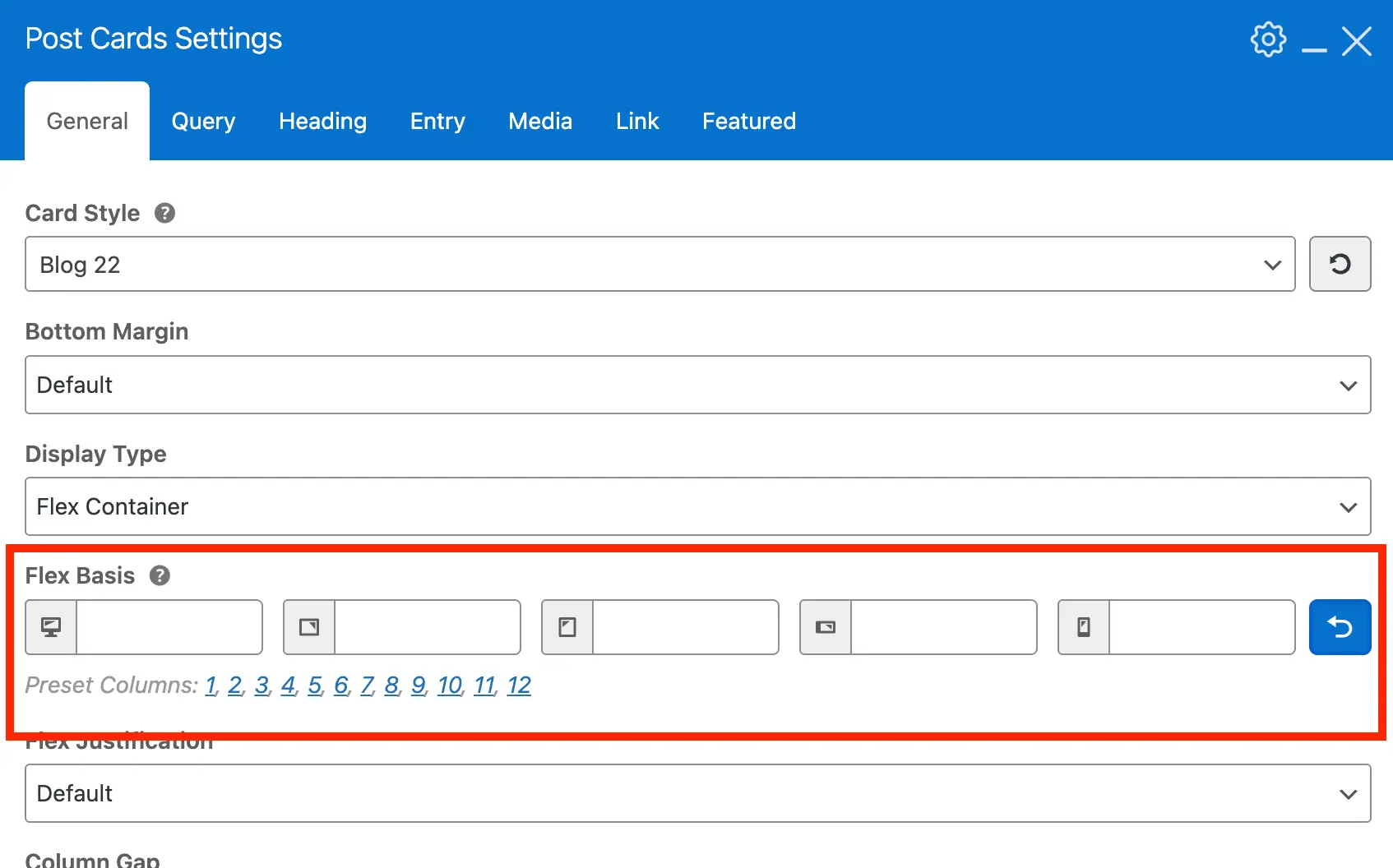
Post & Term Cards Responsive Flex Basis
Post & Term Cards elements now allow you to set flex-basis at different breakpoints when using “Flex Container” or “Horizontal Scroll” display types for better responsive grids. You can also select preset columns 1–12 instead of 1-6.
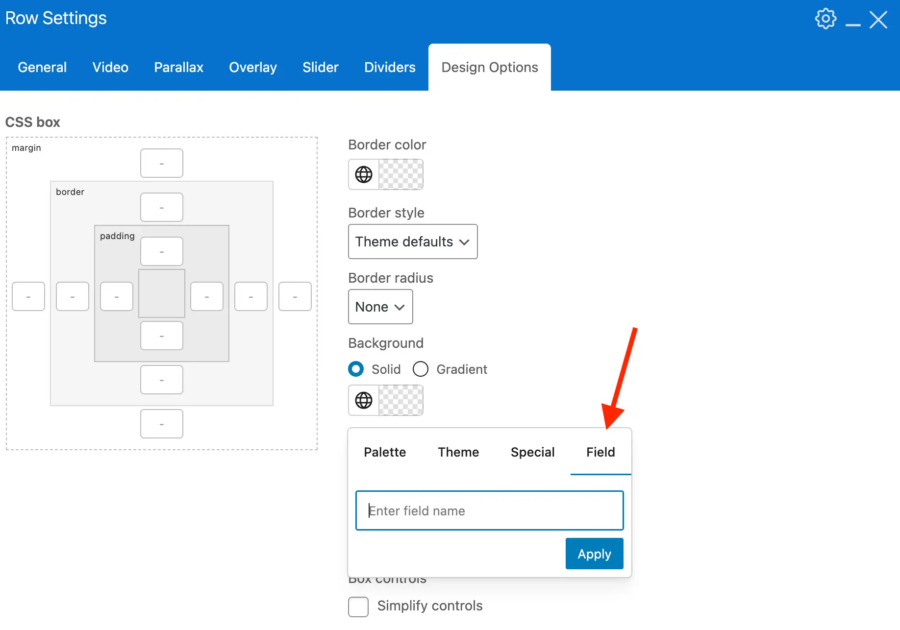
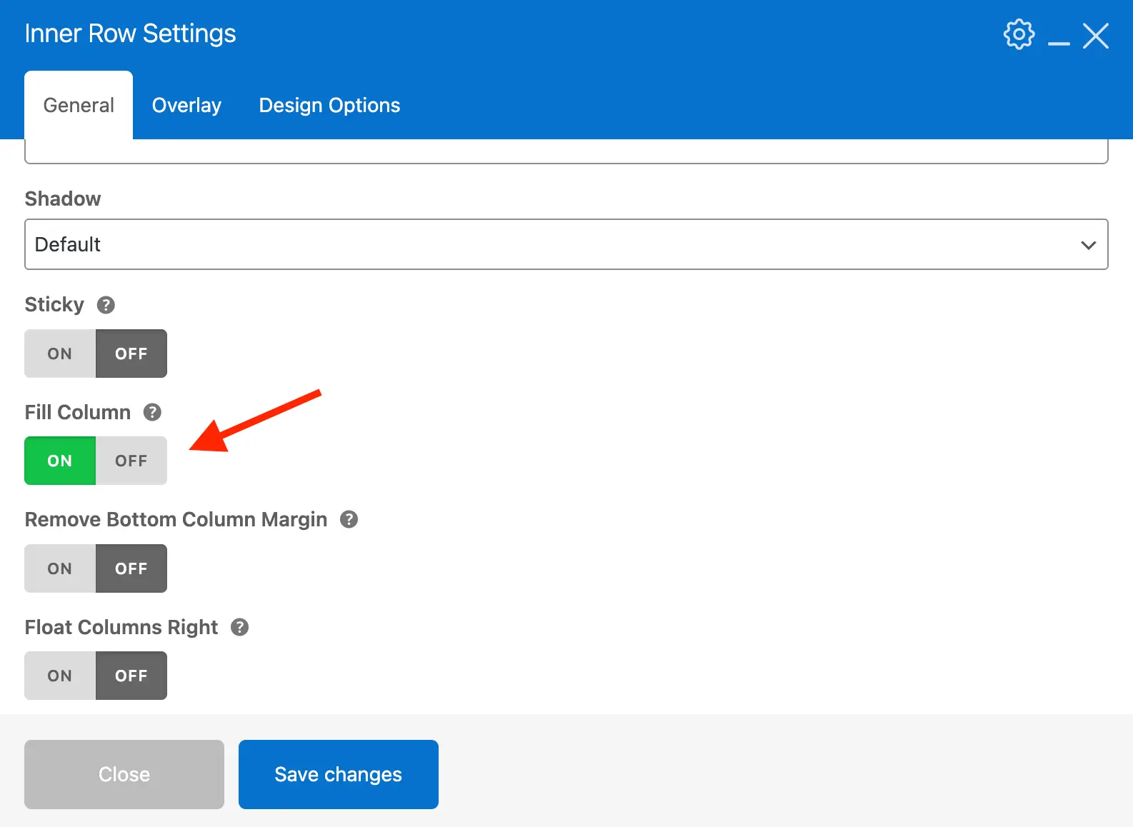
WPBakery Inner Row Fill Column Option
Applying backgrounds to WPBakery columns can be tricky because WPBakery uses padding to create space between columns. This often breaks column backgrounds, so generally it’s best to use inner rows to apply backgrounds inside columns. However, if you are using the Equal Height option on the row and the columns have different heights, the backgrounds won’t line up.
To solve this, we added a new “Fill Column” option for Inner Rows. You can insert a row inside a column and style the inner row with backgrounds, shadows, or padding. Turning on Fill Column makes the inner row fill the entire column, effectively giving you a full-column background without breaking WPBakery’s row and column layout rules.
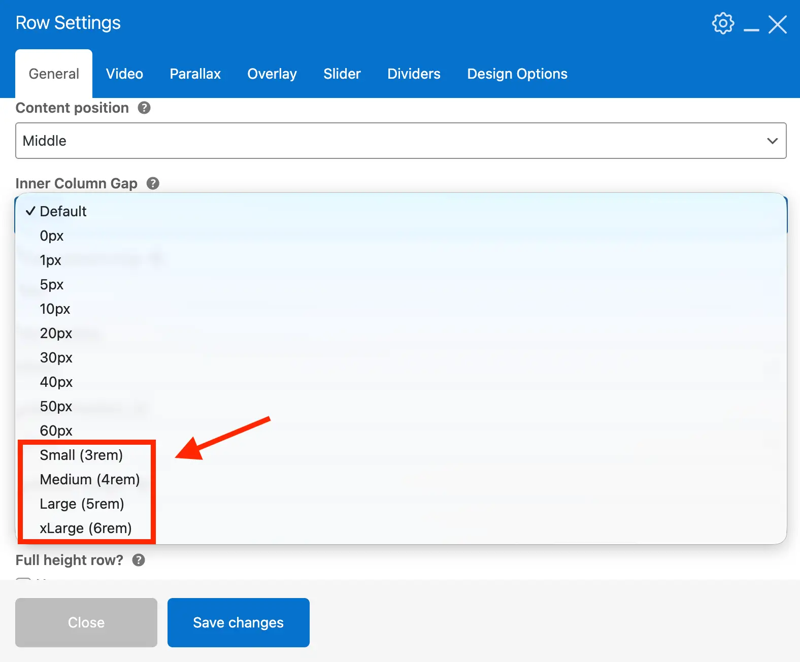
WPBakery Row Preset Column Spacing Choices
Previously, the theme offered only fixed pixel-based Inner Column spacing for WPBakery rows. This caused two issues: gaps were too small for modern sites, and they were not responsive. As a result, columns often appeared “squished” when shrinking the browser and using larger gaps.
In Total 6.6, we added new preset Inner Column gap options: Small, Medium, Large, and xLarge. These provide larger spacing between columns that shrinks proportionally as the browser narrows. This keeps columns readable and maintains a better responsive layout.
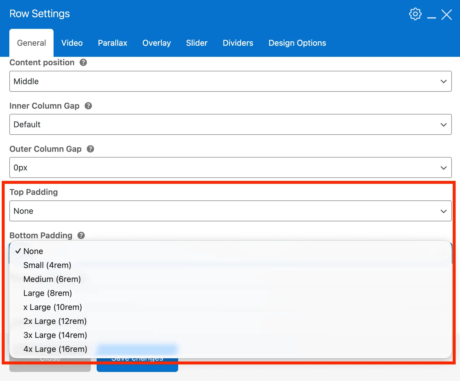
WPBakery Row Top & Bottom Padding Responsive Preset Choices
When creating hero sections, you can add top and bottom padding using the Design Options tab. You can enter percentages or viewport-based units for responsive spacing, but these sometimes appear too small on mobile. Additionally, rows with columns require bottom padding to offset the column margin, which can be tricky to calculate.
In Total 6.6, we added new top and bottom padding presets for WPBakery rows. These use modern CSS to create fluid, responsive spacing that looks good on all screen sizes. The bottom padding automatically compensates for the column margin, eliminating the need for extra adjustments.
View the Full Changelog
Don’t forget to read through the full version 6.6 changelog to via all additions, updates and fixes!