In some cases you may want to add a link to your main header menu but only for display in mobile devices. For example, if your header has a button to the right but there may not be enough room on mobile to display that button or you may wish to slim things down on mobile.
A good example is the Total Finance demo.
This demo has a “contact us” button to the right of the header, but it’s too large for small devices. Using the visibility option for the Header Aside element (in the Customizer) we set the button to hide at the mobile menu breakpoint. But now there is no way for the user to access the contact page. To fix this, we add a normal link to the menu that goes to the contact page and we hide it from desktops.
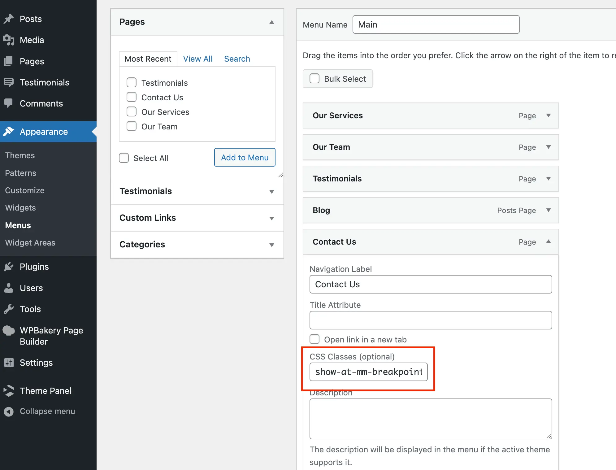
In order to create a menu link that shows on mobile only, add a regular menu item with the classname show-at-mm-breakpoint like the screenshot below:

This field is hidden by default in WordPress so if you’ve never used it before simply click on “screen options” on the top right to enable the field. While you are at it feel free to hide/show any other items you want to optimize your menu dashboard.