By default, when using the WPBakery Page Builder, there is a 30-pixel gap between columns. This is achieved by applying 15px of left and right padding to each column, along with a negative 15px left and right margin on the row. This offset keeps the columns aligned with the rest of your site’s content.
WPBakery is an older page builder that relies on Bootstrap for managing column widths and spacing, unlike modern builders like Elementor which use CSS Grid. As a result, there are some limitations in how precisely you can control spacing between columns. However, it’s still possible to increase the spacing, and the Total theme includes specific techniques you can use to add extra space between elements.
Methods to Increase Column Spacing
Below are several methods you can use to increase the spacing between your columns. The best method depends on your specific context.
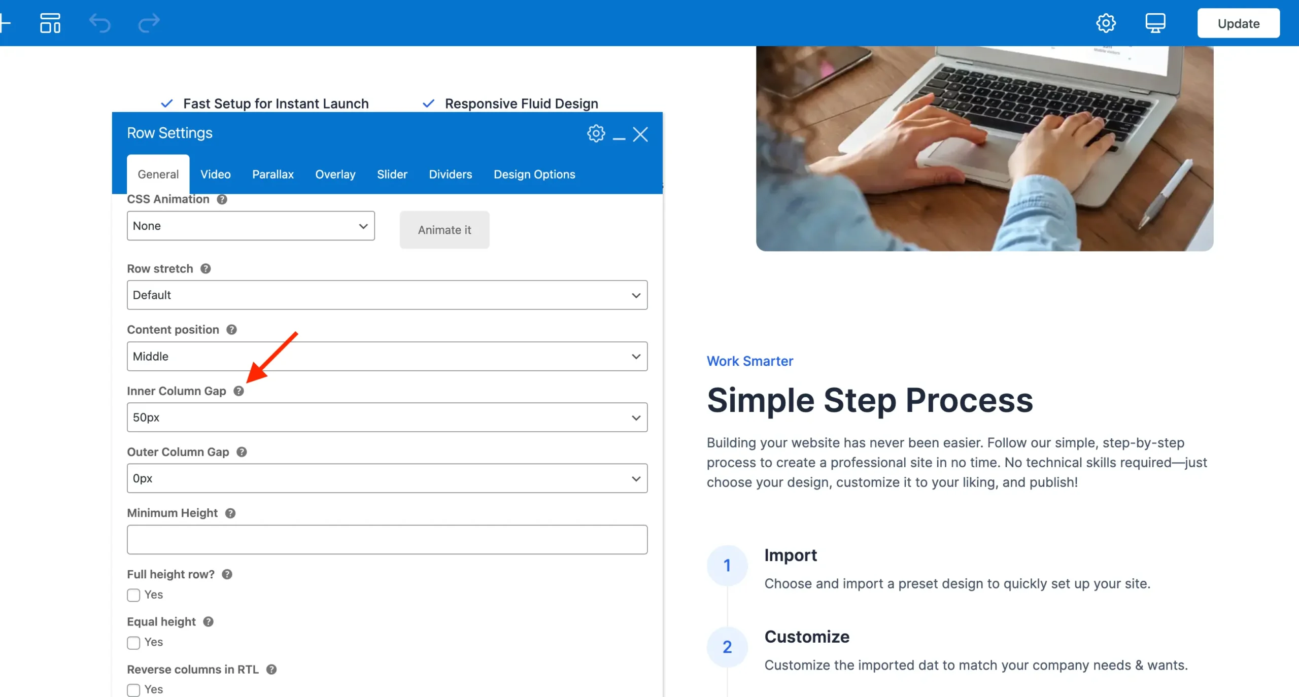
Exclusive Inner Column Gap Option
The Total theme includes an exclusive row option called Inner Column Gap, which allows you to select from preset spacing options to increase or decrease the space between columns. Due to limitations in WPBakery, it’s currently not possible to enter a custom value for this setting.
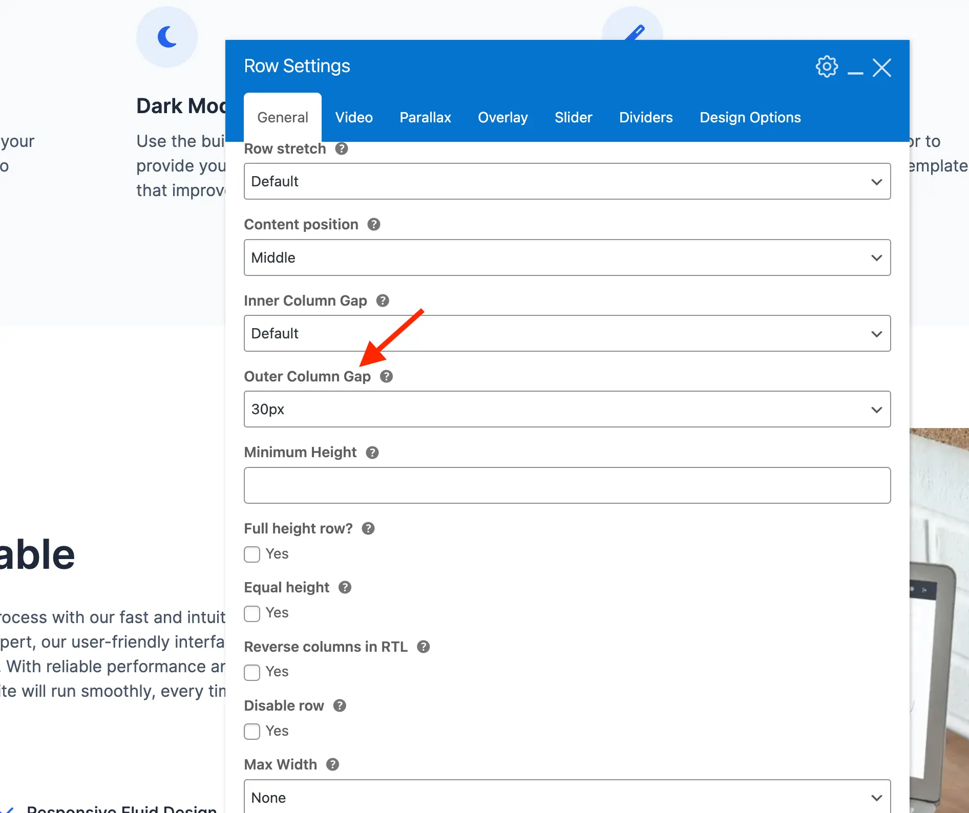
Outer Column Gap
You can also use the Outer Column Gap setting to increase the spacing between columns. However, this core WPBakery feature works by adding padding inside each column, which is primarily intended for use with columns that have background colors or images.
If you choose to use this option, you may need to manually adjust the row’s left and right margins in the Design Options tab. WPBakery does not automatically compensate for this added padding, which could cause your columns to extend beyond the width of your site’s container.
Using Empty Columns to Create Empty Space
If you need greater spacing between columns, one simple method is to add an empty column between them. For example, instead of using two columns for your content, you can insert a three-column layout and place your content in the outer columns, leaving the center column empty to act as a spacer.
You would usually only do this with layouts where you want content added in 2 of the columns as it could get a bit too complex adding multiple empty columns in 4+ column layouts.

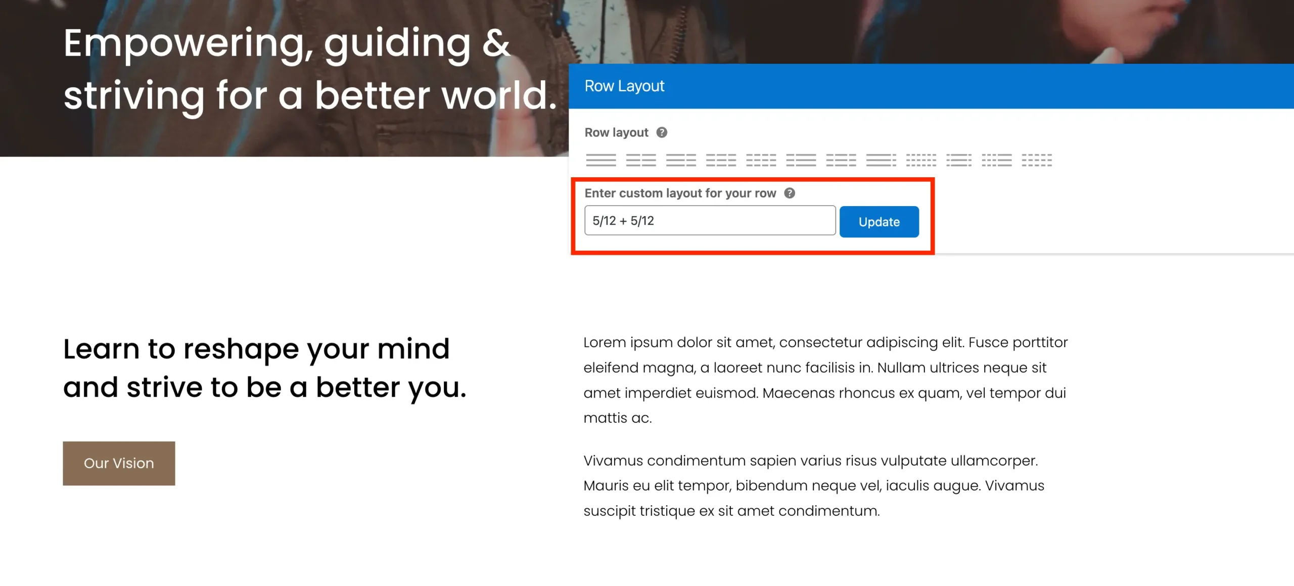
Here are some sample layouts you can use:
| Layout | Description |
|---|---|
5/12 + 2/12 + 5/12 | Balanced spacing with wide content columns |
1/3 + 1/3 + 1/3 | Equal thirds, moderate space |
4/12 + 2/12 + 6/12 | Wider right content, moderate space |
6/12 + 2/12 + 4/12 | Wider left content, moderate space |
5/12 + 1/12 + 6/12 | Smaller gap, slightly wider right content |
6/12 + 1/12 + 5/12 | Smaller gap, slightly wider left content |
The WPBakery 12-Column System
WPBakery uses a 12-column grid system, so when creating custom layouts, the sum of the column fractions should always equal 12. For example, in a three-column layout, the widths of the left, middle, and right columns should add up to 12 (e.g., 5 + 2 + 5 = 12).
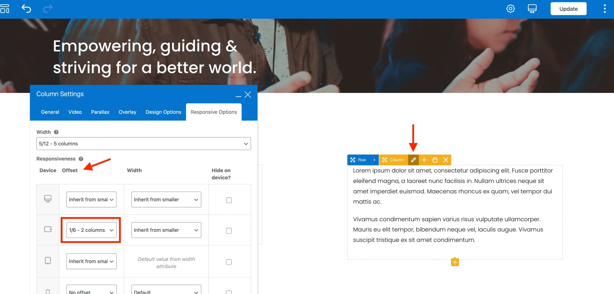
Although WPBakery’s grid is based on 12 columns, you don’t always have to write fractions with a denominator of 12. Equivalent fractions like 2/6 can be used interchangeably with 4/12 for offsets or spacing, as long as the total adds up correctly. For example, you can set two columns to 5/12 + 5/12 and add an offset of 2/6 to create space between them.
Using Column Offsets to Create Empty Space
Using column offsets works similarly to adding empty columns but requires a bit more effort. While there’s generally no strong reason to choose this method, some users prefer it to avoid having extra unused columns in their layout. This method involves two main steps:
Step 1: Set your row column widths so that the widths of both columns combined is less than 100%.
Step 2: Edit the column on the right side and give it an offset equal to the value that added to the widths of the columns would equal 100%.
Be sure to read the previous section on the WPBakery 12 column grid to understand why this works.
Using Side Margins to Increase Spacing Between Items (Intermediate)
You can also increase the space between content in different columns by applying side margins. For example, when building a layout with an image on one side and text on the other, simply adding a side margin to the image creates white space between it and the adjacent content.
To ensure the margin is responsive and removed when the columns stack on smaller screens, use the Total theme’s built-in utility classes. For example, if your layout has text on the left and an image on the right, you can apply the class wpex-md-ml-60 to the image element. This adds a 60px left margin starting at the medium breakpoint (md) and up, maintaining clean spacing without affecting the mobile layout.
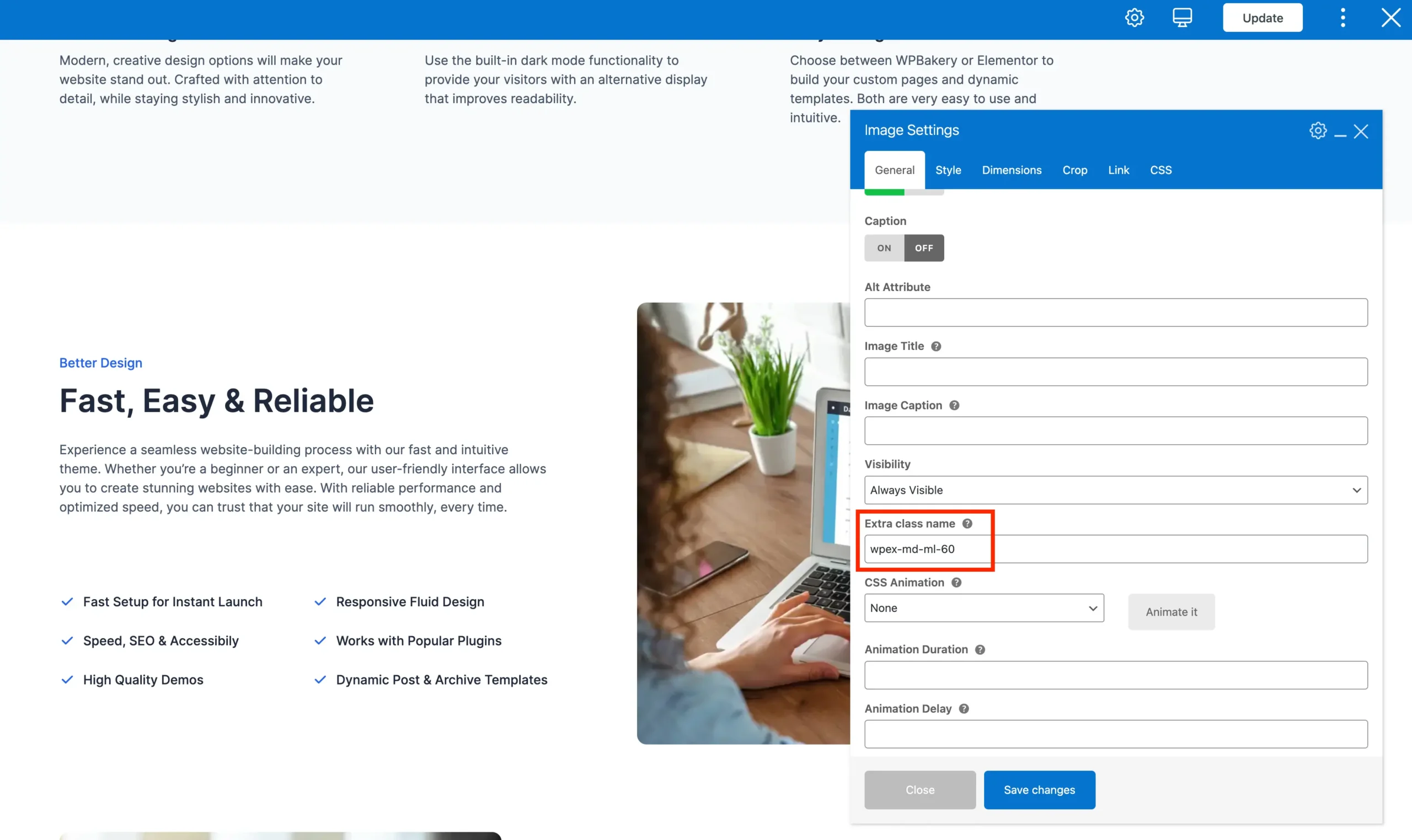
I personally really like this method because it’s quick and easy and you generally just need a little bit more room between the columns.