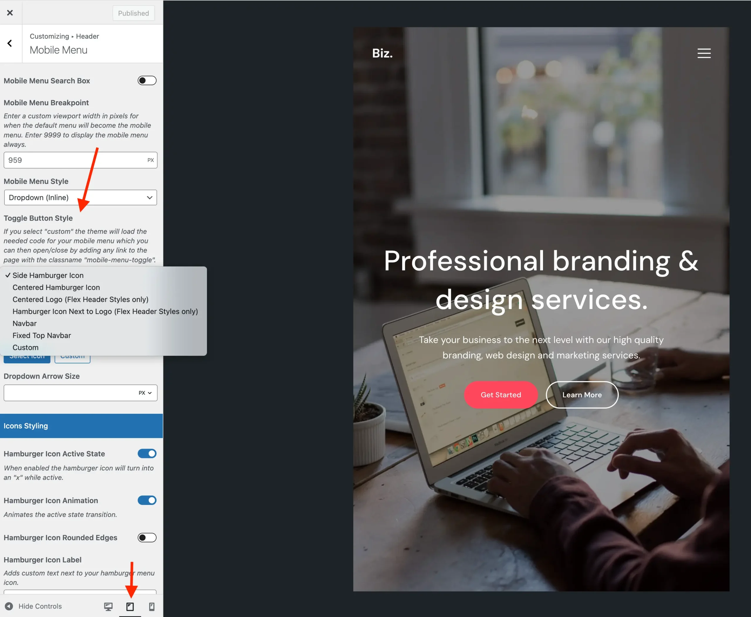
The Total theme offers several options for customizing the mobile menu (also known as the Mobile Menu Toggle) to suit your needs. For instance, if your site has a large logo, you may prefer using the “Navbar” mobile menu toggle to allow more space for the logo in the header.
To change the mobile menu style, simply log into your WordPress dashboard and navigate to Appearance > Customize > Header > Mobile Menu.
The option to choose your mobile menu Toggle style is exclusively for the default built-in theme header styles. If you’re using the Header Builder, the mobile menu will be controlled through the “Off-Canvas Menu” element. This element offers various options to customize how the toggle is displayed, allowing you to choose from different icons and display settings to best suit your design needs.