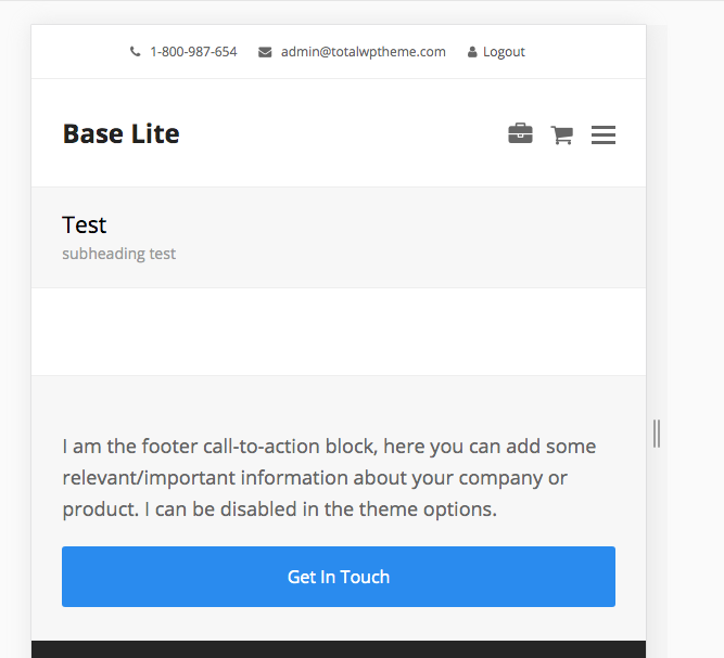
The mobile icons menu in the Total theme works differently from standard menus. Rather than showing text labels like Portfolio, Blog, or Contact, each menu item is represented by an icon.
To set up your mobile icons menu:
- Create a new menu in Appearance → Menus.
- For each menu item, either:
- Enter the theme icon name in the Navigation Label field, or
- Select an icon using the Menu Icon field (this option isn’t available in the Customizer).
- Assign this menu to the Mobile Icons menu location.
This setup allows you to create a fully icon-based navigation experience for mobile devices, like such:

Accessibility Tip: You can use the “Title” attribute for your links (enable under the Screen Options tab) and it will be added with the icon for screen readers.
Icons List: You can find a list of all the available theme icons here if you are adding the icon name manually via the Label field.
Selecting an Icon: In newer versions of the theme you can select your icons via the Appearance > Menu dashboard via a modal popup! See the updates docs on adding menu icons.
Adding a Cart/Shop Icon
The theme can display a counter for cart items on a mobile menu icon and also open the shopping cart. For an icon to be recognized as a cart icon, all of the following conditions must be met:
- WooCommerce is enabled and Advanced Integration is activated in the Theme Panel.
- The selected icon either:
- Starts with
shopping-, or - Contains the word
cart, or - Has a link URL set to
#cart.
- Starts with
Adding a Search Icon
The theme can display a search toggle in the mobile icons menu and open the header search as defined in the Customizer under Header > Search. For an icon to be recognized as a search icon, it must meet one of the following conditions:
- The link URL is
#search, or - The selected icon contains the word
search.
Adding a Dark Mode Toggle Icon
The theme can display a dark mode toggle button icon that will switch between light and dark modes. For an icon to be recognized as a dark mode toggle, it must meet the following condition:
- Dark Mode is enabled in the Theme Panel.
- The link URL is
#dark-mode.
Note: If no icon is set for the dark mode menu item, the theme will use the icon defined in the Customizer.