Total provides a range of utility classes for responsive design, making it easy to show or hide elements based on screen width.
Most Total theme elements include built-in visibility settings for quick and intuitive control over their display. These settings are also available for WPBakery sections, rows, and columns. If you’re using Elementor, you can use the native visibility controls that come with the Elementor builder.
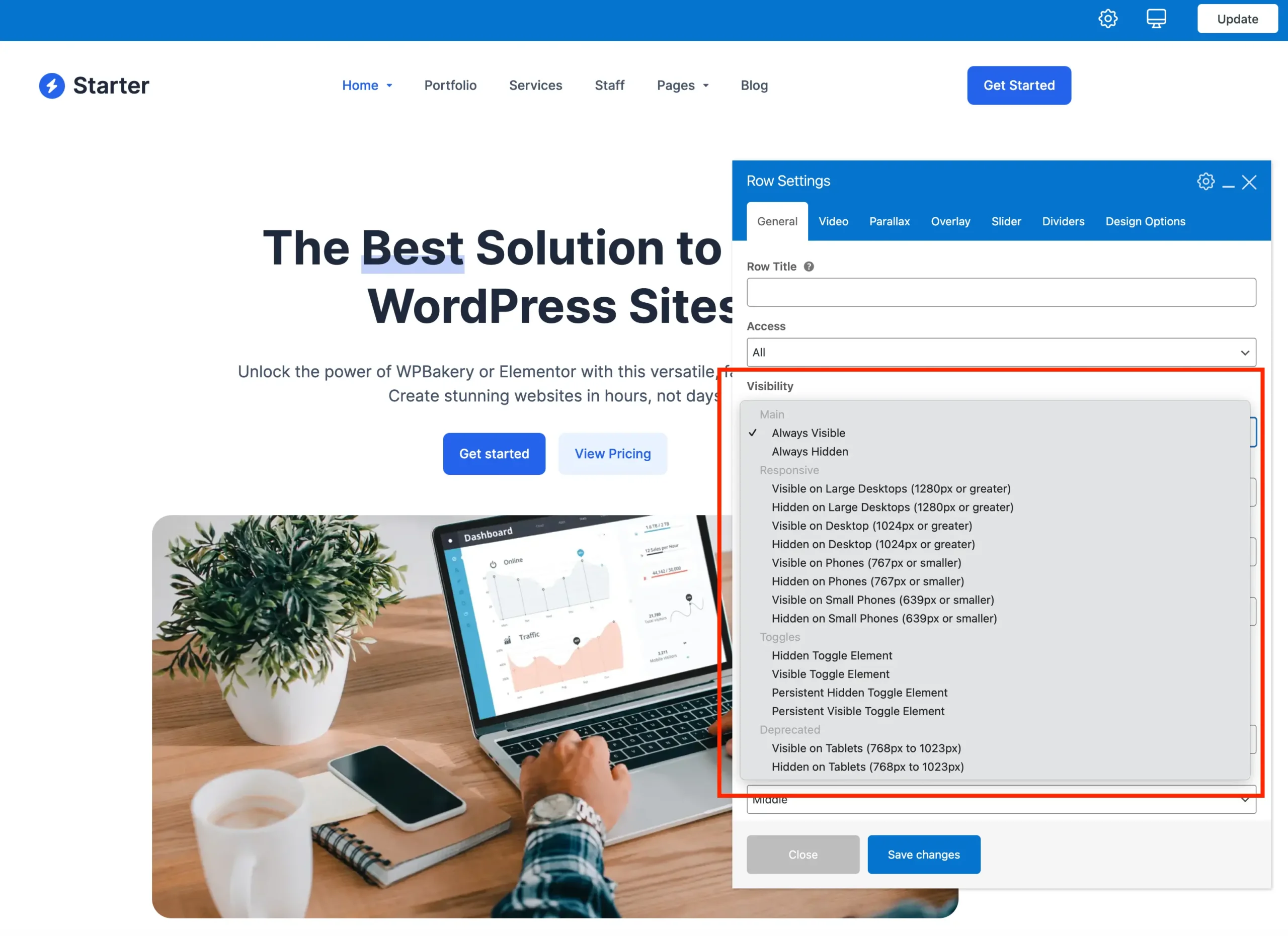
Here is a screenshot from the WPBakery page builder showing the available options:
Please make sure to review the recommendations on using visibility settings, especially regarding responsive design, for the best results.
Visibility Options Overview
Below is a breakdown of the various visibility options grouped by category. Each table lists the option’s name, the corresponding CSS class, and a description explaining its function.
General Visibility
Basic visibility options that apply universally.
| Name | Class | Description |
|---|---|---|
| Always Visible | (empty) | Element is always visible on all screens. |
| Always Hidden | hidden | Element is always hidden on all screens. |
Mobile Menu Breakpoint
These classes control element visibility specifically around the mobile menu breakpoint. You can choose to show or hide elements only when the screen hits the designated mobile menu width. These classes only work with the default header (not the header builder).
| Name | Class | Description |
|---|---|---|
| Visible at Mobile Menu Breakpoint | show-at-mm-breakpoint | Visible only at the mobile menu breakpoint. |
| Hidden at Mobile Menu Breakpoint | hide-at-mm-breakpoint | Hidden only at the mobile menu breakpoint. |
Responsive (By Screen Width)
This group of classes provides control over visibility based on screen width breakpoints.
| Name | Class | Description |
|---|---|---|
| Visible on Large Desktops | visible-desktop-large | Visible on screens 1280px and wider. |
| Hidden on Large Desktops | hidden-desktop-large | Hidden on screens 1280px and wider. |
| Visible on Desktops | visible-desktop | Visible on screens 1024px and wider. |
| Hidden on Desktops | hidden-desktop | Hidden on screens 1024px and wider. |
| Visible on Phones | visible-phone | Visible on screens 767px and smaller. |
| Hidden on Phones | hidden-phone | Hidden on screens 767px and smaller. |
| Visible on Small Phones | visible-phone-small | Visible on screens 639px and smaller. |
| Hidden on Small Phones | hidden-phone-small | Hidden on screens 639px and smaller. |
Toggle Elements
These classes control the visibility of interactive elements that users can toggle open or closed. For detailed usage and examples, please refer to the Toggle Element documentation.
| Name | Class | Description |
|---|---|---|
| Hidden Toggle Element | hidden-toggle-element | Hidden by default; toggled via user interaction. |
| Visible Toggle Element | visible-toggle-element | Visible by default; toggled via user interaction. |
| Persistent Hidden Toggle | hidden-toggle-element-persist | Hidden by default; toggled via user interaction. Does not automatically close when another toggle in the same container is opened. |
| Persistent Visible Toggle | visible-toggle-element-persist | Visible by default; toggled via user interaction. Does not automatically close when another toggle in the same container is opened. |
Deprecated
These classes are no longer recommended because they target only a “middle” screen width range (tablets between 768px and 1023px). This limited scope means you would still need additional classes or styles to properly handle both smaller phones and larger desktops, making these classes less efficient for modern responsive design. They remain available mainly for backward compatibility with older projects.
| Name | Class | Description |
|---|---|---|
| Visible on Tablets | visible-tablet | (Deprecated) Visible on 768px to 1023px. |
| Hidden on Tablets | hidden-tablet | (Deprecated) Hidden on 768px to 1023px. |
Visibility & Responsive Design Recommendations
While the Total theme provides powerful visibility classes to show or hide elements based on screen size, it’s important to use these tools wisely to maintain clean, efficient, and performant layouts.
When to Use Visibility Classes
Use visibility classes primarily when you need to drastically change content or layout, such as swapping out header elements in the header builder or replacing major sections for mobile vs desktop.
When Not to Overuse Visibility Classes
- Avoid using visibility classes simply to make minor style adjustments like padding, margins, or small layout tweaks.
- For those subtle design changes, rely on responsive CSS units and techniques such as
%,vw,vh,vmin, andvmax. These allow elements to adapt smoothly without needing to be hidden or duplicated. - Overusing visibility classes to hide and show large blocks of content for small tweaks can lead to:
- Increased page weight and slower loading times
- More complex markup that’s harder to maintain
- Potential SEO and accessibility issues with hidden content
Best Practices
- Start with flexible, responsive CSS units and media queries for styling adjustments.
- Use visibility classes to swap or hide content only when necessary. For example, different navigation menus or alternative headers.
- Test your design on multiple devices and screen sizes to ensure a smooth, consistent experience without excessive content duplication.
Using Complementary Visibility Classes
Complementary visibility classes work together to control which elements appear or disappear at specific screen sizes. For example, you can hide one element on desktop using the Hidden on Desktop setting while showing another element only on desktop with the Visible on Desktop setting. This allows for easily swapping content at a specific breakpoint.
| Visible | Hidden |
|---|---|
Visible on Large Desktops | Hidden on Large Desktops |
Visible on Desktop | Hidden on Desktop |
Visible on Phones | Hidden on Phones |
Visible on Small Phones | Hidden on Small Phones |
Visible at Mobile Menu Breakpoint | Hidden at Mobile Menu Breakpoint |