The Total theme includes built-in javascript for the modern dialog element. In fact, it’s used for a few features such as the Social Sharing element (when set to Modal) and the Post Cards when the link type is set to modal.
The dialog element is a core browser element that allows for creating popups with minimal code that are accessible and user-friendly. There are ideal for showing notices and pop-up content such as social share, post details or a contact form.
If you are creating a custom function for your site and you want to take advantage of the theme’s built-in modal dialog support you’ve come to the right place – we’ll show you how!
In Total 6.6 we added the Modal type to dynamic templates so you can easily create modal popups. Have a look at the guide for creating a modal popup contact form.
Create a Simple Dialog Window
You can create a simple HTML dialog window using the following HTML:
<dialog id="popup-1" class="wpex-modal">
    <div class="wpex-modal__inner">This is my Popup</div>
</dialog>
If you add this code to your site you won’t actually see anything because dialog elements are hidden by default. So you will need to add a button or link to trigger your popup.
Here is an example of a trigger button:
<button aria-controls="popup-1" class="wpex-open-modal theme-button">Popup</button>You can use a standard button or a link, the important things are that you add the wpex-open-modal classname and that your aria-controls attribute matches the ID of your modal dialog.
Click the button below to view a sample modal in action:
Adding a Close Button
By default dialog windows close when clicking outside them, but Total has built-in code to support close buttons. To add a close button simply insert any element (link or button) with the classname wpex-close-modal inside the dialog.
<dialog id="popup-2" class="wpex-modal">
    <div class="wpex-modal__inner wpex-p-25 wpex-text-center">
        <p>This is my Popup</p>
        <button class="wpex-close-modal theme-button">Close</button>
    </div>
</dialog>This example uses a standard button at the bottom of the dialog, but of course you can style the button however you want. See the example below where we add a “heading” to the modal with a close button to the side.
Adding a Modal Title and Close Icon
Your modal popup will display any HTML you add inside the dialog element so adding a heading and close can be done easily using Total’s CSS utility classes.
<dialog id="popup-3" class="wpex-modal wpex-modal wpex-shadow-lg wpex-rounded wpex-p-0" style="width:"600px;">
    <div class="wpex-modal__inner">
        <div class="wpex-modal__header wpex-flex wpex-items-center wpex-gap-20 wpex-p-20 wpex-border-b wpex-border-solid wpex-border-main">
            <div class="wpex-modal__title wpex-heading wpex-text-xl">Hello There!</div>
            <button class="wpex-modal__close wpex-close-modal wpex-unstyled-button wpex-flex wpex-items-center wpex-justify-center wpex-ml-auto wpex-text-lg" aria-label="Close modal"><span class="wpex-icon" aria-hidden="true"><svg xmlns="http://www.w3.org/2000/svg" viewBox="0 0 24 24"><path d="M0 0h24v24H0V0z" fill="none"></path><path d="M19 6.41L17.59 5 12 10.59 6.41 5 5 6.41 10.59 12 5 17.59 6.41 19 12 13.41 17.59 19 19 17.59 13.41 12 19 6.41z"></path></svg></span></button>
        </div>
        <div class="wpex-modal__body wpex-p-20 wpex-last-mb-0">
            <p>This is my Popup</p>
        </div>
    </div>
</dialog>In this example I’ve also added an inline width of 600px to the dialog element. By default the dialog will expand to fit whatever content is inside it, but you can give it a default width if you’d like either using an inline style tag like I did or targeting the unique ID with custom CSS.
Modal Width
By default, the modal automatically adjusts its size to fit its content, with a maximum width defined as clamp(0px, 95%, var(--wpex-modal-width, 900px)).
If you’d like to set a minimum width, the simplest approach is to add an inline style attribute specifying a fixed width. If you look at the previous example you’ll see a width of 600px added to modal.
Example:
<dialog id="sample-modal-id" class="wpex-modal wpex-modal--custom-width" style="width:"600px;">When adding a custom width, it’s recommended that you add the wpex-modal--custom-width modifier class. This will remove the theme’s custom max-width on the modal so it uses the browser’s native max-width.
Adding a Modal to a Custom Card
It’s also possible to add modals to your custom cards to open up content specific to the post from within the card. In order to do this though, you need to ensure every modal has a unique ID. Otherwise, whenever you click on the button that opens the modal it will open the modal found on the first card.
Setting up unique ID’s for your modals:
The easiest way to create unique ID’s for your modals so that each card has it’s own unique modal is to use the theme’s {{post_id}} dynamic variable. For example, you may give the modal an id of card-modal-{{post_id}}. This way each modal ID will be appended with the current post ID and thus be unique.
Example HTML for your custom card that opens a modal with the post content:
<p><button aria-controls="my-custom-card-modal-{{post_id}}" class="wpex-open-modal theme-button">View Details</button></p>
<dialog id="my-custom-card-modal-{{post_id}}" class="wpex-modal wpex-modal wpex-shadow-lg wpex-rounded wpex-p-0" style="width:"600px;">
    <div class="wpex-modal__inner">
        <div class="wpex-modal__body wpex-p-20 wpex-last-mb-0">{{post_content}}</div>
    </div>
</dialog>
Notice how we are also using the {{post_content}} variable to render the content for the current card post inside the modal.
Using a Template part for the Modal Content
You can also create a new template part under Theme Panel > Dynamic Templates to contain the code to use for your modal content.
- Create new template.
- Select “Part” as the “Template Type.
- Add any elements you want to your template.
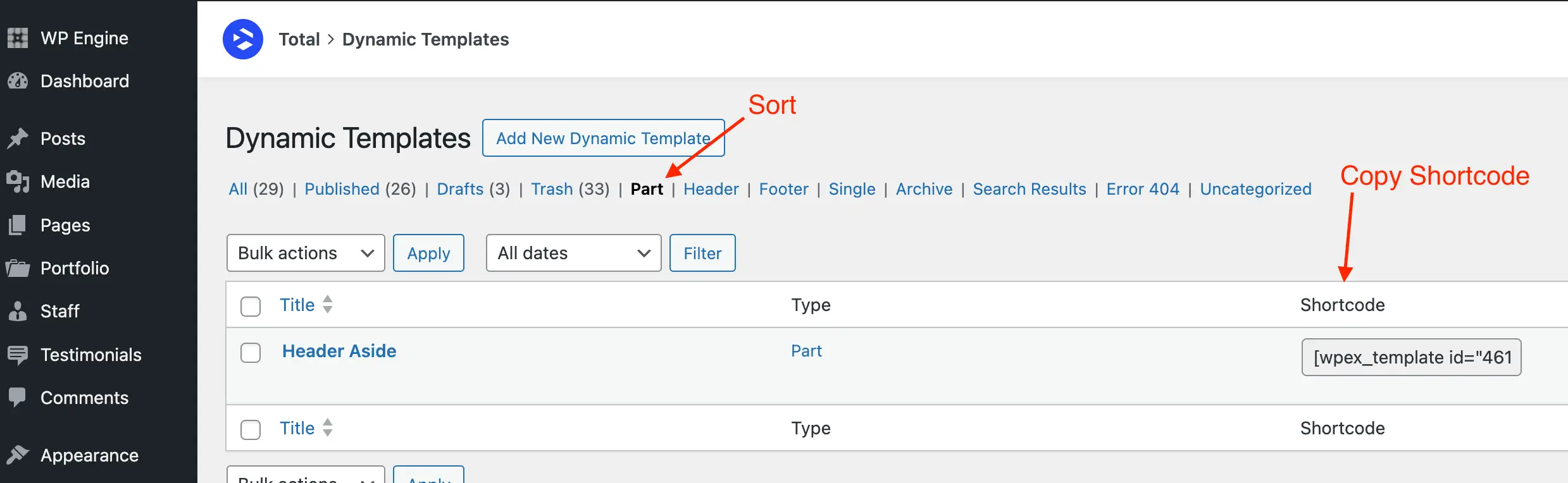
- Go back to the main Dynamic Templates dashboard.
- Click on “Part” to sort the templates.
- Now you can copy the shortcode for your template part to use in your modal content.