In this guide you will learn how to add an image inside a WPBakery column that is stretched so that it renders at the same height as the content column next to it. This is a popular affect that can be a bit tricky to figure out on your own, but it’s actually really easy to do.
This is a screenshot of the end result we are looking for:
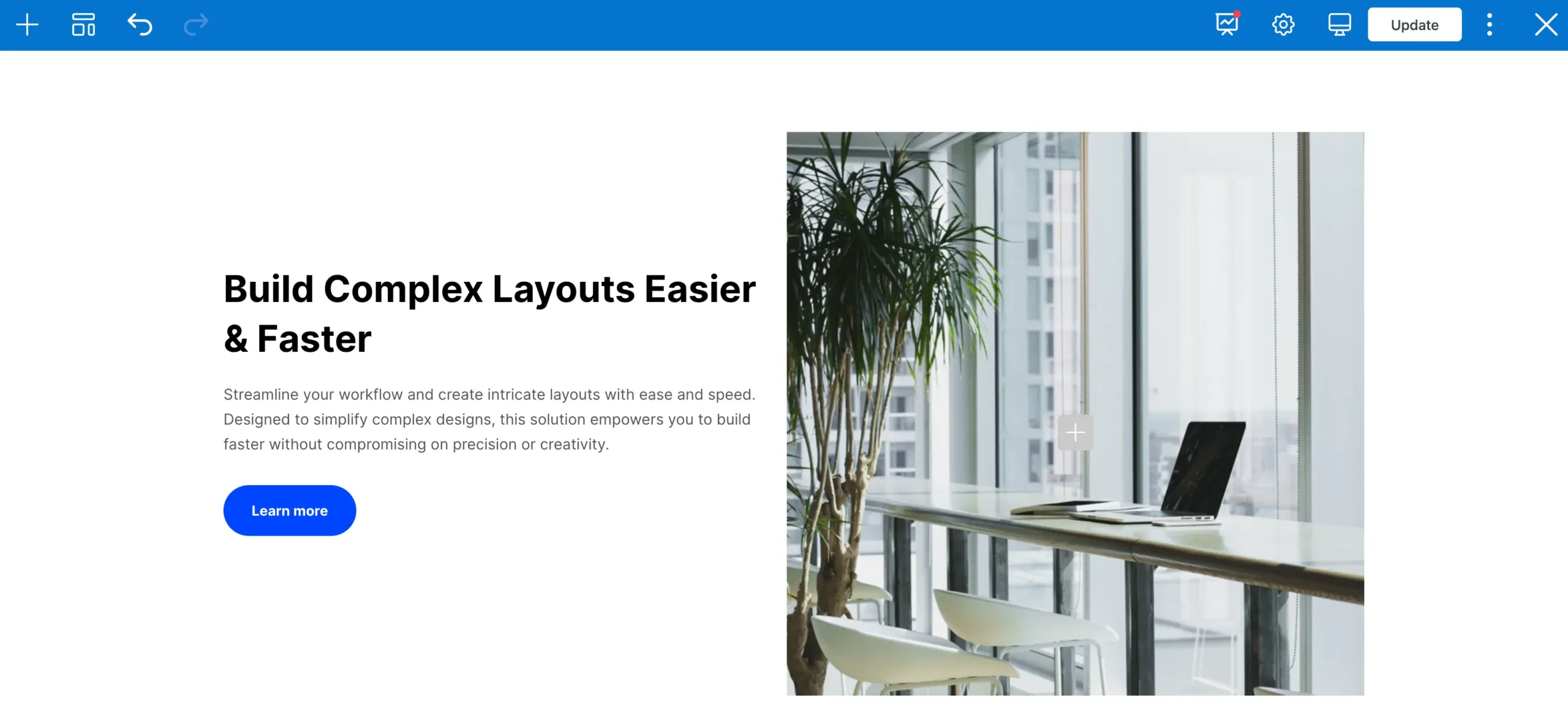
As you shrink/expand your browser and the content on the left shifts the image will always be the same height as the content next to it.
Method 1: Using the “Fill Column” Setting
In Total 6.0.3 we introduced a new Fill Column setting to several elements that will allow them to stretch to fill their parent column. Currently the setting is added to the Image, Image Banner and Video elements. This makes it extremely easy to insert an image that will stretch to fill it’s parent column.
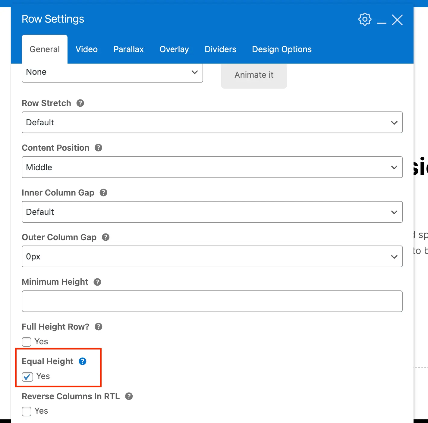
Step 1: Insert a Row and Enable Equal Height
The first step is to insert a row and enable the equal height option. This will ensure that the column where you insert your image will be as tall as any columns next to it.
Step 2: Edit your Image & Enable the Fill Column Setting
Now you can edit your image and under the Dimensions tab turn on the Fill Column setting like such:
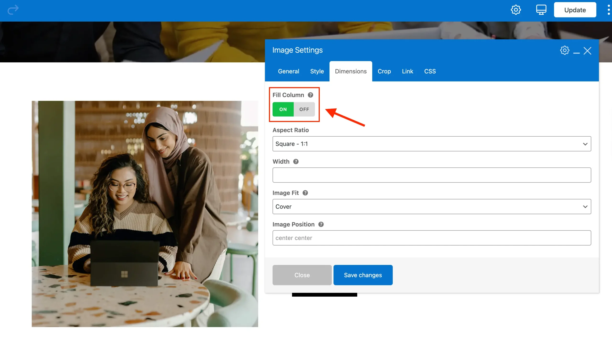
When this option is enabled, the image will use modern flexbox styles to expand and occupy any available space within the column. This allows you to place content before or after the image, and it will automatically adjust to fill the remaining space.
Method 2: Using Column Backgrounds
The second method is to add a blank column and then set it’s background to be an image. This is the “older” way of doing things and not really recommended. But I want to keep the explanation for anyone that may find this guide that isn’t lucky enough to be using the Total theme but still using WPBakery.
Step 1: Insert a Two Column Row and Enable Equal Height
The first step is to insert your 2 column row and enable equal height for the row. This will ensure that both the column will be the same height when they aren’t stacked (mobile display).
If you wish to display your image at the top mobile but on the right on desktop please see the following article on how to reverse column stack on mobile.
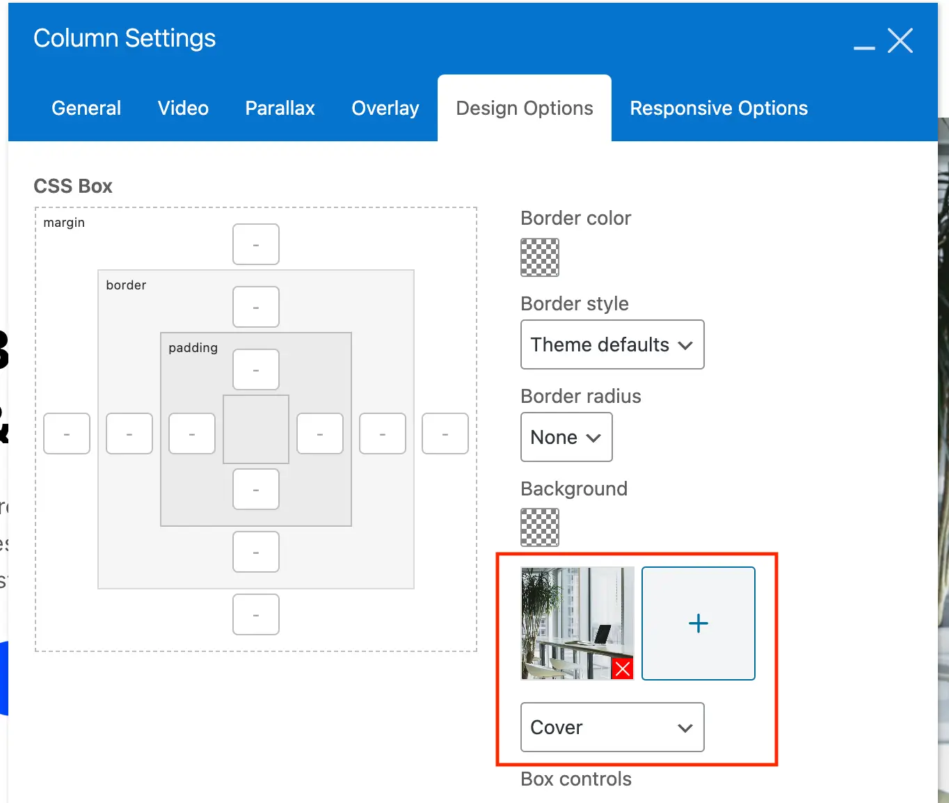
Step 2: Give Your Image Based Column a Background
For the column that you wish to add an image to you will do so by giving it a background. Make sure you select the “Cover” style background so that your image expands while keeping it’s proportions.
Step 3: Add a Minimum Height to Your Column
The last step is to add a minimum height to the column that has the background image. This is done for two reasons:
- Can be used to if the column with your content is too short and you want the image to display taller.
- When columns stack on mobile your column will have a 0px height because it doesn’t have any content. Adding a minimum height will ensure that your image is visible once stacked.
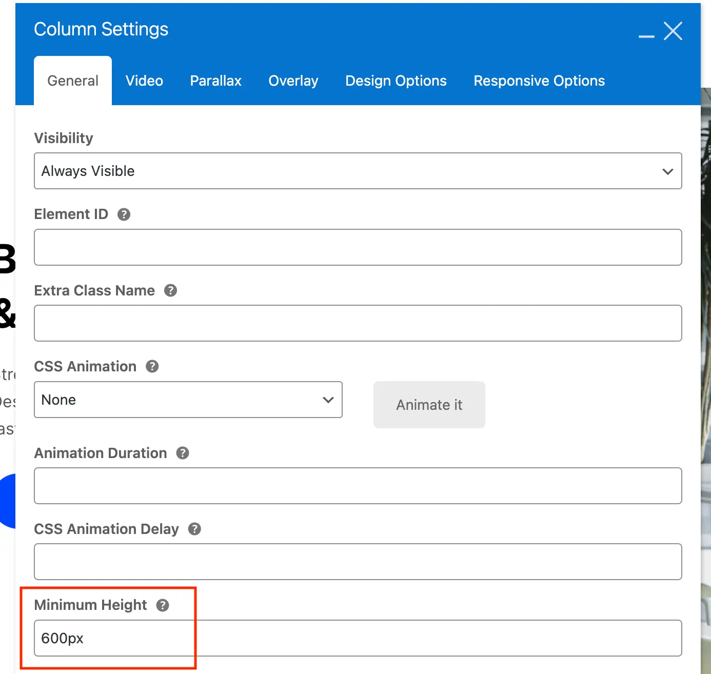
The Minimum Height field does accept CSS functions such as calc(), clamp(), min() and max(). You can also use responsive units such as vh, vmin or vmax.