Total offers a Color Palette feature that simplifies defining and controlling your site’s colors globally. This way you don’t have to remember the colors your site uses and you can always modify them from a centralized location.
How to Create Your Color Palette
To get started go to: Theme Panel → Color Palette
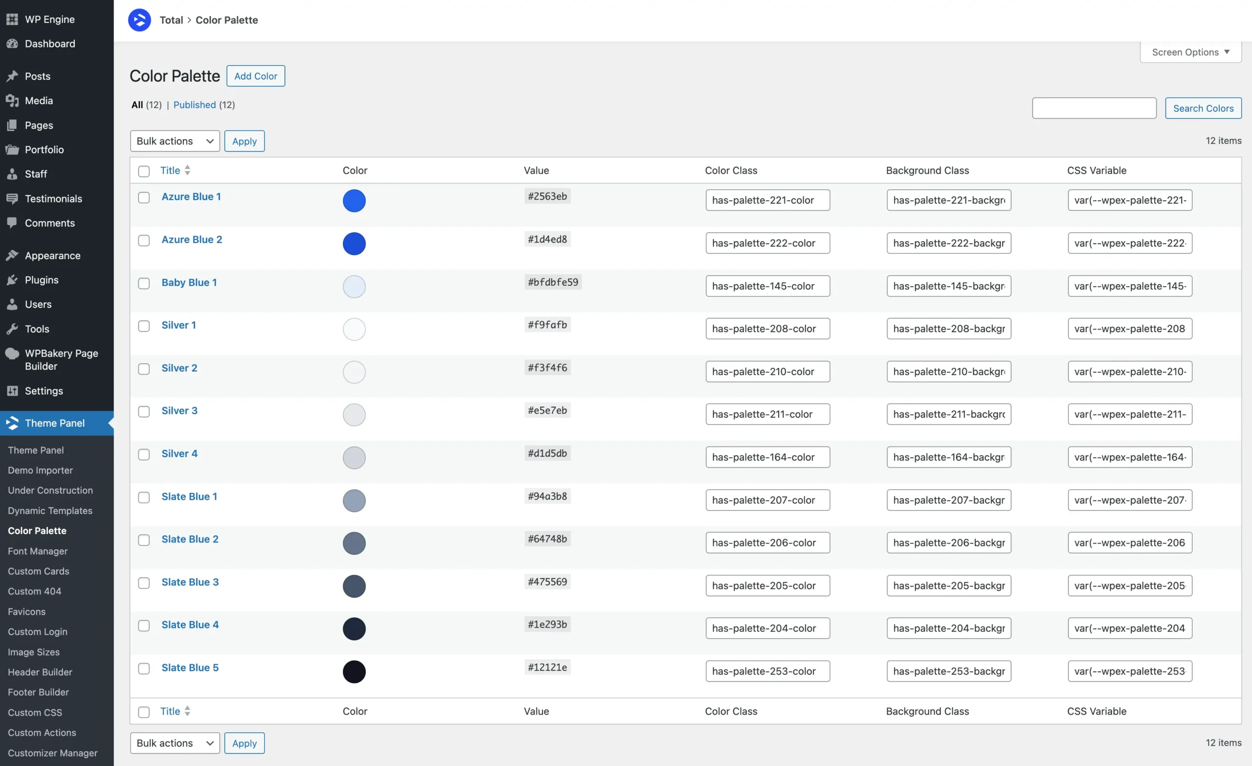
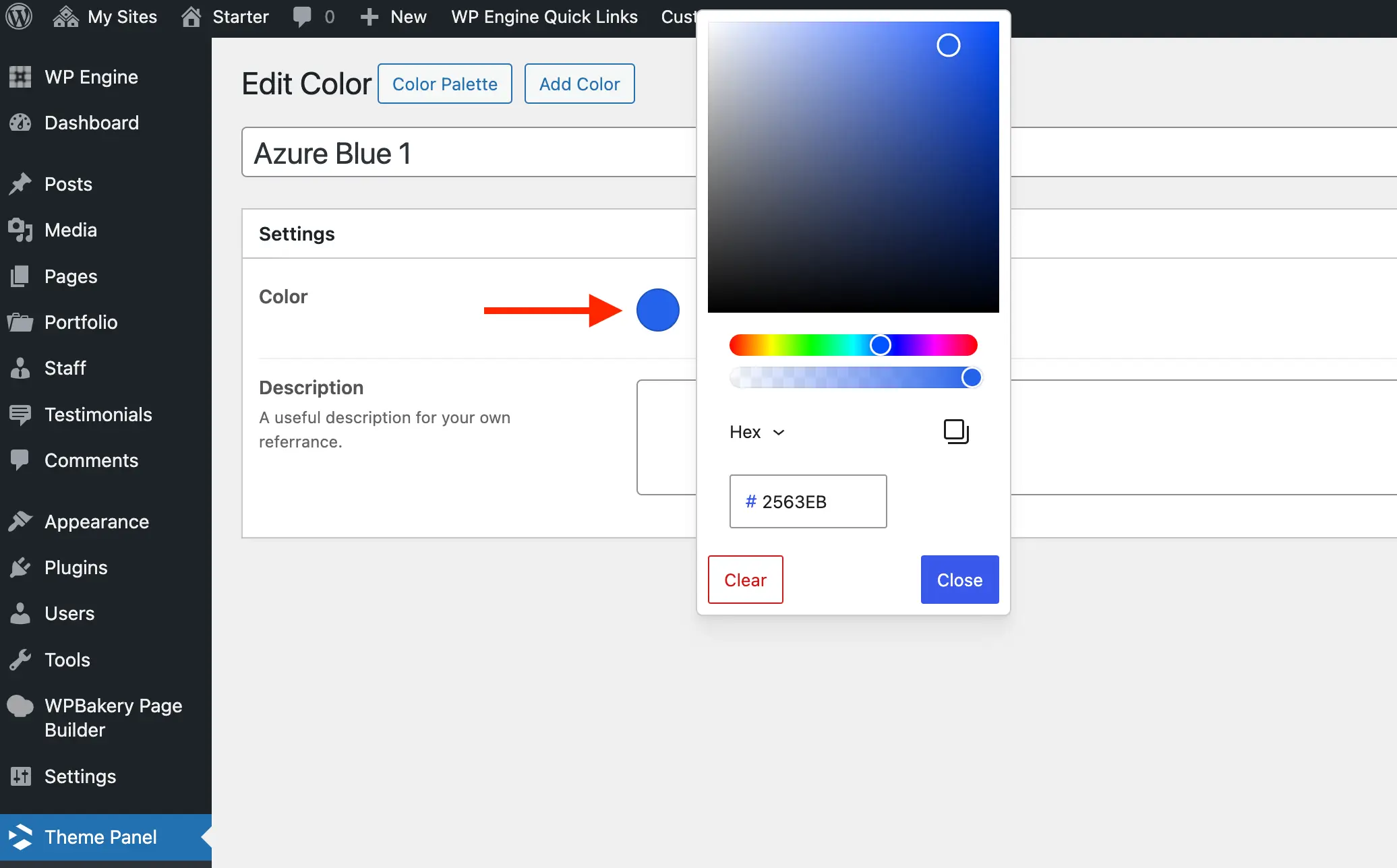
Click the “Add Color” button to add a new color to your palette, then define your custom color in the Add Color window. You can also add a description to help remind yourself or inform your client about the purpose of the color.
Now that you’ve added your colors to the Color Palette panel you can use them in any theme element and in the Customizer.
If you wish to use the Dark Mode feature you will need to enable it first in the main Theme Panel. This will allow you to define the dark mode color variation for your color.
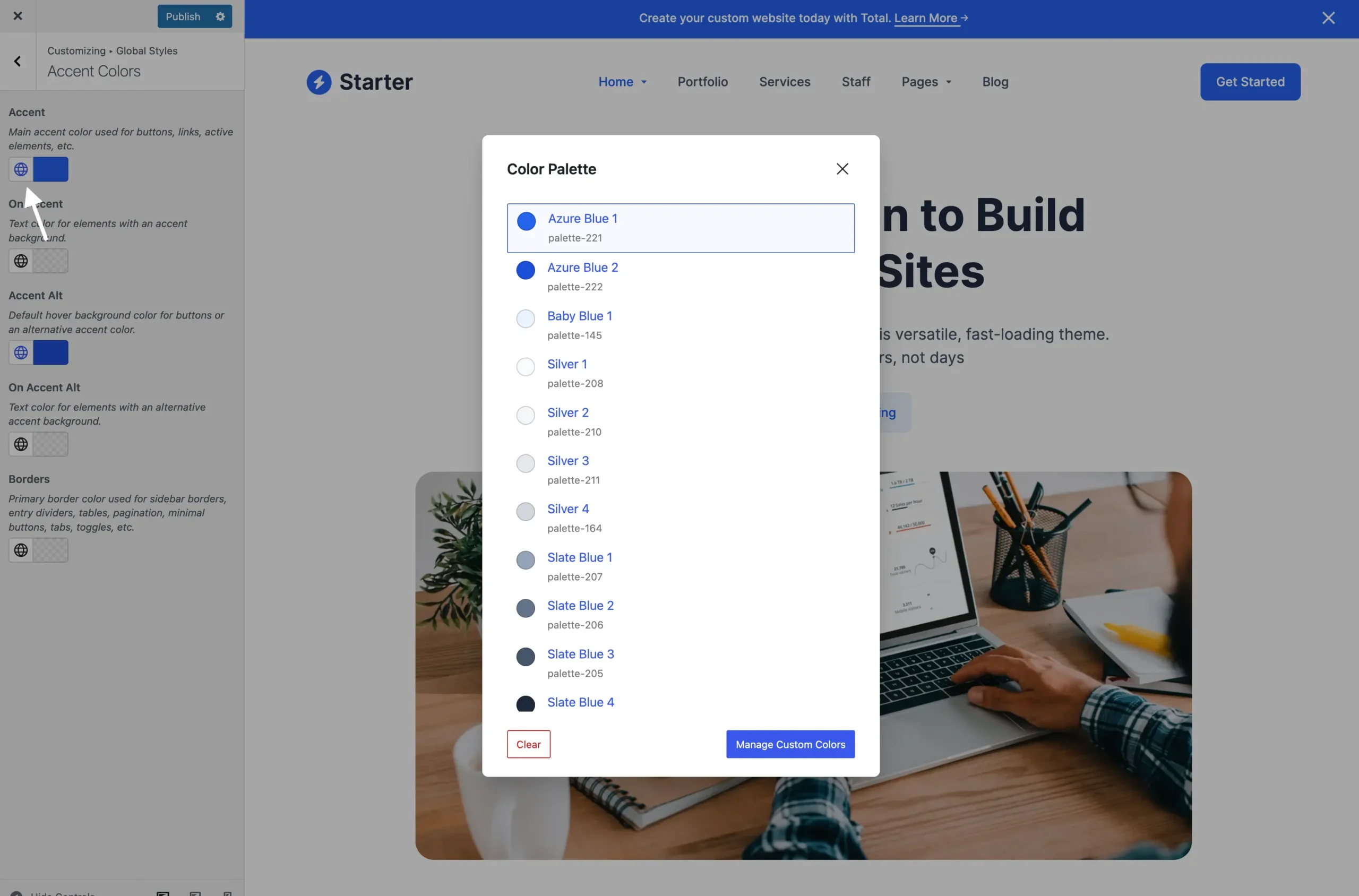
Using Your Colors in the Customizer
Access your color palette colors straight from the WordPress Customizer to apply them to various elements. Simply click the Globe Icon next to any theme color picker to open the color palette popup.
Below is a screenshot from the Customizer:
Using Your Colors in WPBakery Elements
Below is a screenshot showing the theme’s color picker in action within the WPBakery page builder. Just like in the Customizer, simply click the globe icon to access your color palette colors.
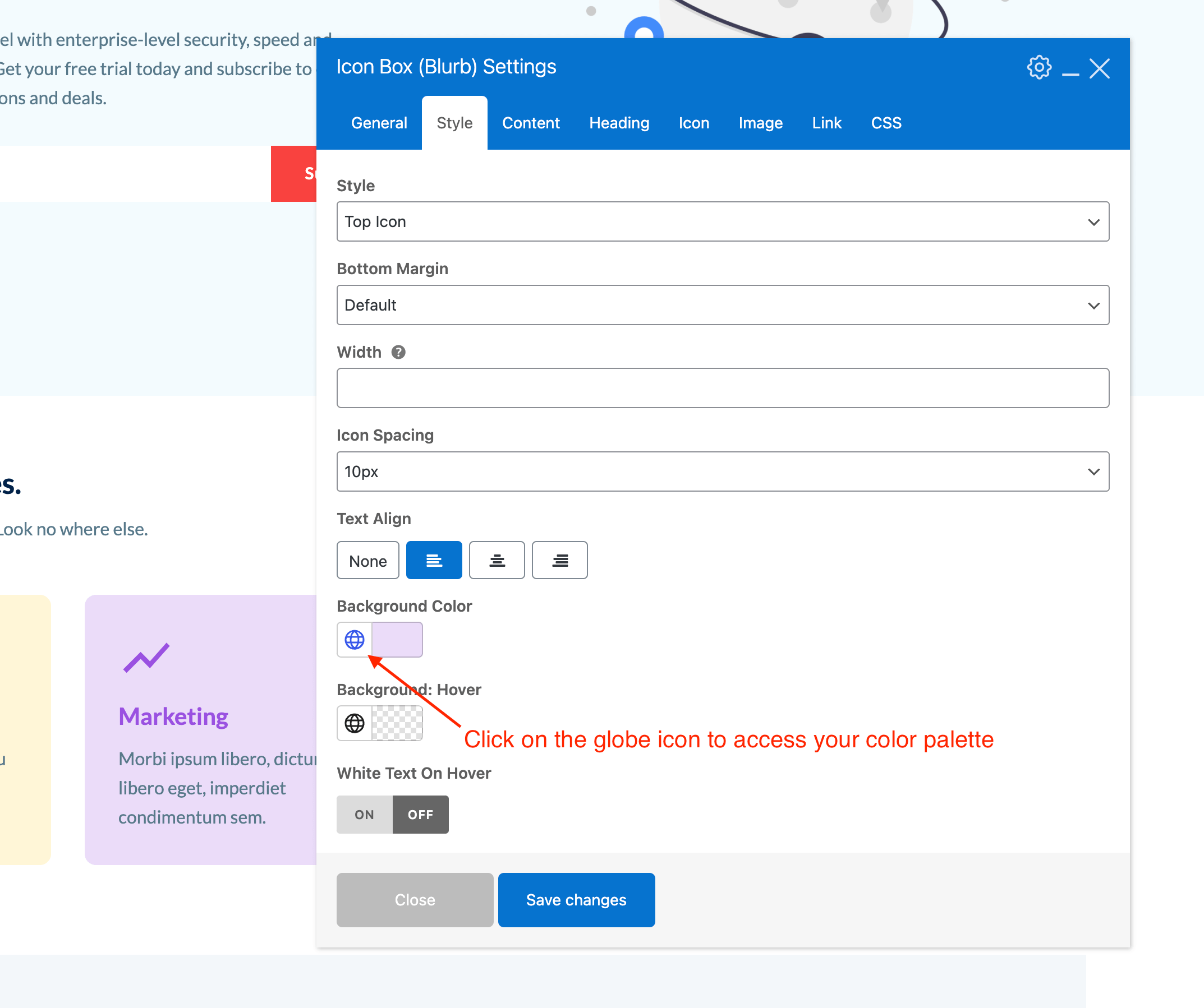
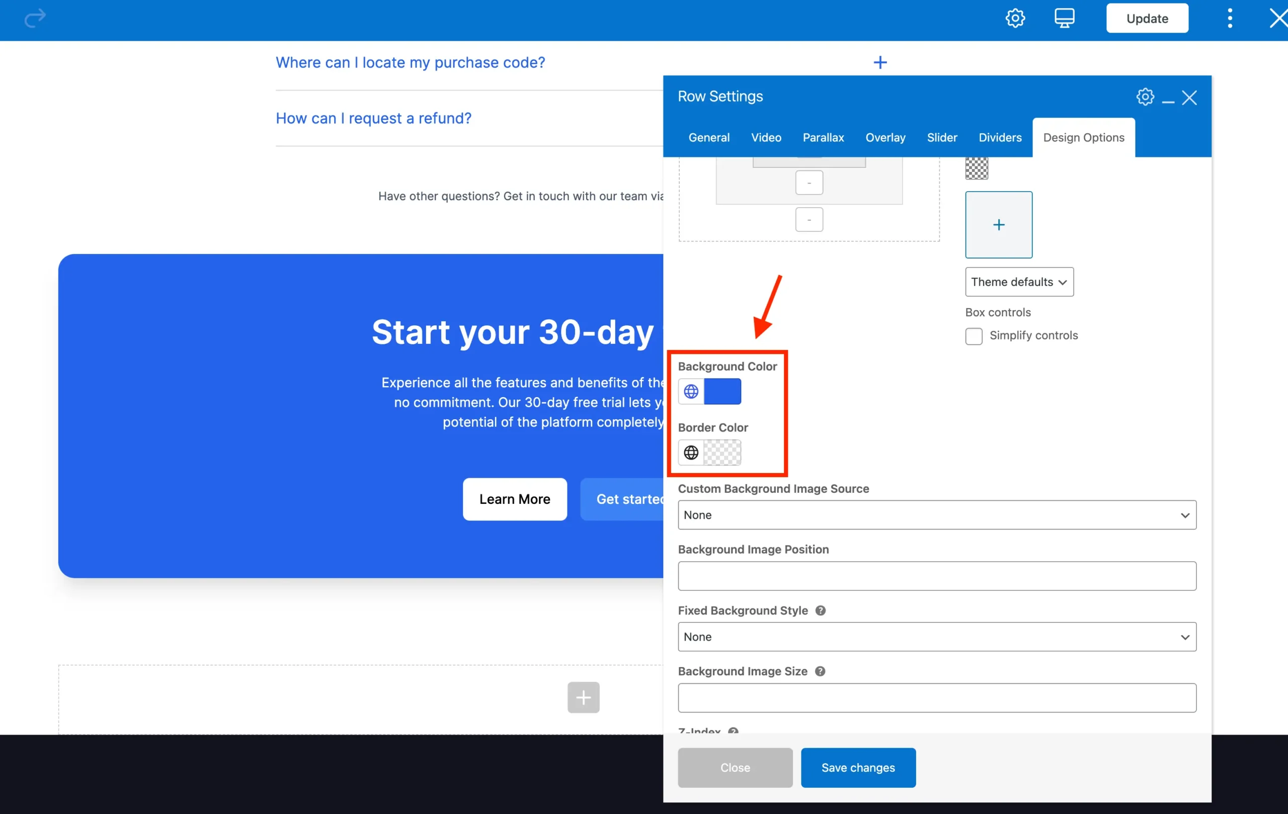
Using Your Colors with WPBakery Section, Row & Column Backgrounds and Borders
Because of how the WPBakery Page Builder works, in order to use your color palette colors we’ve added custom color options to these elements like such:
Using Your Colors in Elementor
The Color Palette colors will automatically sync with Elementor! This means you can access them in any Elementor color picker via the global colors setting:
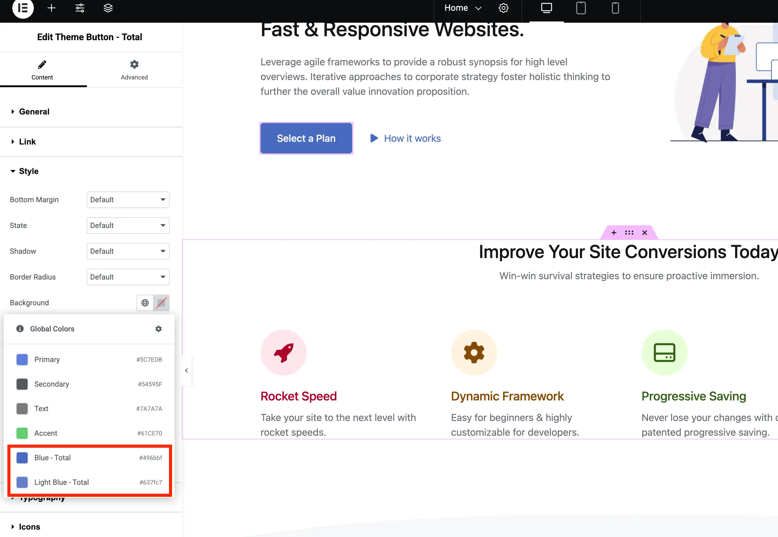
When using Elementor, your color palette colors will be prefixed with ‘Total’ to clearly indicate they are sourced from the theme’s color palette.
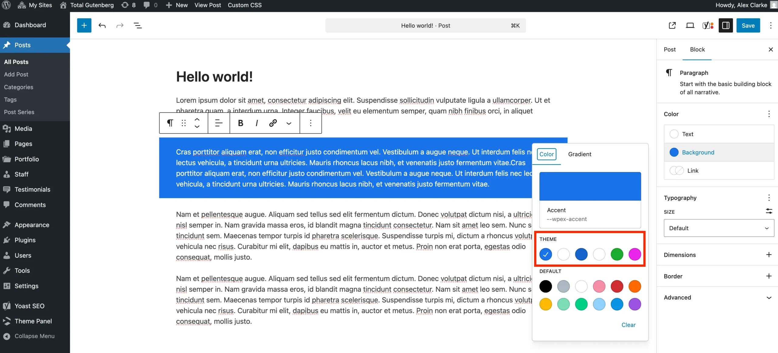
Using Your Colors in Gutenberg
And of course the theme also registers your color palette colors for use with the native WordPress Gutenberg editor.
Helper Developer Classes
The theme automatically supports Gutenberg for your custom colors through helper classes, which you can also use in your development. For every color you define, two class names are generated on the front-end, allowing you to apply them as either background or text colors.
has-{slug}-colorhas-{slug}-background-color
Where the {slug} is the slug as shown on the main Color Palette admin page. So if you look up at the first screenshot on the page the classes would be “has-palette-88-color” and “has-palette-88-background-color”.
You can also find these classes in your site header when inspecting via the source code.
Palette CSS Variables
The theme also registers each of your colors as a a CSS variable that can be used in any custom CSS. The CSS variables use the following format:
--wpex-{slug}-color
So let’s say if you are writing some custom CSS and want to apply one of your colors as a background to your element you could do so like so:
.element {
     background-color: var(--wpex-palette-14104-color);
}
Where “palette-14104” is your color slug.