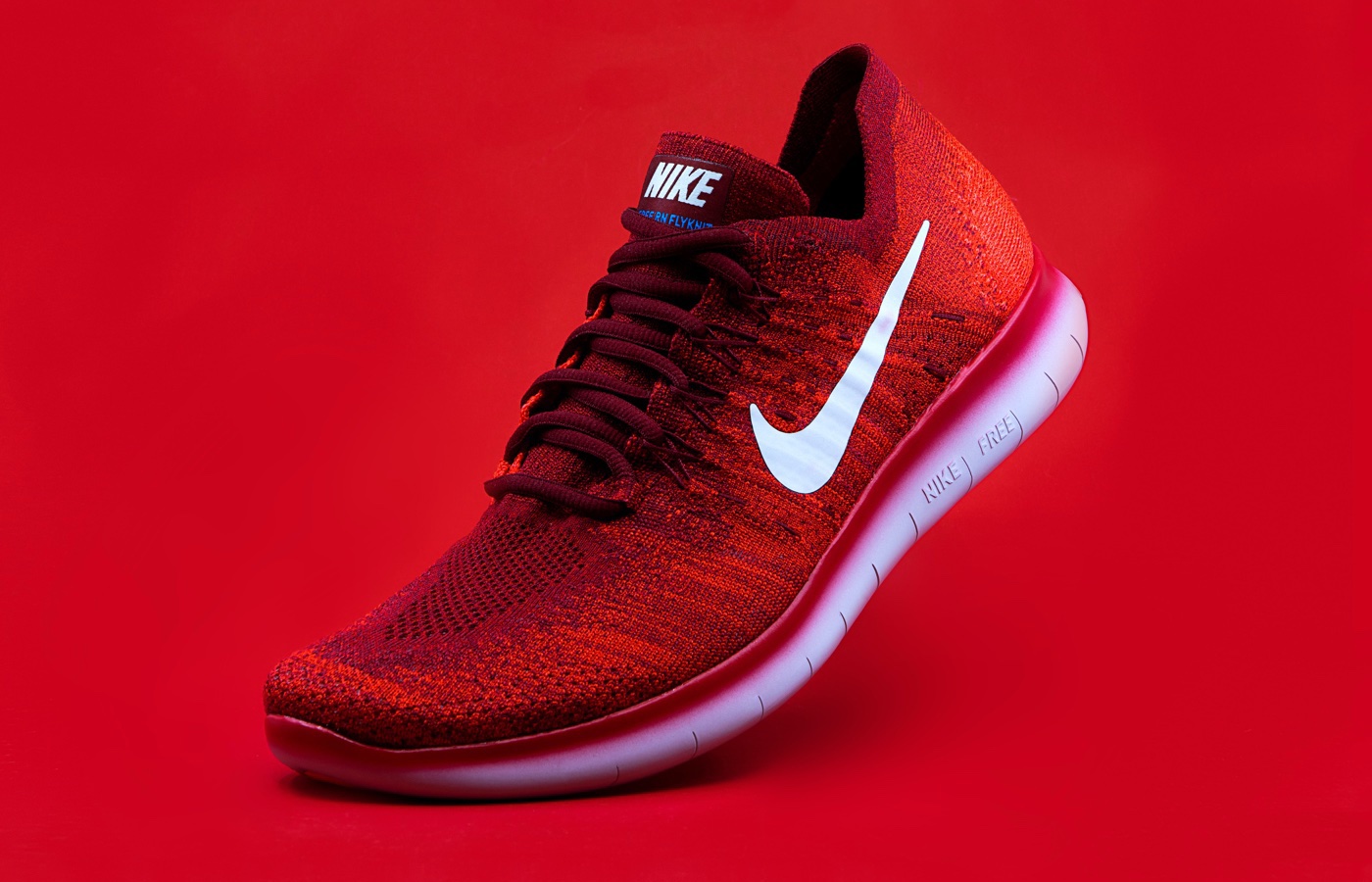
Left Content & Right Image
This sample Feature Box has content on the left with an image on the right. The content is also vertically aligned with the image. Notice, how the image displays at the top on mobile – this is another benefit of using the element.
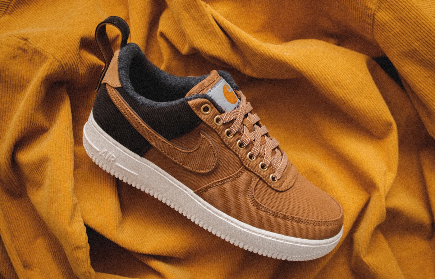
Right Content & Left Image
This sample Feature Box has content on the right with an image on the left. It’s also using custom widths instead of the default 50/50 width so that the image can display at a larger size and it has a custom background color.
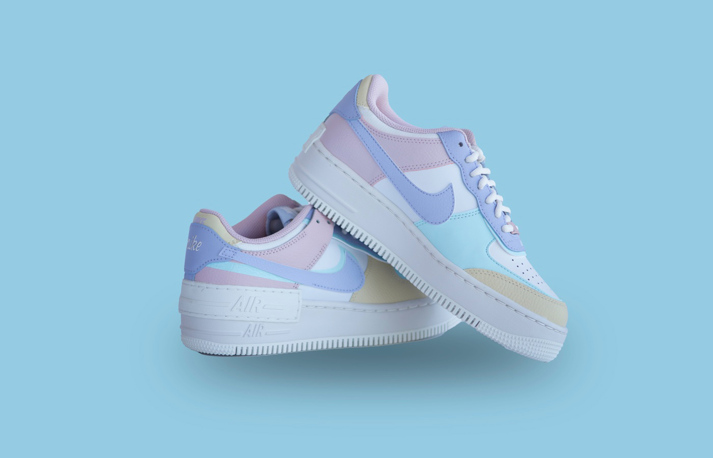
Centered Content & Bleeding Image
You can adjust the default alignment of the Feature Box heading and content, and optionally add a button to link to another page or website. This is great for creating call-to-action sections with a side image. In this example, the image extends all the way to the right edge of the browser for a full-width effect.
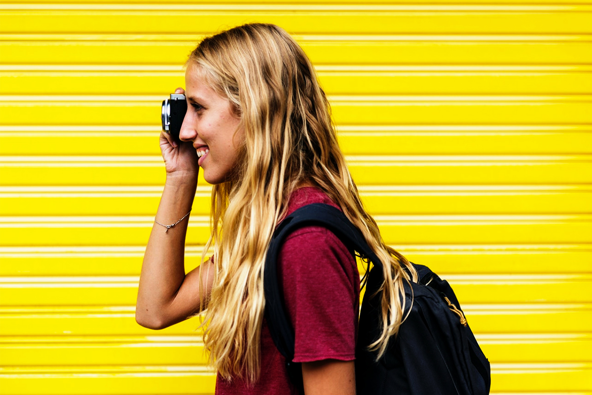
Rounded Image & Lotta Text
If you just want to add an image next to a paragraph (or more) of text then the Feature Box element is a good solution instead of adding a text block with a floated image. As you can see here we are adding quite a bit of text which will remain to the side of our image.
- You can even create lists if you wanted here.
- Lists can be useful for listing services or features.
- Lists can also be useful for describing things.
- But remember you can add anything you want here.
- This Feature box is also using a fixed 320px width for the image and the text will take up any remaining space.
- We’ve also added a border to this feature box to show you that it’s possible.