The Toggle Bar lets you display a customizable notice or additional content at the top of your site. It can be configured to be toggleable (users can open or close it) or dismissible (users can close it, and it will remain hidden even after page refreshes).
To get started go to Customize → Toggle Bar
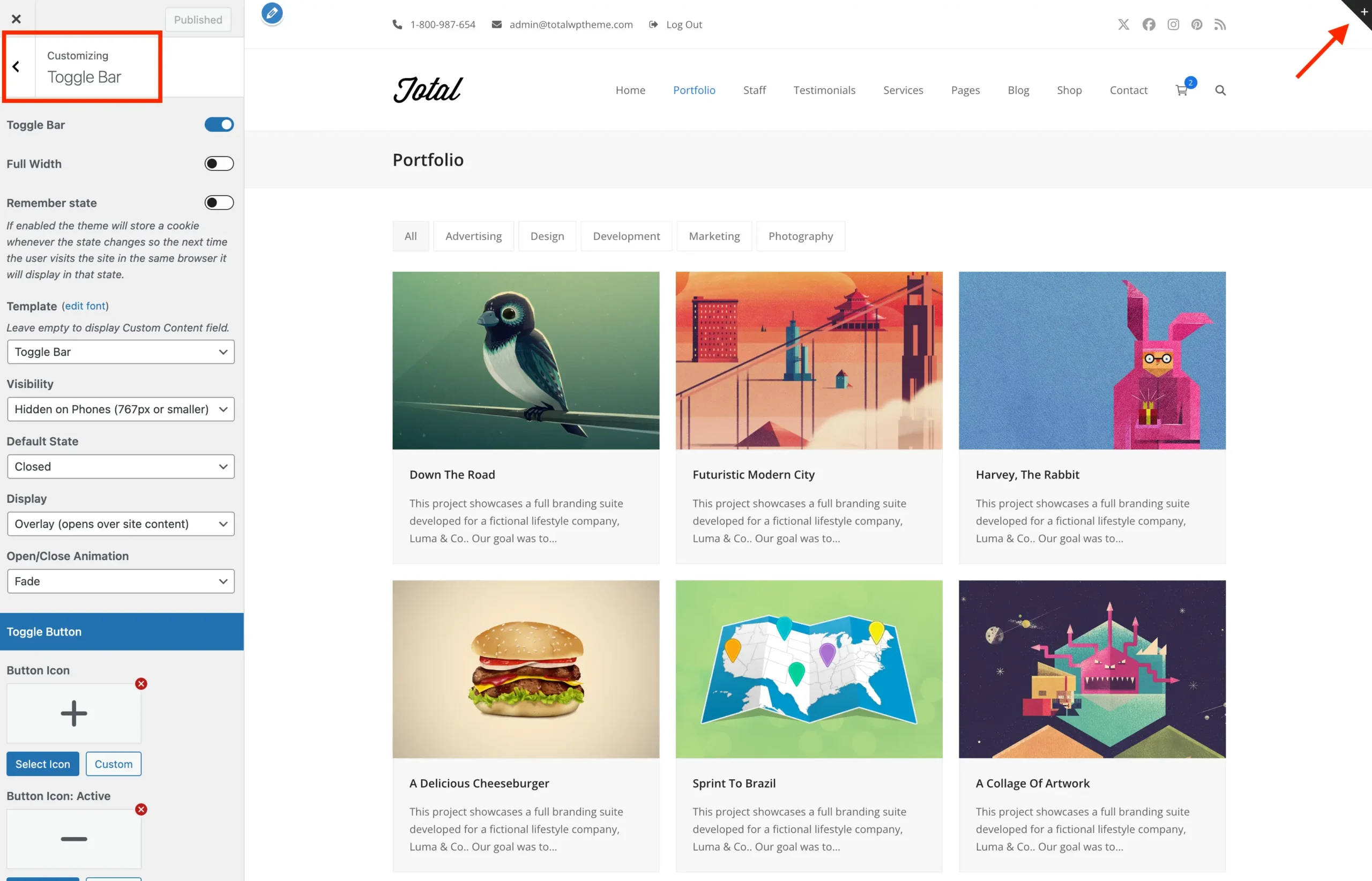
Toggle Bar Content
You have two options for displaying content in the Toggle Bar:
- Select a Custom Template: Choose a dynamic template part to display its content in the Toggle Bar. This way you can use a page builder (WPBakery, Gutenberg, Elementor or other) for the output.
- Enter Custom Text: Add your own message or content directly within the Customizer.
Toggle Bar Behaviour
By default, the Toggle Bar shows a button in the top-right corner of your site that lets users manually open or close the notice. When opened, the notice appears over the site content at the top of the page. You can customize this behavior using the following settings:
- Default State: Choose whether the notice starts Closed or Open when the page loads.
- Display: Choose how the notice appears. Overlay (overlapping the content) or Inline (pushing the content down).
Displaying a Dismissible Notice
To create a dismissible notice that users can close and hide permanently, configure the Toggle Bar settings as follows:
- Set Default State to Open so the notice is visible on page load.
- Set Display to Inline so the notice pushes the page content down.
- Enable the Close Button option allowing users to dismiss the notice.
- Enable the Remember State option so that the notice is hidden for subsequent page visits or refreshes.
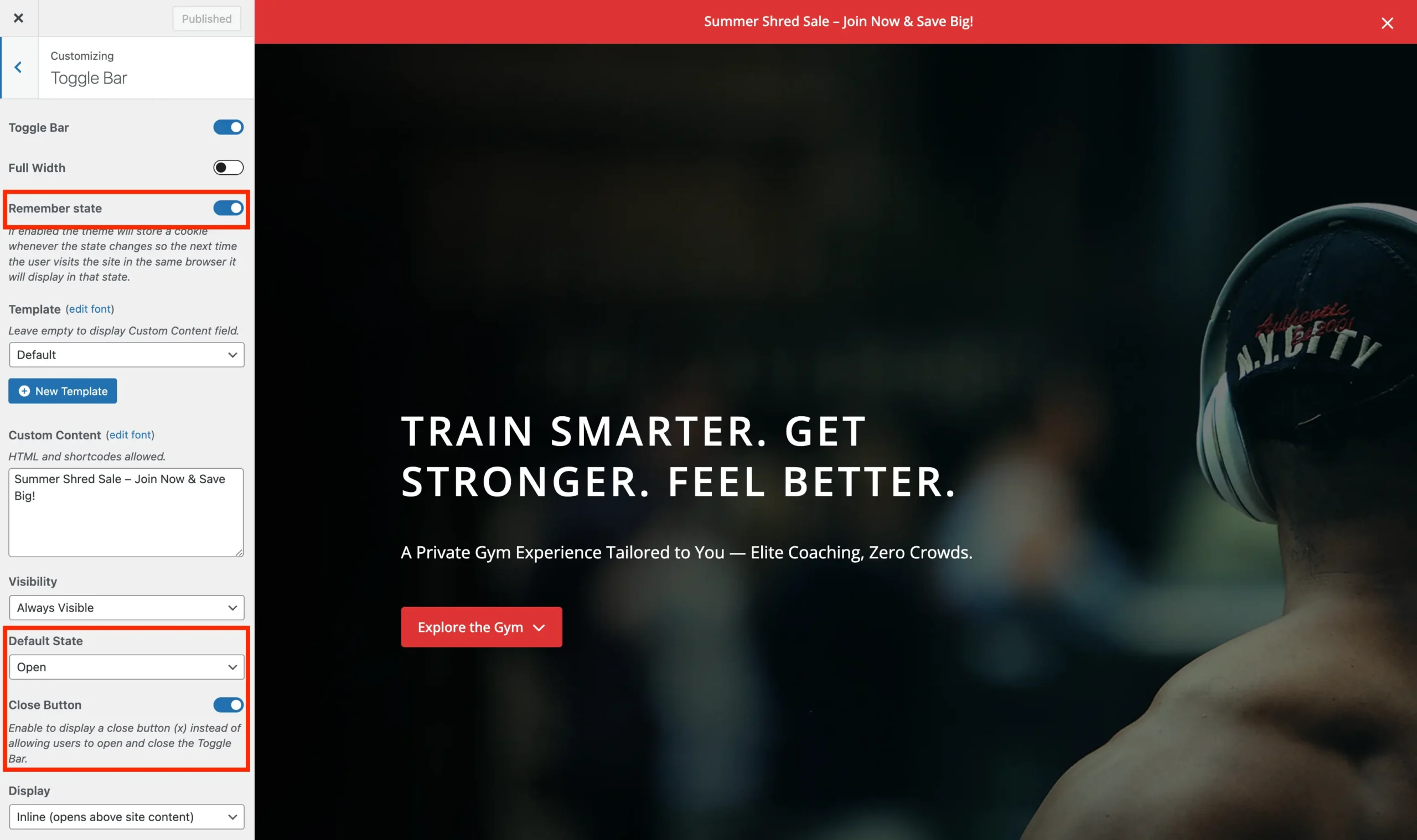
The theme uses localStorage to remember if a notice has been dismissed, not cookies. This means the dismissal is stored directly in the user’s browser and persists across page refreshes and sessions without relying on cookies.